
Chapter 6 Data Visualization
Now that we have learned basic data structures in R, we can now learn about how to do visualize our data. There are several different data visualization tools in R, and we focus on one of the most popular, “Grammar of Graphics”, or known as “ggplot”.
The syntax for ggplot2 will look a bit different than the code we have been writing, with syntax such as:
The output of all of these functions, such as from ggplot() or aes() are not data types or data structures that we are familiar with…rather, they are graphical information.
You should be worried less about how this syntax is similar to what we have learned in the course so far, but to view it as a new grammar (of graphics!) that you can “layer” on to create more sophisticated plots.
To get started, we will consider these most simple and common plots:
Univariate
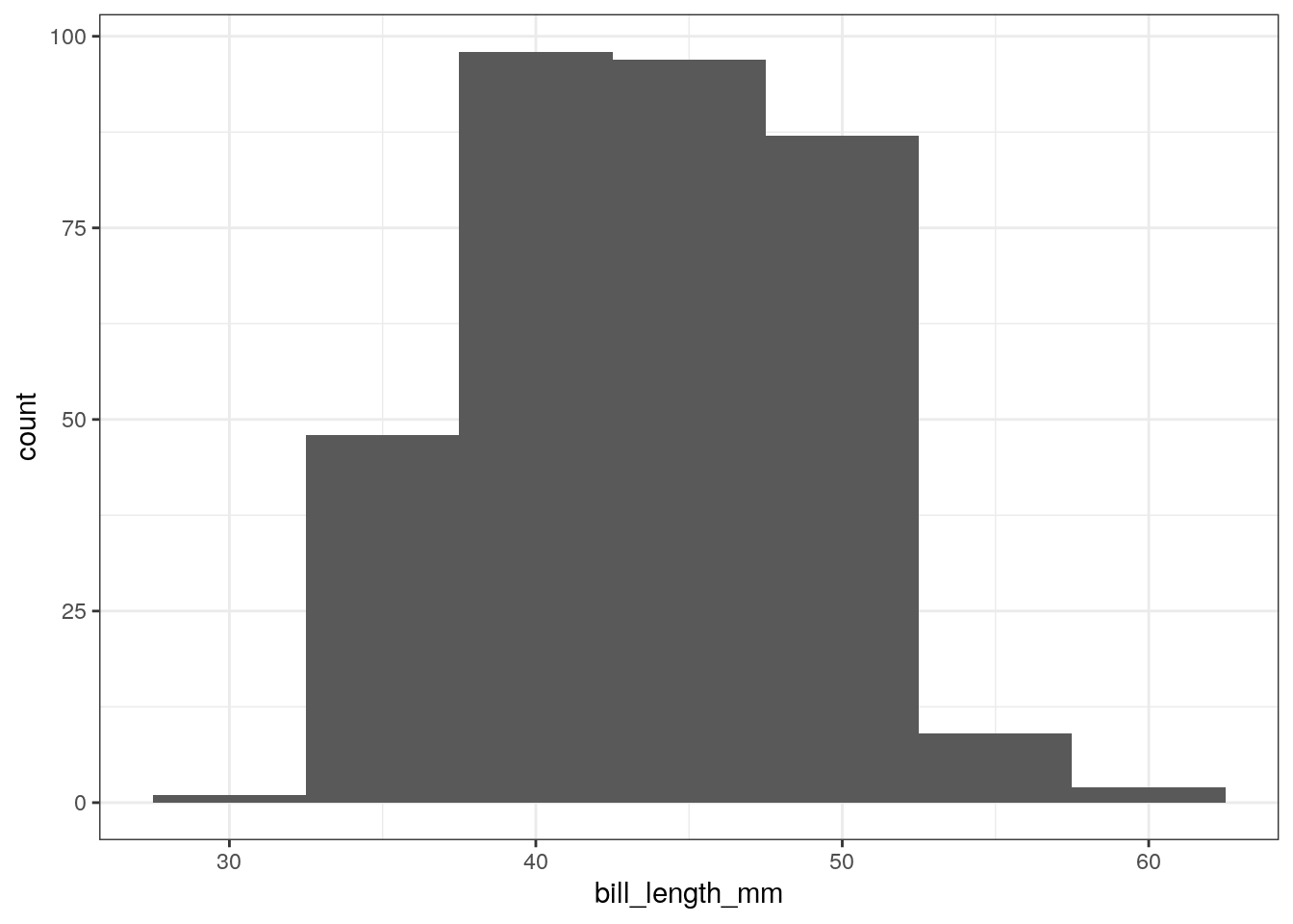
- Numeric: histogram
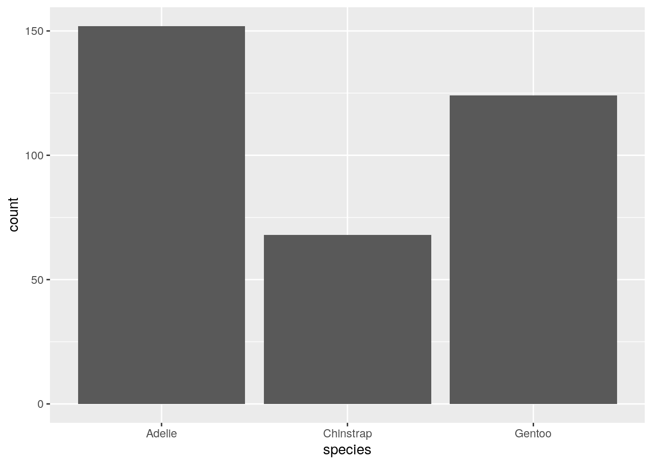
- Character: bar plots
Bivariate
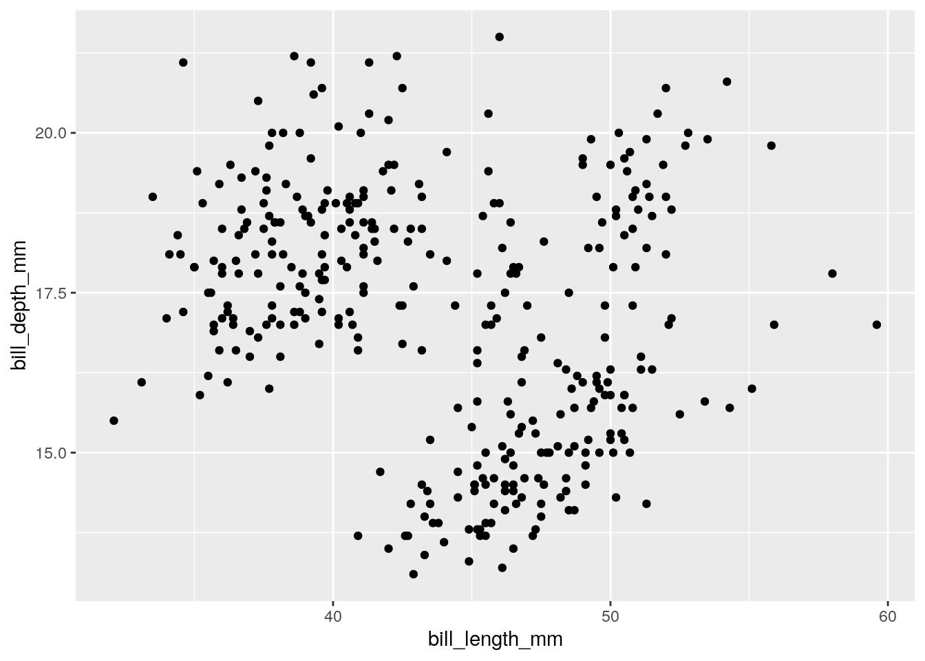
- Numeric vs. Numeric: Scatterplot, line plot
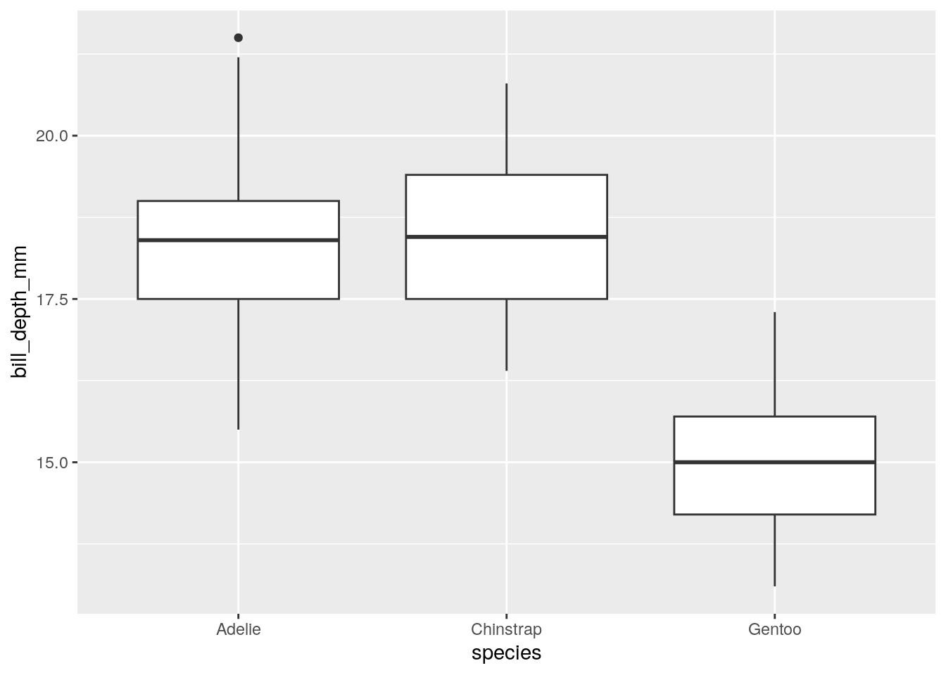
- Numeric vs. Character: Box plot
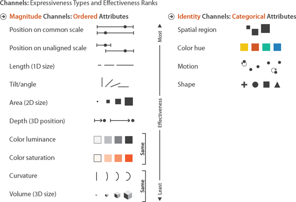
Why do we focus on these common plots? Our eyes are better at distinguishing certain visual features more than others. All of these plots are focused on their position to depict data, which gives us the most effective visual scale.
6.1 Grammar of Graphics
The syntax of the grammar of graphics breaks down into 4 sections.
Data
Mapping to data
Geometry
Additional settings
You add these 4 sections together to form a plot.
6.3 Let’s take it apart
You can always try out a ggplot incrementally if you’re not sure what pieces do:
## `stat_bin()` using `bins = 30`. Pick better value with `binwidth`.## Warning: Removed 2 rows containing non-finite outside the scale range
## (`stat_bin()`).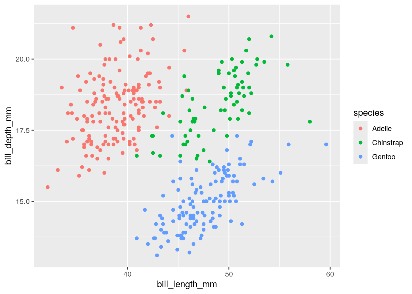
6.4 Bar plots
ggplot(penguins) + aes(x = species) + geom_bar()
6.4.2 Multivariate Scatterplot
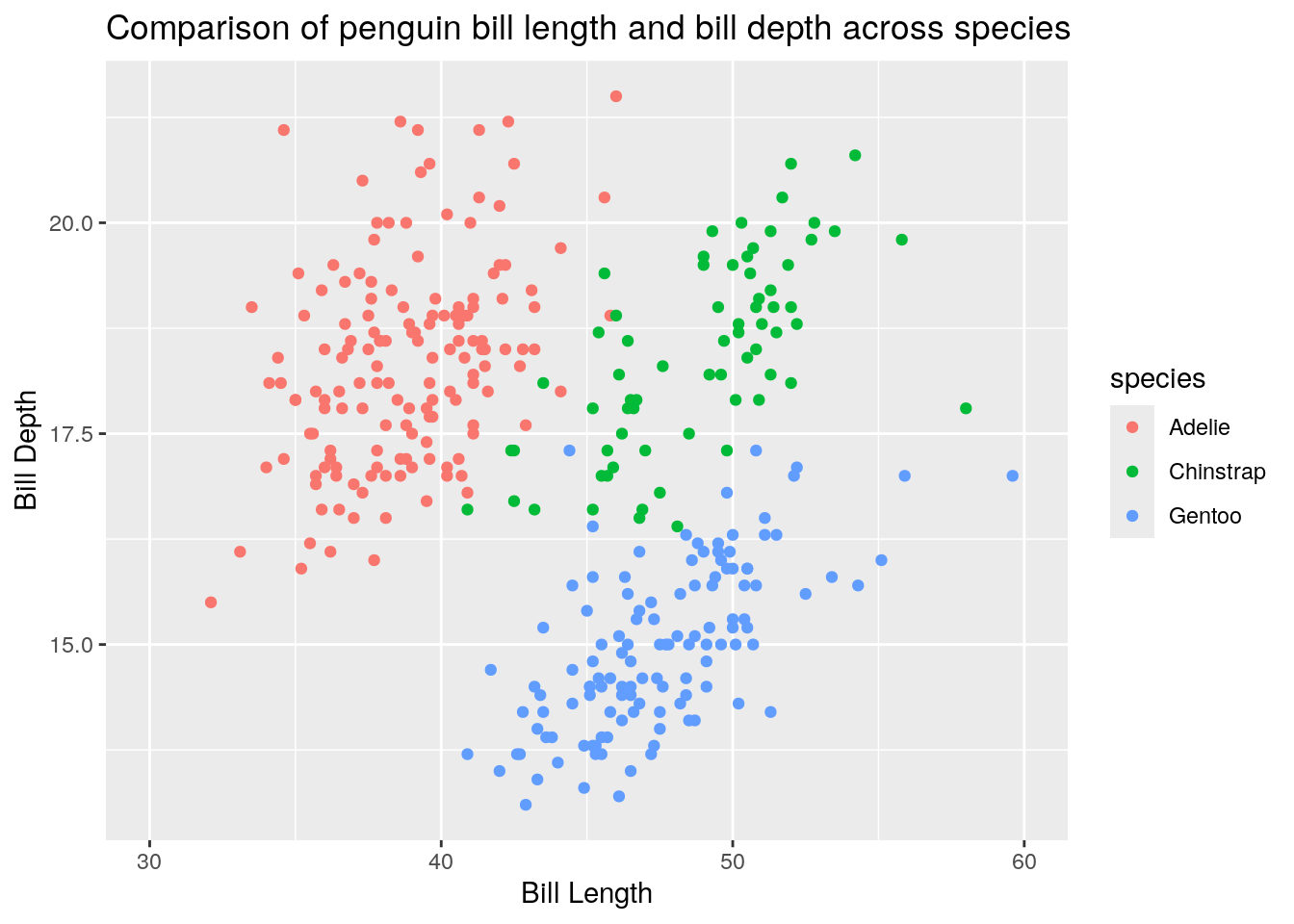
ggplot(penguins) + aes(x = bill_length_mm, y = bill_depth_mm, color = species) + geom_point()
6.4.3 Multivaraite Scatterplot
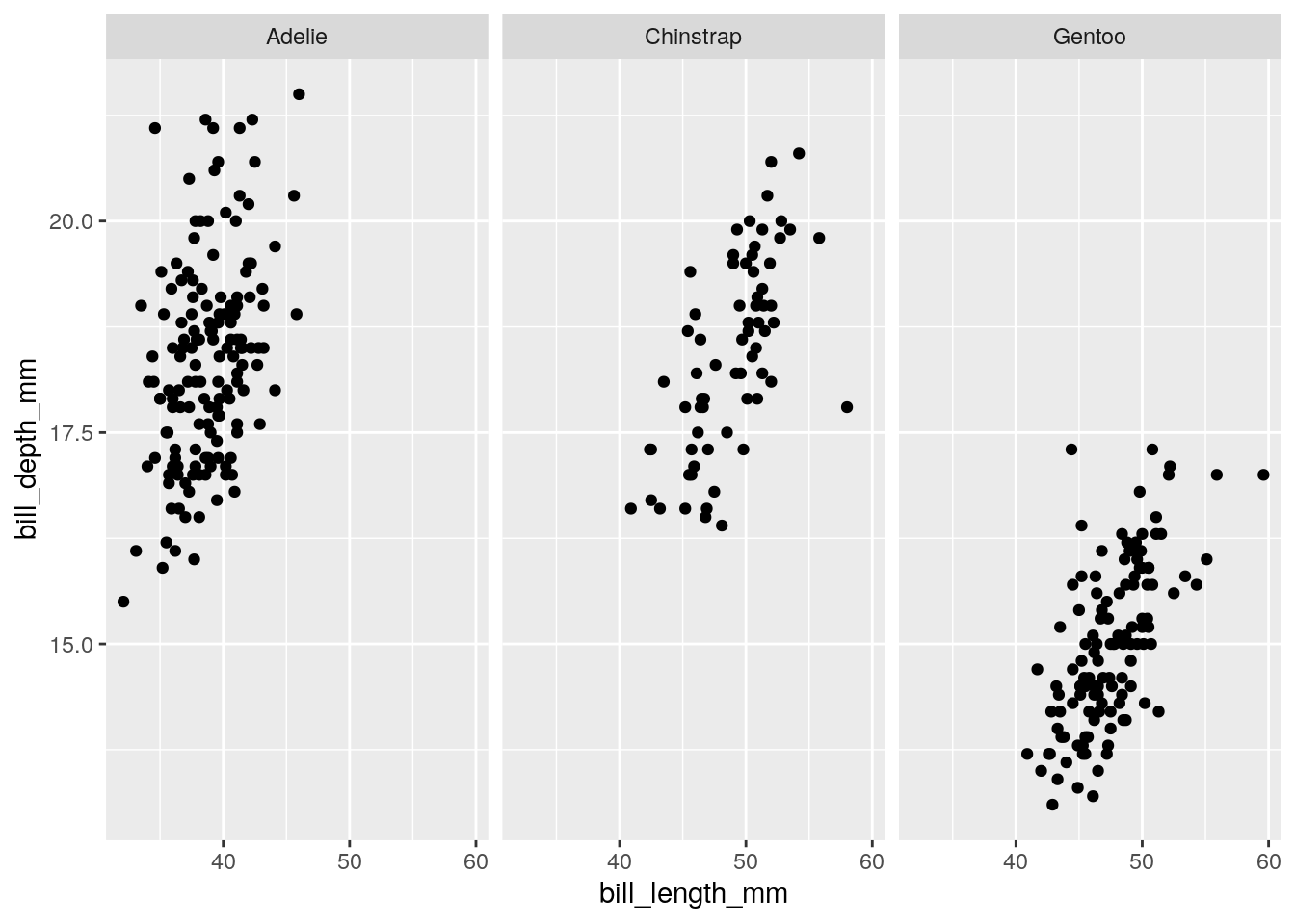
ggplot(penguins) + aes(x = bill_length_mm, y = bill_depth_mm) + geom_point() + facet_wrap(~species)

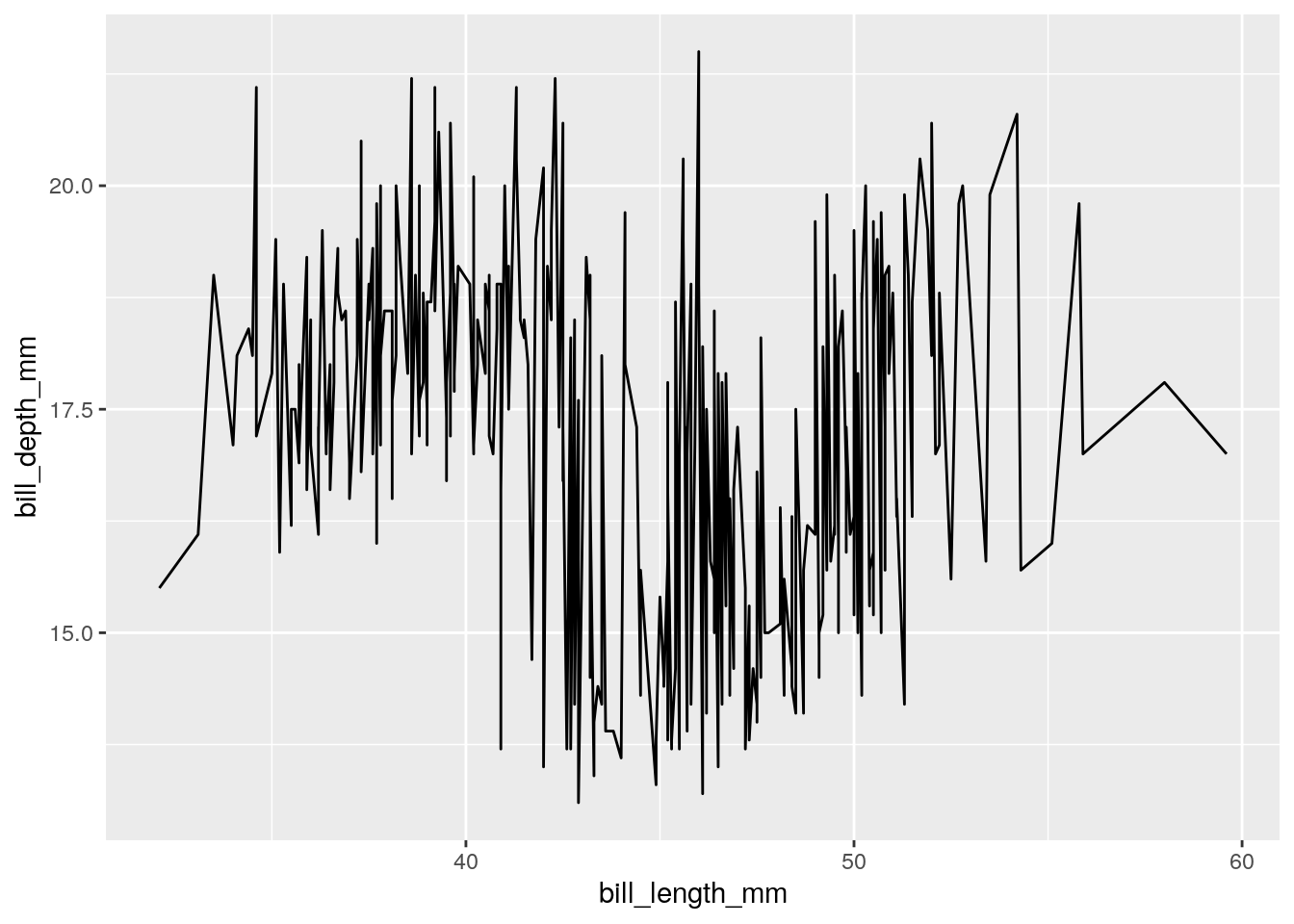
6.4.5 Grouped Line plot?
ggplot(penguins) + aes(x = bill_length_mm, y = bill_depth_mm, group = species) + geom_line()


6.5 Summary of options
data
geom_point: x, y, color, shape
geom_line: x, y, group, color
geom_histogram: x, y, fill
geom_bar: x, fill
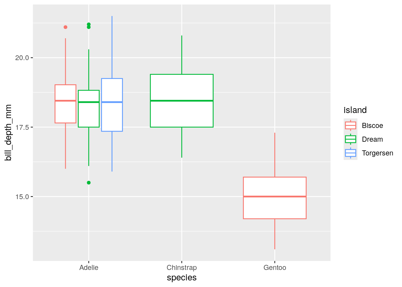
geom_boxplot: x, y, fill, color
facet_wrap
labs
scale_x_continuous
scale_y_continuous
scale_x_discrete
scale_y_discrete
Consider the esquisse package to help generate your ggplot code via drag and drop.
An excellent ggplot “cookbook” can be found here.
6.6 Exercises
You can find exercises and solutions on Posit Cloud, or on GitHub.