
Chapter 5 Data Visualization
In our final to last week together, we learn about how to visualize our data.
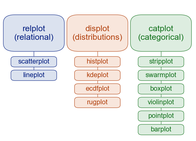
There are several different data visualization modules in Python:
matplotlib is a general purpose plotting module that is commonly used.
seaborn is a plotting module built on top of matplotlib focused on data science and statistical visualization. We will focus on this module for this course.
plotnine is a plotting module based on the grammar of graphics organization of making plots. This is very similar to the R package “ggplot”.
To get started, we will consider these most simple and common plots:
Distributions (one variable)
- Histograms
Relational (between 2 continuous variables)
Scatterplots
Line plots
Categorical (between 1 categorical and 1 continuous variable)
Bar plots
Violin plots
Why do we focus on these common plots? Our eyes are better at distinguishing certain visual features more than others. All of these plots are focused on their position to depict data, which gives us the most effective visual scale.
](https://www.oreilly.com/api/v2/epubs/9781466508910/files/image/fig5-1.png)
Let’s load in our genomics datasets and start making some plots from them.
import pandas as pd
import seaborn as sns
import matplotlib.pyplot as plt


metadata = pd.read_csv("classroom_data/metadata.csv")
mutation = pd.read_csv("classroom_data/mutation.csv")
expression = pd.read_csv("classroom_data/expression.csv")
5.1 Distributions (one variable)
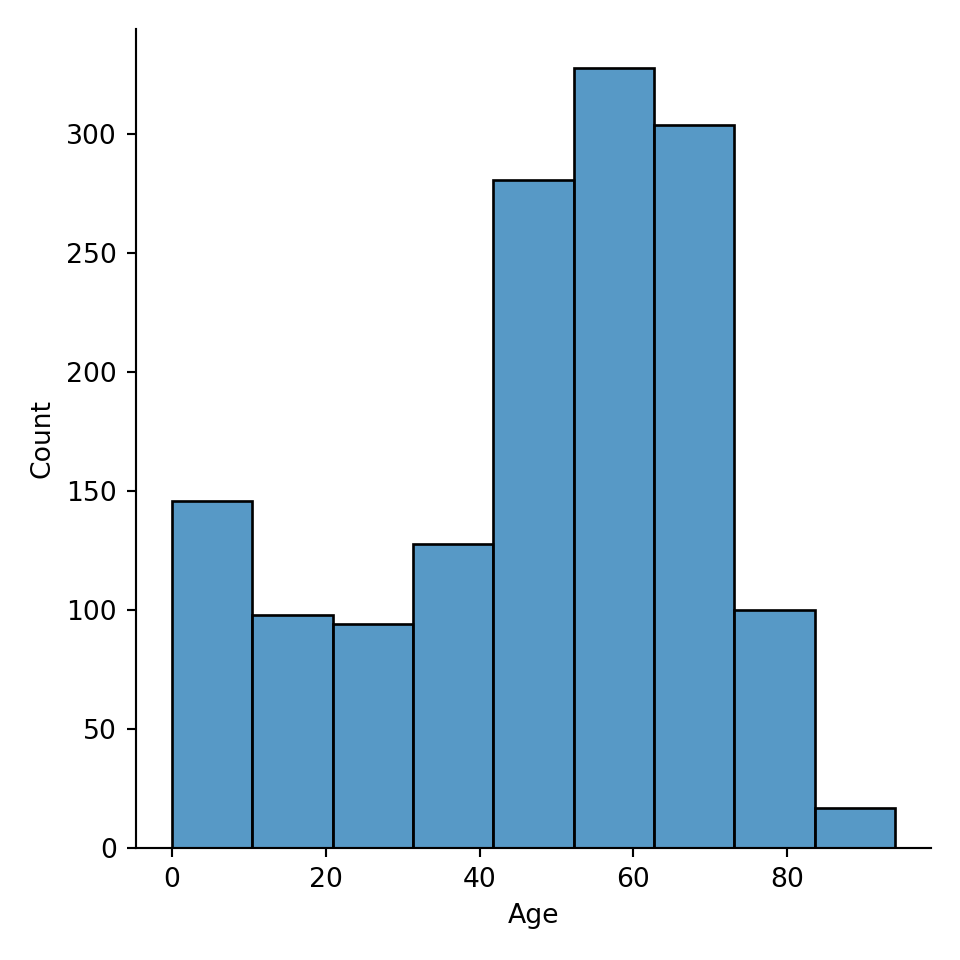
To create a histogram, we use the function sns.displot() and we specify the input argument data as our dataframe, and the input argument x as the column name in a String.
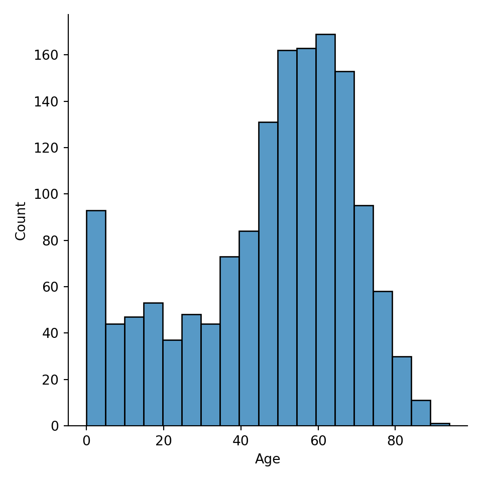
(For the webpage’s purpose, assign the plot to a variable plot. In practice, you don’t need to do that. You can just write sns.displot(data=metadata, x="Age")).
A common parameter to consider when making histogram is how big the bins are. You can specify the bin width via binwidth argument, or the number of bins via bins argument.
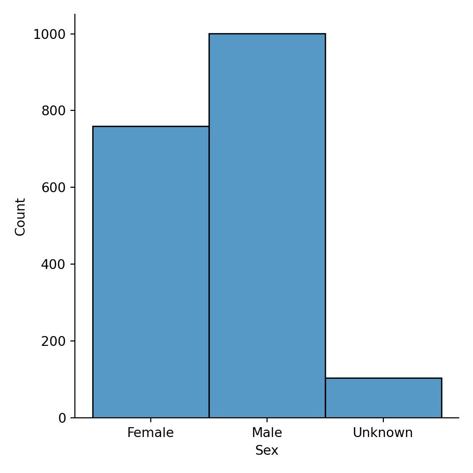
Our histogram also works for categorical variables, such as “Sex”.
Conditioning on other variables
Sometimes, you want to examine a distribution, such as Age, conditional on other variables, such as Age for Female, Age for Male, and Age for Unknown: what is the distribution of age when compared with sex? There are several ways of doing it. First, you could color variables by color, using the hue input argument:
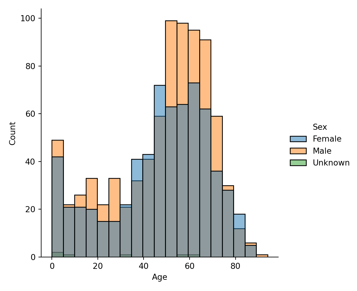
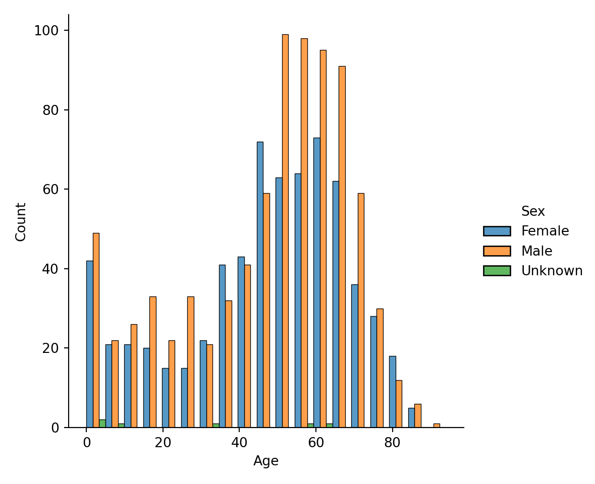
It is rather hard to tell the groups apart from the coloring. So, we add a new option that we want to separate each bar category via multiple="dodge" input argument:
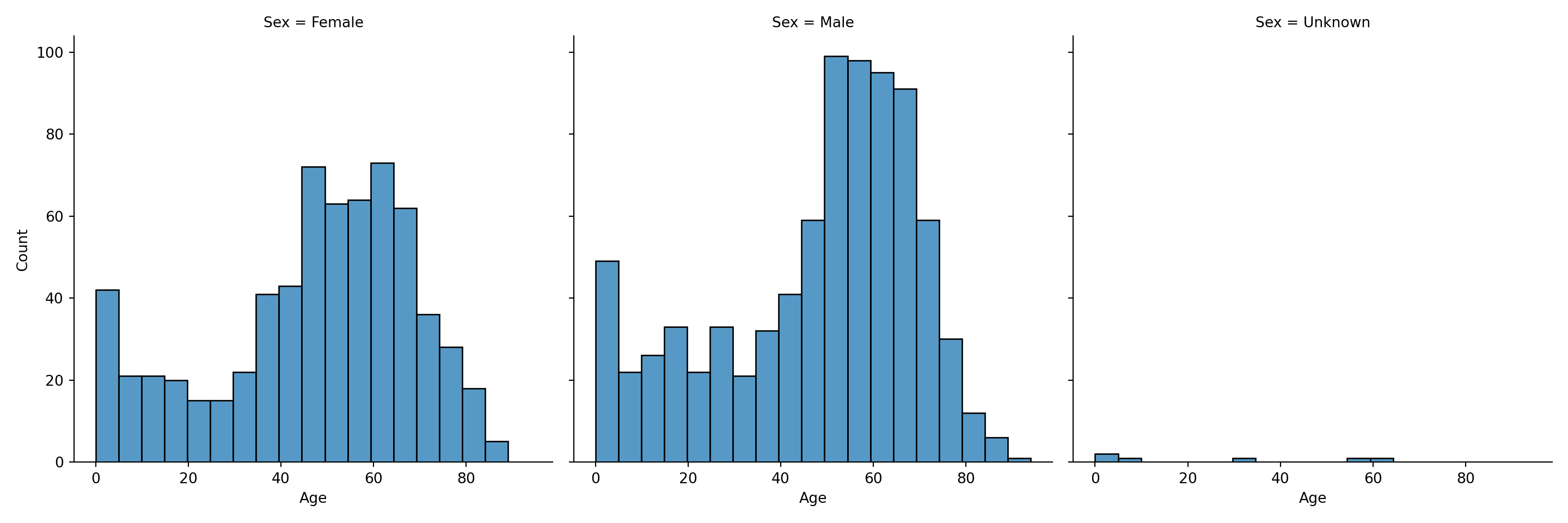
Lastly, an alternative to using colors to display the conditional variable, we could make a subplot for each conditional variable’s value via col="Sex" or row="Sex":
You can find a lot more details about distributions and histograms in the Seaborn tutorial.
5.2 Relational (between 2 continuous variables)
To visualize two continuous variables, it is common to use a scatterplot or a lineplot. We use the function sns.relplot() and we specify the input argument data as our dataframe, and the input arguments x and y as the column names in a String:

To conditional on other variables, plotting features are used to distinguish conditional variable values:
hue(similar to the histogram)stylesize
Let’s merge expression and metadata together, so that we can examine KRAS and EGFR relationships conditional on primary vs. metastatic cancer status. Here is the scatterplot with different color:
expression_metadata = expression.merge(metadata)

plot = sns.relplot(data=expression_metadata, x="KRAS_Exp", y="EGFR_Exp", hue="PrimaryOrMetastasis")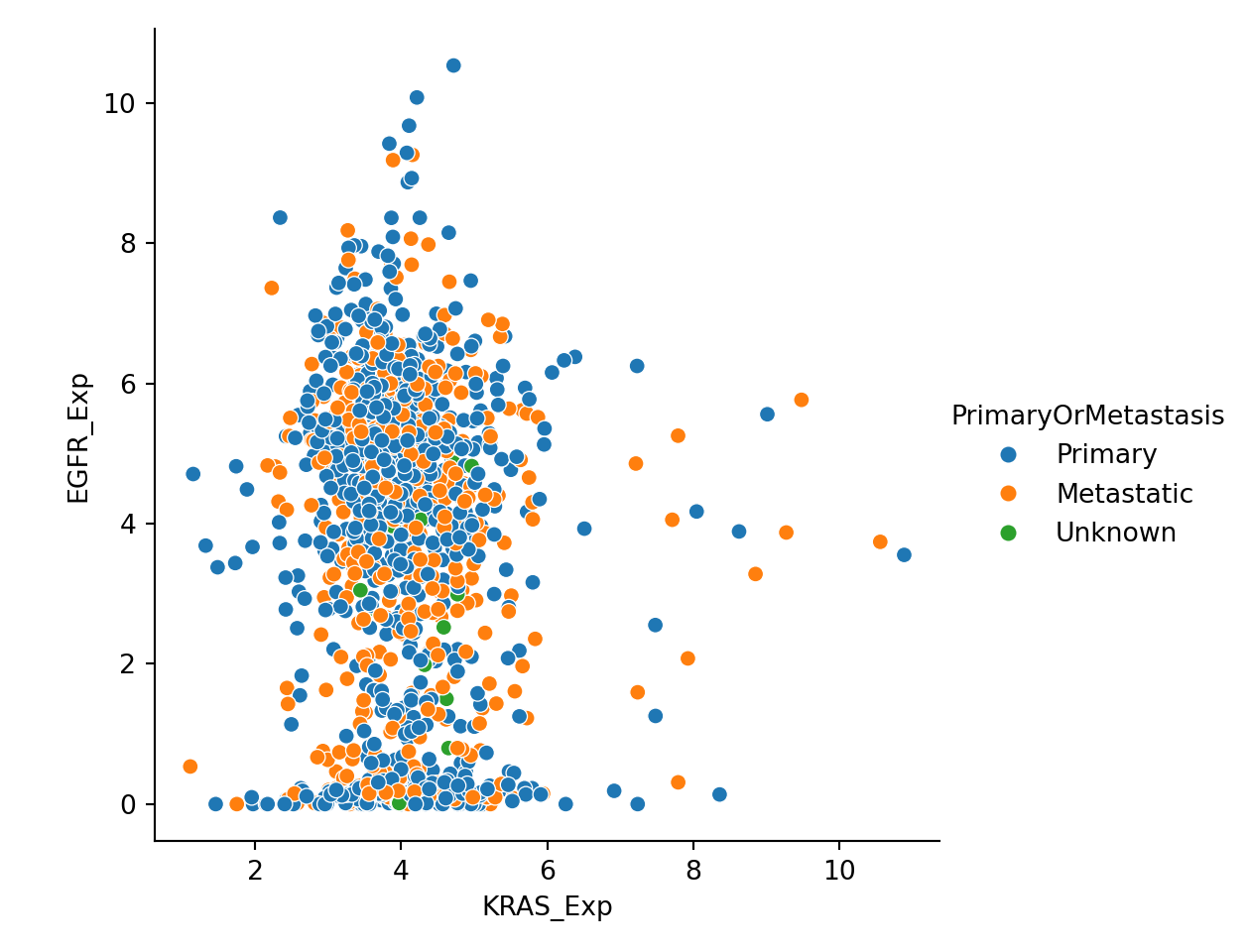
Here is the scatterplot with different shapes:
plot = sns.relplot(data=expression_metadata, x="KRAS_Exp", y="EGFR_Exp", style="PrimaryOrMetastasis")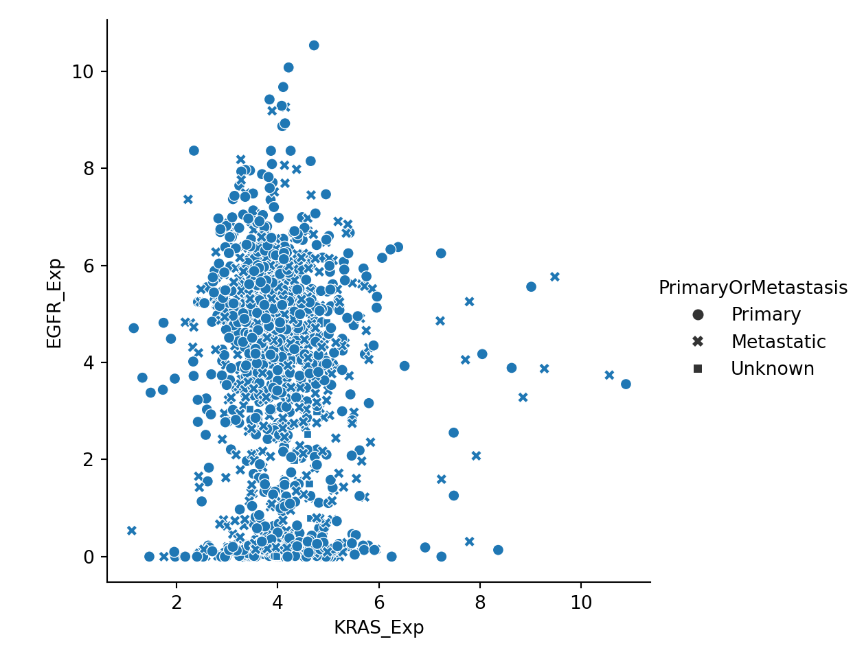
You can also try plotting with size=PrimaryOrMetastasis" if you like. None of these seem pretty effective at distinguishing the two groups, so we will try subplot faceting as we did for the histogram:
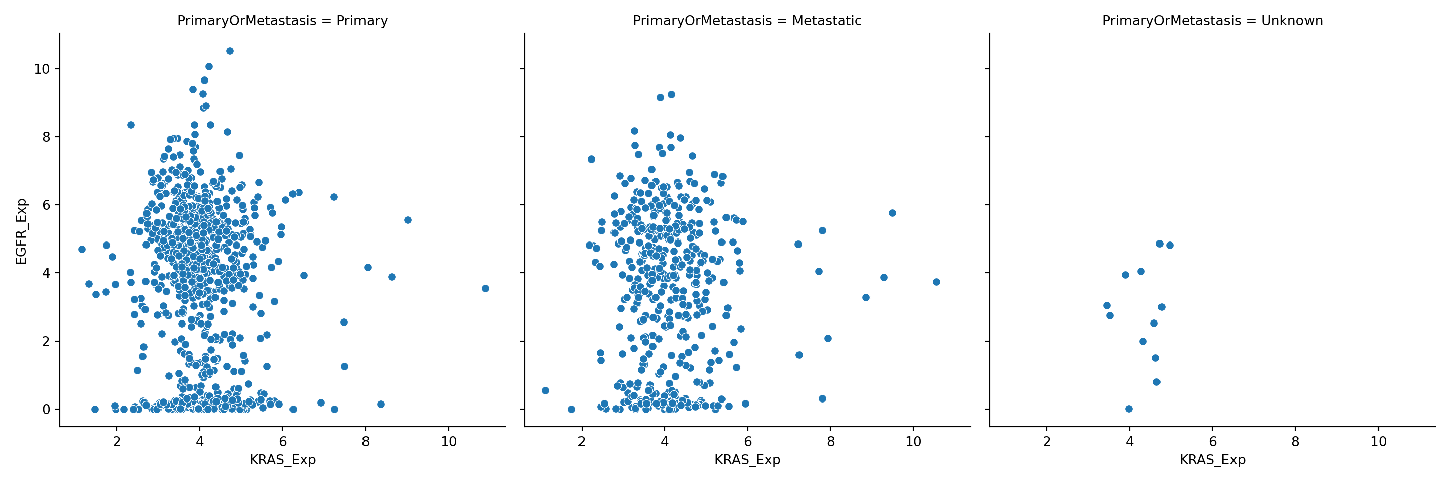
You can also conditional on multiple variables by assigning a different variable to the conditioning options:
plot = sns.relplot(data=expression_metadata, x="KRAS_Exp", y="EGFR_Exp", hue="PrimaryOrMetastasis", col="AgeCategory")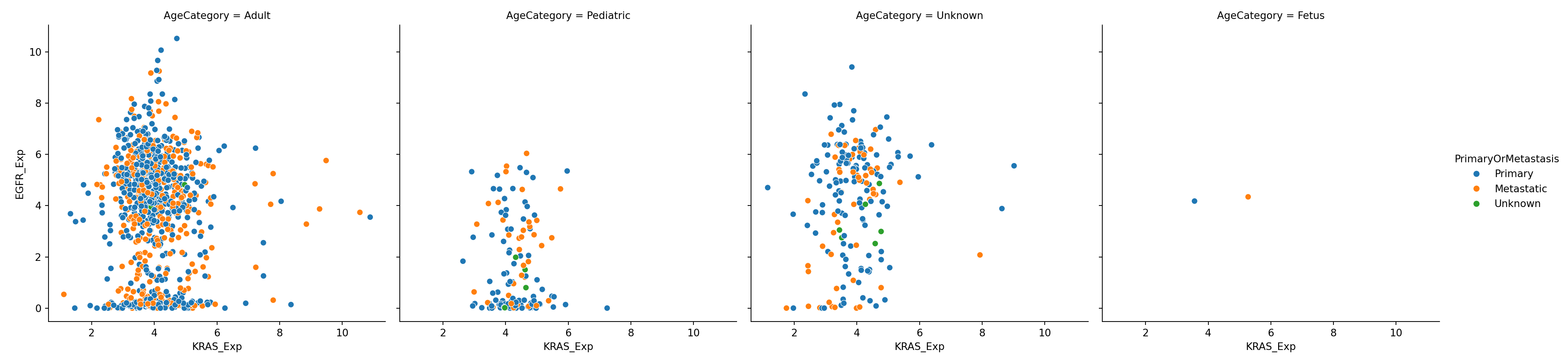
You can find a lot more details about relational plots such as scatterplots and lineplots in the Seaborn tutorial.
5.3 Categorical (between 1 categorical and 1 continuous variable)
A very similar pattern follows for categorical plots. We start with sns.catplot() as our main plotting function, with the basic input arguments:
dataxy
You can change the plot styles via the input arguments:
kind: “strip”, “box”, “swarm”, etc.
You can add additional conditional variables via the input arguments:
huecolrow
See categorical plots in the Seaborn tutorial.
5.4 Basic plot customization
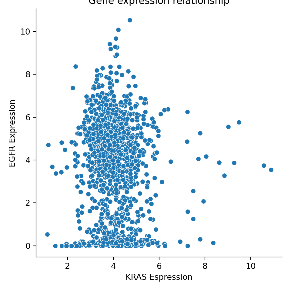
You can easily change the axis labels and title if you modify the plot object, using the method .set():
exp_plot = sns.relplot(data=expression, x="KRAS_Exp", y="EGFR_Exp")
exp_plot.set(xlabel="KRAS Espression", ylabel="EGFR Expression", title="Gene expression relationship")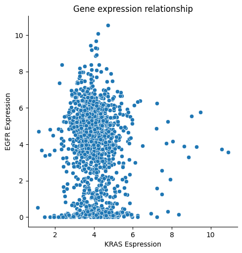
You can change the color palette by setting adding the palette input argument to any of the plots. You can explore available color palettes here:
plot = sns.displot(data=metadata, x="Age", hue="Sex", multiple="dodge", palette=sns.color_palette(palette='rainbow')
)
## <string>:1: UserWarning: The palette list has more values (6) than needed (3), which may not be intended.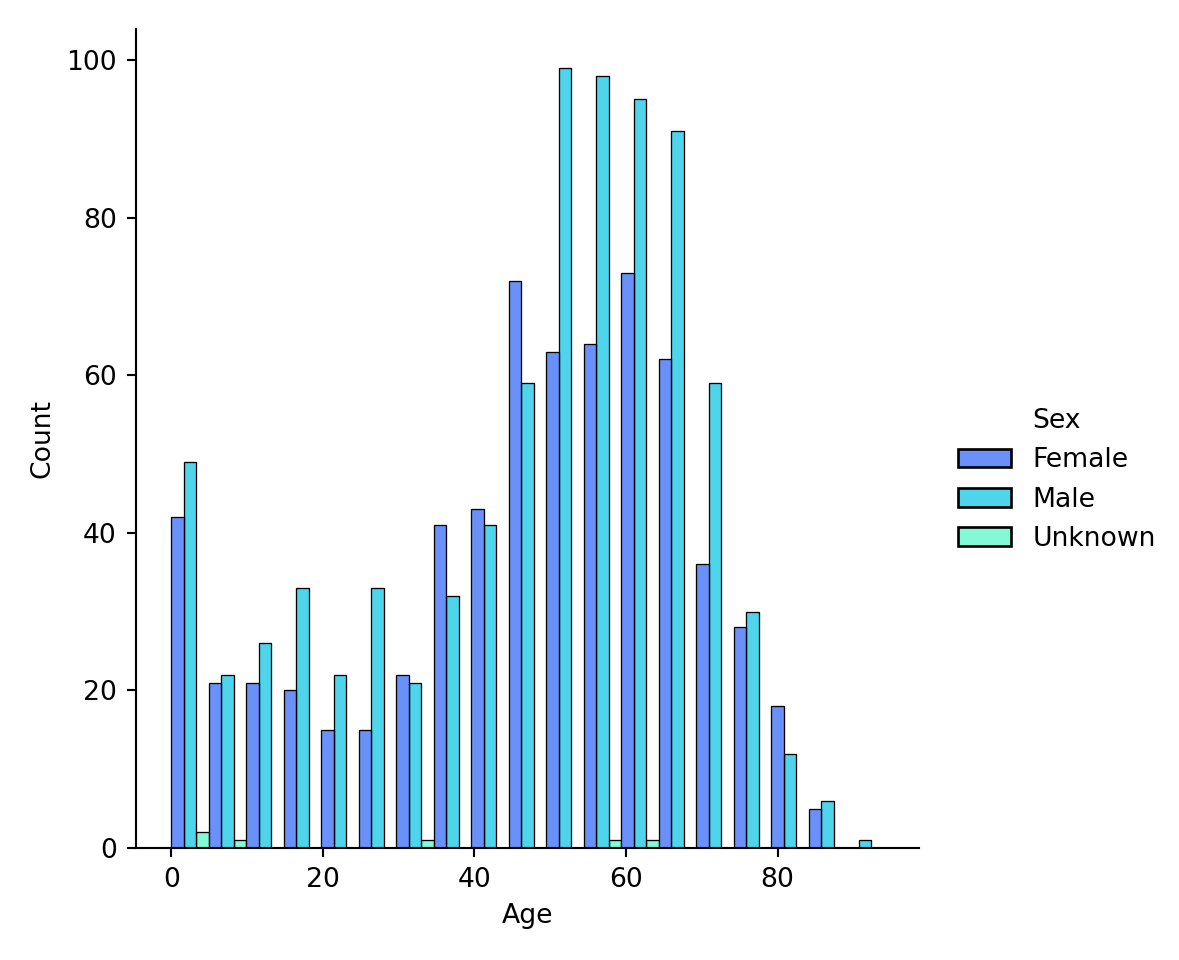
5.5 Other resources
We recommend checking out the workshop Better Plots, which showcase examples of how to clean up your plots for clearer communication.
5.6 Exercises
Exercise for week 5 can be found here.