Chapter 12 Part 3. Visualizing the Data
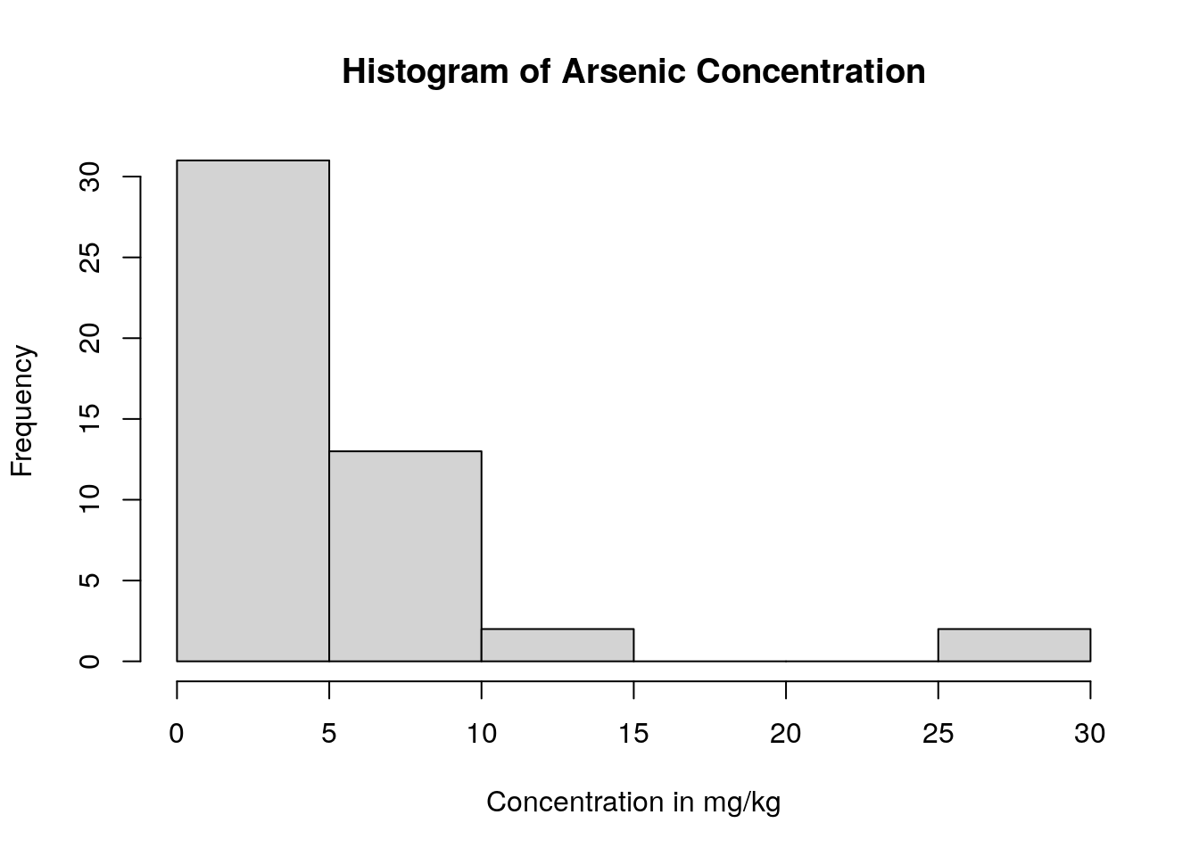
Often, it can be easier to immediately interpret data displayed as a plot than as a list of values. For example, we can more easily understand how the arsenic concentration of the soil samples are distributed if we create histograms compared to looking at point values like mean, standard deviation, minimum, and maximum.
One way to make histograms in R is with the hist() function. This function only requires that we tell R which column of the dataset that we want to plot. (However, we also have the option to tell R a histogram name and a x-axis label.)
We can again use the pull() command and pipes (%>%) to choose the column we want from the soil.values.clean dataset and make a histogram of them.
This combination of commands follows the code structure:
dataset %>% pull(column_name) %>% hist(main = chart_title, xlab = x_axis_title)
soil.combined %>%
    pull(As_EPA3051) %>%
    hist(main = 'Histogram of Arsenic Concentration',
         xlab ='Concentration in mg/kg' )
We can see that almost all the soil samples had very low concentrations of arsenic (which is good news for the soil health!). In fact, many of them had arsenic concentrations close to 0, and only a few sampling locations appear to have high levels of arsenic.
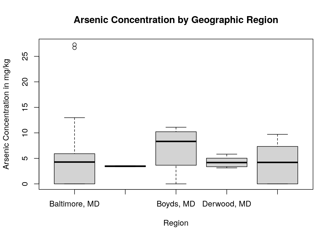
We might also want to graphically compare arsenic concentrations among the geographic regions in our dataset. We can do this by creating boxplots. Boxplots are particularly useful when comparing the mean, variation, and distributions among multiple groups.
In R, one way to create a boxplot is using the boxplot() function. We don’t need to use pipes for this command, but instead will specify what columns we want to use from the dataset inside the boxplot() function itself.
This command follows the code structure:
boxplot(column_we’re_plotting ~ grouping_variable, data = dataset, main = “Title of Graph”, xlab = “x_axis_title”, ylab = “y_axis_title”)
boxplot(As_EPA3051 ~ origin,
        data = soil.combined,
        main = "Arsenic Concentration by Geographic Region",
        xlab = "Region",
        ylab = "Arsenic Concentration in mg/kg")
By using a boxplot, we can quickly see that, while two sampling sites within Baltimore, MD have a very high concentration of arsenic in the soil (indicated by the two small circles on the plot), in general there isn’t a difference in arsenic content between any of our locations.
QUESTIONS:
Create a histogram for iron concentration, as well as a boxplot comparing iron concentration by region. Is the iron concentration similar among regions? Are there any outlier sites with unusually high or low iron concentrations?
Create a histogram for lead concentration, as well as a boxplot comparing lead concentration by region. Is the lead concentration similar among regions? Are there any outlier sites with unusually high or low lead concentrations?