
7 Wrapping up
7.1 Learning Objectives
7.2 Iterative Example
To summarize all of the considerations and best practices discussed in the chapters before this, the first section of this final chapter will walk through an example, step-by-step, of iteratively building up an expository data visualization. Each step or iteration showcases a different view of the same data as we refine how to effectively communicate the message we want to convey for the audience.
7.2.1 Data Introduction
A 2017 survey from the University of British Columbia asked potential trick-or-treaters a series of questions. The main question provided a list of candy (and a few joke non-candy items) to survey takers. The prompt asked
Basically, consider that feeling you get when you receive this item in your Halloween haul. Does it make you really happy (joy)? Or is it something that you automatically place in the junk pile (despair)? Meh for indifference, and you can leave blank if you have no idea what the item is. place in the junk pile (despair)? Meh for indifference, and you can leave blank if you have no idea what the item is.
Using this dataset, we will focus on responses to the question about feelings related to specific candies, selecting only real candy, for a total of 76 candies. For each of these candies, we will compute the proportion of respondents who replied with each general feeling (e.g., Joy, Despair, Indifference, or No response). We will use this to make a visualization about how respondents feel about different kinds of candy.
R code for data import and preliminary wrangling steps
library(here)
library(tidyverse)

df_2017 <- read.csv(here("data/candyhierarchy2017.csv"), fileEncoding = "ISO-8859-1")

non_candy <- c("Bonkers  the board game",
               "Box o Raisins",
               "Broken glow stick",
               "Cash  or other forms of legal tender",
               "Chardonnay",
               "Creepy Religious comics Chick Tracts",
               "Dental paraphenalia",
               "Generic Brand Acetaminophen",
               "Glow sticks",
               "Healthy Fruit",
               "Hugs  actual physical hugs",
               "JoyJoy  Mit Iodine",
               "Kale smoothie",
               "Senior Mints",
               "Green Party M M s",
               "Independent M M s",
               "Abstained from M M ing",
               "Minibags of chips",
               "Pencils",
               "Real Housewives of Orange County Season 9 Blue Ray",
               "Sandwich sized bags filled with BooBerry Crunch",
               "Spotted Dick",
               "Trail Mix",
               "Vials of pure high fructose corn syrup  for main lining into your vein",
               "Vicodin",
               "White Bread",
               "Whole Wheat anything")

## making a dataframe of just the feeling responses for the candy
## selecting columns related to Question 6 about feelings about candy. Each candy has its own column
## polishing the column names to remove "Q6", "." and white space
## selecting columns that are just the candy by excluding all of the non-candy
## using pivot_longer to make a column that has candy names (`column_name`) and responses of "JOY", "DESPAIR", or "MEH" in `value`
## each candy will have multiple rows because of pivot_longer use
## grouping by candy and the value to count (using `summarise`) the number of respondents who felt Joy, Despair, or Meh for each candy
## dropping the value grouping to sum counts to find total counts for each candy
## undoing all of the grouping
## finding a proportion for each row: candy and feeling combo

df_2017_jc <- df_2017 %>%
  select(starts_with("Q6")) %>%
  rename_with(~ str_remove(., "Q6...")) %>%
  rename_with(~ str_replace_all(., "\\.", " ")) %>%
  rename_with(~ str_trim(.x, side = "both")) %>%
  select(-all_of(non_candy)) %>%
  pivot_longer(everything(), names_to = "column_name", values_to = "value") %>%
  group_by(column_name, value) %>%
  summarise(count = n(), .groups = "drop_last") %>%
  mutate(total = sum(count)) %>%
  ungroup() %>%
  mutate(proportion = count / total)


## replacing empty values with NA

df_2017_jc[df_2017_jc==""]<- NA

## replacing NA with "Not Answered"
## using pivot_wider to recollapse the data so that each candy has a single row
## there will be a column with proportions for each feeling
## arrange the data according to magnitude of joy proportions

to_plot <- df_2017_jc %>%
  replace_na(list(value = "Not Answered")) %>%
  pivot_wider(id_cols = column_name,
              names_from = value,
              values_from = proportion) %>%
  arrange(JOY)

nrow(to_plot)
[1] 76Python code for data import and preliminary wrangling steps
import pandas as pd
import matplotlib as mpl
import matplotlib.pyplot as plt


df_2017 = pd.read_csv('data/candyhierarchy2017.csv', encoding = "ISO-8859-1")

just_q6= df_2017.filter(like="Q6 |", axis=1)
q6_counts = just_q6.apply(lambda x: x.value_counts(dropna=False)).T
q6_counts['total_response'] = pd.DataFrame.sum(q6_counts, axis=1)
q6_counts['likeness'] = q6_counts['JOY'] / q6_counts['total_response']
q6_counts['indifference'] = q6_counts['MEH'] / q6_counts['total_response']
q6_counts['dislikeness'] = q6_counts['DESPAIR'] / q6_counts['total_response']

q6_counts.index = q6_counts.index.str.replace("Q6 | ", "")

just_candy_props = q6_counts[~q6_counts.index.isin(["Bonkers (the board game)",
                                                    "Box'o'Raisins",
                                                    "Broken glow stick",
                                                    "Cash, or other forms of legal tender",
                                                    "Chardonnay",
                                                    "Creepy Religious comics/Chick Tracts",
                                                    "Dental paraphenalia",
                                                    'Generic Brand Acetaminophen',
                                                    "Glow sticks",
                                                    "Healthy Fruit",
                                                    "Hugs (actual physical hugs)",
                                                    "JoyJoy (Mit Iodine!)",
                                                    "Senior Mints",
                                                    "Kale smoothie",
                                                    "Green Party M&M's",
                                                    "Independent M&M's",
                                                    "Abstained from M&M'ing.",
                                                    "Minibags of chips",
                                                    "Pencils",
                                                    "Real Housewives of Orange County Season 9 Blue-Ray",
                                                    "Sandwich-sized bags filled with BooBerry Crunch",
                                                    "Spotted Dick",
                                                    "Trail Mix",
                                                    "Vials of pure high fructose corn syrup, for main-lining into your vein",
                                                    "Vicodin",
                                                    "White Bread",
                                                    "Whole Wheat anything"])].sort_values(by='likeness')

just_candy_props.shape[0]76What variables (specifically what types of variables – categorical or numerical) are part of this dataset as described?
Variables in the candy dataset
This means that the candy dataset (at least given the way we have worked with or “wrangled” it) has a few main variables of interest:
- Names of the candy
- A categorical variable
- 76 different values
- Proportion of respondents who reported joy
- A numerical variable
- Specifically a continuous numerical variable
- Bounded between 0 and 1.0
- 76 different values - one for each candy
- Proportion of respondents who reported despair
- A numerical variable
- Specifically a continuous numerical variable
- Bounded between 0 and 1.0
- 76 different values - one for each candy
There are additional variables such as responses to demographic questions as well as the proportion of respondents who reported indifference or didn’t respond at all. However, to simplify the message we wish to communicate with our data visualization, we won’t directly use these variables for this example.
To review variables and different types of data, visit Chapter 3
7.2.2 Goal
Our goal is to visualize a ranking for the most liked candies in 2017 according to this dataset.
7.2.3 Choosing a plot type
Given the data that we have to work with and the goal of the visualization, what type of plot would you use?
Comparing and contrasting plot types for this visualization
Note that respondents did not simply rank the candy based on preference and we instead have two numerical values for each candy. Therefore we should probably consider plots types beyond the conventional ranking plots described in Chapter 4.
A more conventional approach:
A bar plot or even a stacked bar plot could work if we computed a single score (proportion of Joy - proportion of Despair perhaps), but with 76 candies, we would need to arrange the bars based on the magnitude or size and just focus on the bars on the extremes. The visualization would likely appear pretty cramped overall if we tried to show every candy.
Here’s an example of an analysis that utilized bar plots: https://github.com/phoebewong/candy-hierarchy-2017. Notice, for this example they focused on a couple specific candies which gets around the “cramped” visualization concern.
Similar to a bar plot is a lollipop chart (seems fitting for a candy dataset): https://x.com/ttrodrigz/status/923582440937021440. This example uses a log ratio rather than a difference for each candy, sorts based on magnitude, and then focuses on the extremes as expected.
A more unconventional approach:
A scatter plot is constructed with two numerical variables and is often used to show a correlation. We might expect our data to have some sort of a correlation because likely candy that is greatly enjoyed by many won’t be despised by many. And conversely, candy that is despised by many probably won’t be greatly enjoyed. The only way to see if this expectation is true is to explore the data and just plot it. So that’s what we’ll do for the first iteration.
To review different conventional plot types, visit Chapter 4.
7.2.4 Building the plot
The first few iterations will be an exploratory analysis of the data where we don’t focus on aesthetics, but rather:
- what the data looks like
- if patterns match our expectations
- if our chosen plot style will work for us
- perhaps even hypothesis or idea generation
Then the remaining iterations will transition into polishing the visualization in order to prepare an expository data visualization.
To review the differences between exploratory and expository data visualizations, visit Chapter 2.
7.2.4.1 Plot the data
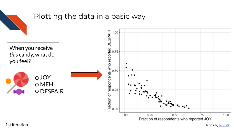
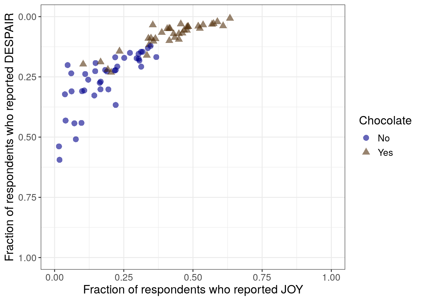
This first iteration is an exploratory data analysis step. We’re not worried about making the plot look pretty yet. We just want to look at the data. Primarily we want to see whether or not the relationship that we expect between the joy and despair variables holds true.
R code for plotting a scatter plot
##proportion of Joy on x-axis
##proportion of Despair on the y-axis
##geom_point for scatter plot
##set xlim and ylim to 0,1 since our data is bounded that way
##theme_bw() is a quick way to adjust theme to make it simpler
##using labs to set quick axis labels
## setting overall text size just for example purposes

to_plot %>%
  ggplot(aes(x = JOY,
             y = DESPAIR
            )
         ) +
  geom_point() +
  xlim(0, 1) +
  ylim(0, 1) +
  theme_bw() +
  labs(x = "Fraction of respondents who reported JOY",
       y = "Fraction of respondents who reported DESPAIR") +
  theme(text = element_text(size = 14))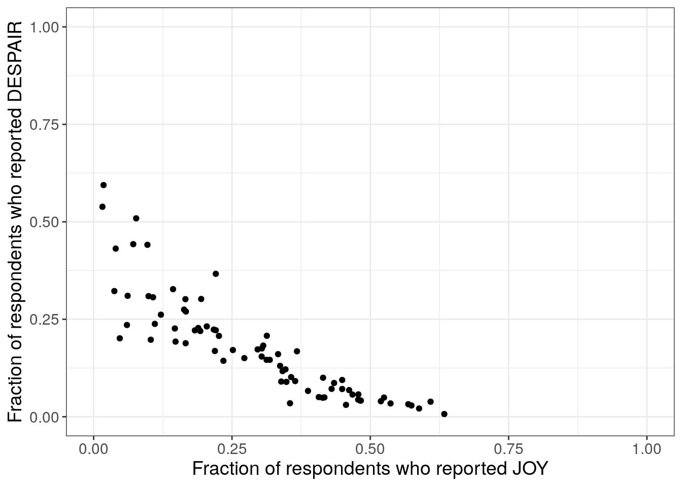
Note that normally in a first iteration of exploratory data analysis, we might not set the axis labels (they’ll default to the column name of whatever is being plotted.), and we might not adjust the text size. Both of these are done here to add clarity to this example.
Python code for plotting a scatter plot
mpl.rcParams["font.size"] = 14
plt.style.use('seaborn-v0_8-deep')
fig1, ax1 = plt.subplots()
ax1.scatter(just_candy_props['likeness'], just_candy_props['dislikeness'])
ax1.set_xlim(0,1)
ax1.set_ylim(0,1)
ax1.minorticks_on()
ax1.grid(which='major',
linestyle='-', linewidth='0.5',
color='grey', alpha=0.7)
ax1.grid(which='minor',
linestyle=':', linewidth='0.3',
color='grey', alpha=0.5)
ax1.set_xlabel('Fraction of respondents who reported JOY')
ax1.set_ylabel('Fraction of respondents who reported DESPAIR')
plt.show()
plt.close()- 1
-
Replicating the
theme_bwstyle of ggplot
(0.0, 1.0)
(0.0, 1.0)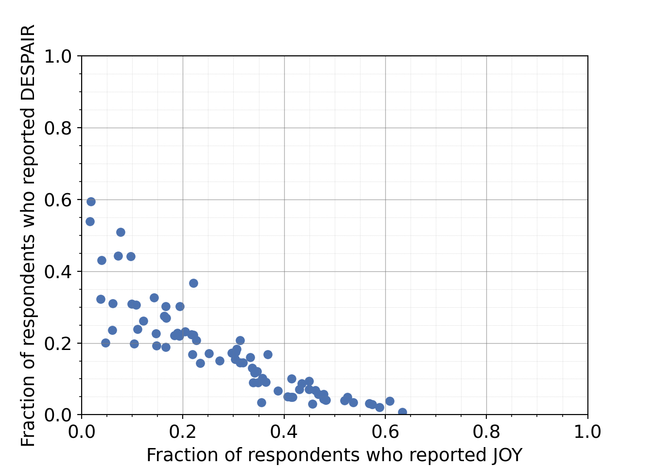
Note that normally in a first iteration of exploratory data analysis, we might not set the axis labels (Python won’t add any labels) and we might not adjust the text size. Both of these are done here to add clarity to this example.
So far, this is just using 2 of the 3 main variables we identified. How can we use the third variable?
Plotting the candy names
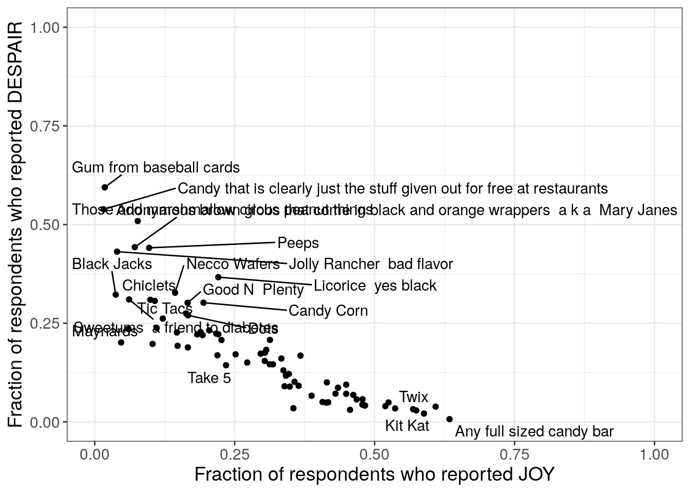
We can use a labeling function to add the candy names to the plot, labeling specific points.7.2.4.2 Labeling all points
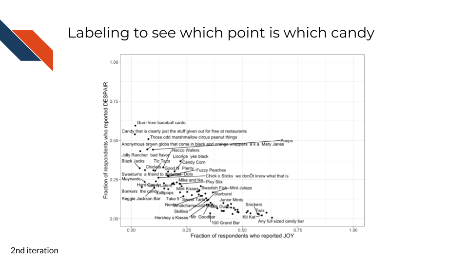
This second iteration is another exploratory data analysis step. Now that we’ve confirmed the relationship between the variables that we expected, we want to know what candies are the most highly ranked and what candies are the least highly ranked. We can use the categorical candy name variable for this and add labels directly to the points.
R code for adding the candy names as labels
library(ggrepel)
to_plot %>%
ggplot(aes(x = JOY,
y = DESPAIR,
label = column_name
)
) +
geom_point() +
xlim(0, 1) +
ylim(0, 1) +
theme_bw() +
geom_text_repel(show.legend = FALSE, max.overlaps = 20) +
labs(x = "Fraction of respondents who reported JOY",
y = "Fraction of respondents who reported DESPAIR") +
theme(text = element_text(size = 14))- 1
- Need to load ggrepel package for the labeling function
- 2
- Specifies the candy names/variable that will be used for labeling
- 3
-
Uses
geom_text_repel()fromggrepelpackage to label the points, using the repel part of the function to handle overlapping points/labels
Python code for adding the candy names as labels
from adjustText import adjust_text
mpl.rcParams["font.size"] = 14
plt.style.use('seaborn-v0_8-deep')
fig2, ax2 = plt.subplots()
ax2.scatter(just_candy_props['likeness'],
just_candy_props['dislikeness'],
s = 10)
ax2.set_xlim(0,1)
ax2.set_ylim(0,1)
ax2.minorticks_on()
ax2.grid(which='major',
linestyle='-', linewidth='0.5',
color='grey', alpha=0.7)
ax2.grid(which='minor',
linestyle=':', linewidth='0.3',
color='grey', alpha=0.5)
ax2.set_xlabel('Fraction of respondents who reported JOY')
ax2.set_ylabel('Fraction of respondents who reported DESPAIR')
texts = [plt.text(just_candy_props['likeness'].iloc[i],
just_candy_props['dislikeness'].iloc[i],
just_candy_props.index[i],
fontsize = 6)
for i in range(len(just_candy_props))]
adjust_text(texts,
avoid_points = True)
plt.show()
plt.close()- 2
- Need to load adjustText package for the labeling function. Python equivalent of ggrepel.
- 3
- Decreasing the size of the points a bit for readability. Default is s = 35.
- 4
- Using list comprehension to build an input to the labeling function of what the labels are and where they’re going to go. Only labeling one out of every three candies to avoid overcrowding.
- 5
- Using the adjust_text function from the adjustText package to automatically adjust the position of text labels to minimize overlaps
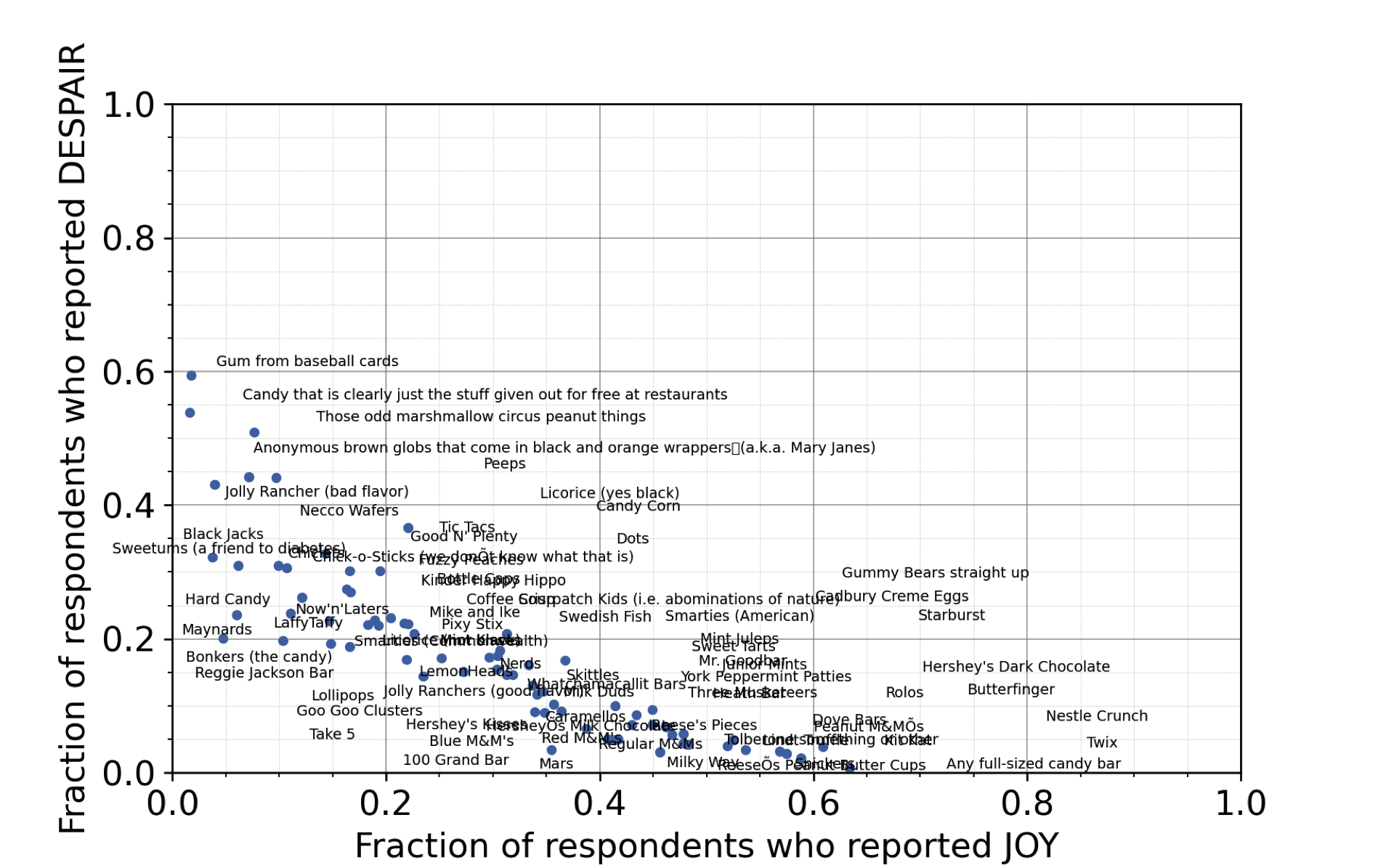
What do you notice after observing the labels? Do you have any ideas on new variables or a takeaway message?
Takeaways from the candy name labeling
It looks like chocolate candy (Twix, Kit Kat, 100 Grand Bar…) is among the most liked candy. It could be beneficial to create a new categorical variable that represents if each candy is chocolate or not.7.2.4.3 Distinguishing groups
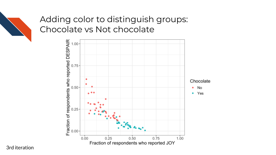
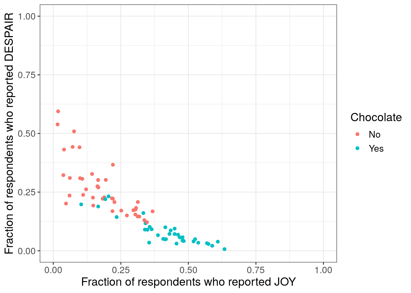
This third iteration, uses color to distinguish the data points according to whether or not they represent a chocolate candy. We’ve removed the labeling for now (and will add it back later – labeling fewer or specific candies only). Note that we’re assuming that any full sized candy bar is chocolate since the majority of full sized candy bars tend to have chocolate.
R code for adding color to distinguish groups
#removed code related to the labeling for now
to_plot$Chocolate <- "No"
to_plot$Chocolate[c(12, 21, 25, 27, 33, 43,
45, 46, 48, 49, 50, 51,
53, 54, 55, 56, 57, 58,
59, 60, 61, 62, 63, 64,
65, 66, 67, 68, 69, 70,
71, 72, 73, 74, 75, 76 )] <- "Yes"
to_plot %>%
ggplot(aes(x = JOY,
y = DESPAIR,
color = Chocolate
)
) +
geom_point() +
xlim(0, 1) +
ylim(0, 1) +
theme_bw() +
labs(x = "Fraction of respondents who reported JOY",
y = "Fraction of respondents who reported DESPAIR") +
theme(text = element_text(size = 14))- 4
- Create a new categorical variable
- 5
- Specify that color should use that new categorical variable
Python code for adding color to distinguish groups
import numpy as np
labels = np.full(just_candy_props.shape[0], 'No', dtype='U3')
labels[np.array([12, 21, 25, 27, 33, 43,
45, 46, 48, 49, 50, 51,
53, 54, 55, 56, 57, 58,
59, 60, 61, 62, 63, 64,
65, 66, 67, 68, 69, 70,
71, 72, 73, 74, 75, 76])-1] = "Yes"
colors = np.where(labels == "Yes", True, False).astype(int)
just_candy_props = just_candy_props.assign(Chocolate=labels, colors=colors)
mpl.rcParams["font.size"] = 14
plt.style.use('seaborn-v0_8-deep')
fig, ax = plt.subplots()
scatter = ax.scatter(just_candy_props['likeness'],
just_candy_props['dislikeness'],
c = just_candy_props['colors'])
ax.set_xlim(0,1)
ax.set_ylim(0,1)
ax.minorticks_on()
ax.grid(which='major',
linestyle='-', linewidth='0.5',
color='grey', alpha=0.7)
ax.grid(which='minor',
linestyle=':', linewidth='0.3',
color='grey', alpha=0.5)
ax.set_xlabel('Fraction of respondents who reported JOY')
ax.set_ylabel('Fraction of respondents who reported DESPAIR')
ax.legend(handles=list(scatter.legend_elements()[0]),
labels=list(just_candy_props['Chocolate'].unique()),
title = "Chocolate")
plt.show()
plt.close()- 6
- Using the numpy package for arrays to wrangle the data
- 7
- Creating an array that has the same number of rows as our data where everything is “No” (not chocolate)
- 8
- Changing specific locations in that array to “Yes” (chocolate). Using the same indices as the R code, but subtracting one from all of them since Python uses 0-based indexing or numbering rather than the 1-based R does.
- 9
- Making a new numpy array of Trues and Falses that we convert to an integer (1s and 0s) for the color (which is Matplotlib’s preference when it is mapping values to colors)
- 10
- Adding the numpy arrays for color/chocolate grouping as data within our pandas DataFrame
- 11
- Added the color column to the scatter call to specify c or color. Note we are saving the output of this line in a variable for later legend use
- 12
- Creating the legend for color. The Yes/No label from the first numpy array are the labels we display
(0.0, 1.0)
(0.0, 1.0)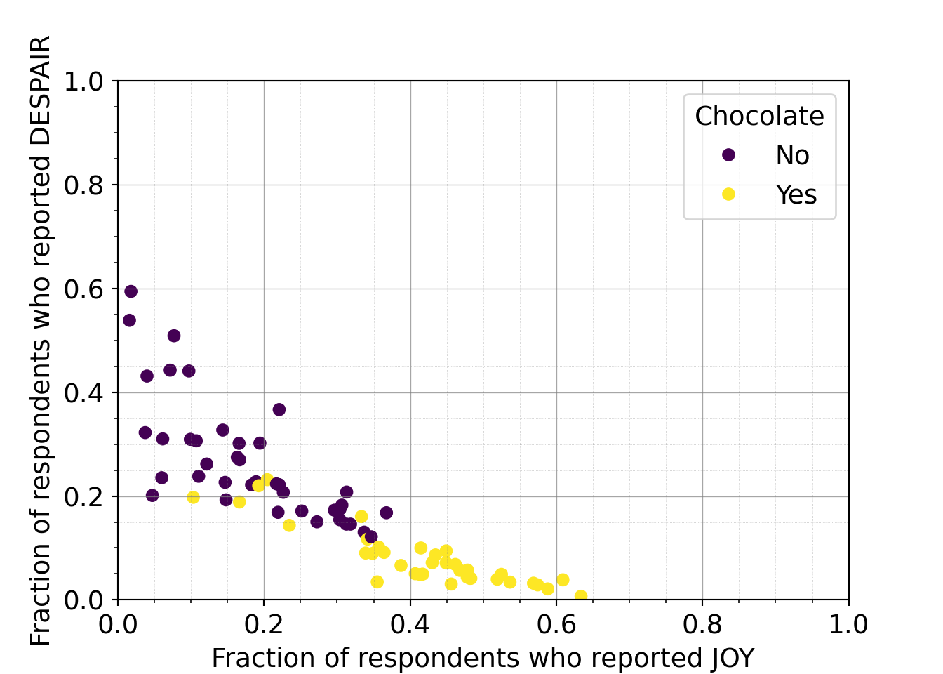
What do you observe about the group coloring?
Takeaways from the group coloring
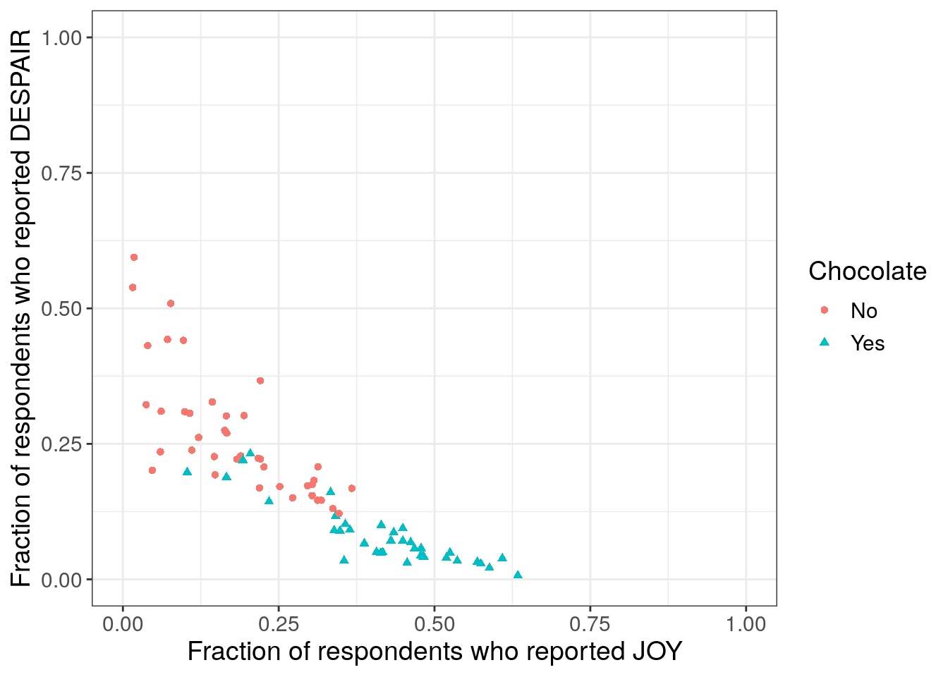
It looks even more convincing that chocolate candy is among the most liked candy – a strong pattern that could be our takeaway message.7.2.4.4 Using shape with color
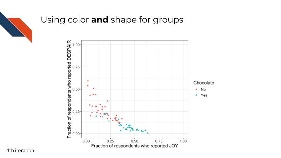
This fourth iteration is the first polishing iteration. As discussed in Chapter 5, to enhance accessibility, we don’t want to rely on color alone to distinguish groups. So we’ll also use shape to distinguish the groups. This is a bit redundant but can be beneficial to our future audience.
R code for using color and shape together
to_plot %>%
ggplot(aes(x = JOY,
y = DESPAIR,
color = Chocolate,
shape = Chocolate
)
) +
geom_point() +
xlim(0, 1) +
ylim(0, 1) +
theme_bw() +
labs(x = "Fraction of respondents who reported JOY",
y = "Fraction of respondents who reported DESPAIR") +
theme(text = element_text(size = 14))- 6
- Specify that the shape of the points should also display the chocolate/not-chocolate categorical variable.
Python code for using color and shape together
shapes = np.where(colors == 1, "^", "o")
just_candy_props['shapes'] = pd.Series(shapes, index = just_candy_props.index)
mask_choc = np.where(shapes == "^", True, False)
mask_nc = ~mask_choc
vmin = colors.min()
vmax = colors.max()
mpl.rcParams["font.size"] = 14
plt.style.use('seaborn-v0_8-deep')
fig, ax = plt.subplots()
scatter_choc = ax.scatter(just_candy_props['likeness'][mask_choc],
just_candy_props['dislikeness'][mask_choc],
c = just_candy_props['colors'][mask_choc],
marker = np.unique(just_candy_props['shapes'][mask_choc]).item(),
vmin = vmin, vmax = vmax,
label = "Yes")
scatter_nc = ax.scatter(just_candy_props['likeness'][mask_nc],
just_candy_props['dislikeness'][mask_nc],
c = just_candy_props['colors'][mask_nc],
marker = np.unique(just_candy_props['shapes'][mask_nc]).item(),
vmin = vmin, vmax = vmax,
label = "No")
ax.set_xlim(0,1)
ax.set_ylim(0,1)
ax.minorticks_on()
ax.grid(which='major',
linestyle='-', linewidth='0.5',
color='grey', alpha=0.7)
ax.grid(which='minor',
linestyle=':', linewidth='0.3',
color='grey', alpha=0.5)
ax.set_xlabel('Fraction of respondents who reported JOY')
ax.set_ylabel('Fraction of respondents who reported DESPAIR')
ax.legend(title="Chocolate")
plt.show()
plt.close()- 13
- Creating a shape array to reflect different shapes for the candy groups. A caret for chocolate and a circle for not chocolate.
- 14
- Saving that shape array into the pandas dataframe
- 15
- Creating a boolean mask (Trues and Falses) that report which rows are chocolate candy
- 16
- Creating an inverted boolean mask that reports which rows are not chocolate candy
- 17
- Finding the min and max values for color which we’ll give to our scatter calls so that they know there are two colors even though each call is only going to be plotting one specific group. Without finding and passing the vmin and vmax values, all points on the graph would be the same color unless we were passing a specific color name or hexcode.
- 18
- Two different scatter calls – one for chocolate and one for not chocolate. We set the markers (needs to be a specific item, not a member of an array) that will be used in the legend. Has to be two calls in Python – one for each group – if we want to set different shapes.
- 19
- Can majorly simplify the call that adds the legend since we set the vmin, vmax, marker, and label within the scatter calls
(0.0, 1.0)
(0.0, 1.0)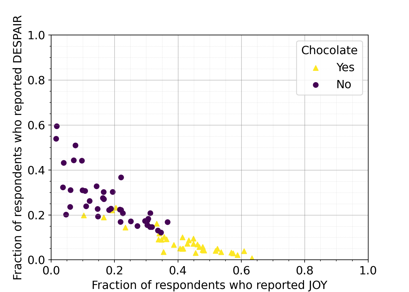
When using color to distinguish groups, an important accessibility step is to use shape as a redundant way to distinguish groups. This redundancy increases accessibility for those with color vision deficiency.
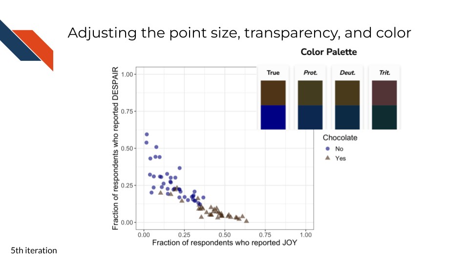
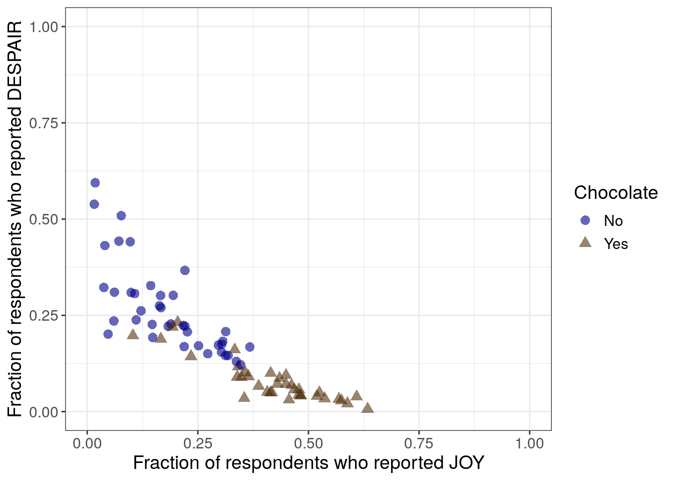
7.2.4.5 Adjusting point size, transparency, and color
This fifth iteration is another polishing step. It includes changes controlling how the points appear:
- size
- transparency
- color
For the plot produced from R, we want to increase the point size. For the plot produced from Python, the point size is good already.
For the plots from both R and Python, we want to increase the point transparency to better separate or show data points that are plotted in similar locations.
We also want to set a specific color scheme rather than relying on default colors. Changing the color palette can be both an accessibility consideration and an aesthetic choice. Aesthetically, we’re choosing a brown color to represent the chocolate group. The blue for non-chocolate candy appears to be distinguishable from the brown for those with color vision deficiency (according to the palette checker). However, it is still good practice to keep both color and shape as a means to distinguish the two groups.
R code for adjusting the point size, transparency, and color
to_plot %>%
ggplot(aes(x = JOY,
y = DESPAIR,
color = Chocolate,
shape = Chocolate
)
) +
geom_point(size = 3,
alpha = 0.6
) +
xlim(0, 1) +
ylim(0, 1) +
theme_bw() +
scale_color_manual(values = c("Yes" = "#543210",
"No" = "#00008B")) +
labs(x = "Fraction of respondents who reported JOY",
y = "Fraction of respondents who reported DESPAIR") +
theme(text = element_text(size = 14))- 7
- This addition sets the size of the points
- 8
- This addition sets the transparency or opacity of the points so that overlapping points are semi-transparent.
- 9
- This addition manually sets a color scheme using hex codes - brown for chocolate group and dark blue for non-chocolate group
Python code for adjusting the point transparency and color
just_candy_props['colors'] = np.where(just_candy_props['Chocolate'] == "Yes", "#543210", "#00008B")
mpl.rcParams["font.size"] = 14
plt.style.use('seaborn-v0_8-deep')
fig, ax = plt.subplots()
scatter_choc = ax.scatter(just_candy_props['likeness'][mask_choc],
just_candy_props['dislikeness'][mask_choc],
c = just_candy_props['colors'][mask_choc],
marker = np.unique(just_candy_props['shapes'][mask_choc]).item(),
label = "Yes",
alpha = 0.6)
scatter_nc = ax.scatter(just_candy_props['likeness'][mask_nc],
just_candy_props['dislikeness'][mask_nc],
c = just_candy_props['colors'][mask_nc],
marker = np.unique(just_candy_props['shapes'][mask_nc]).item(),
label = "No",
alpha = 0.6)
ax.set_xlim(0,1)
ax.set_ylim(0,1)
ax.minorticks_on()
ax.grid(which='major',
linestyle='-', linewidth='0.5',
color='grey', alpha=0.7)
ax.grid(which='minor',
linestyle=':', linewidth='0.3',
color='grey', alpha=0.5)
ax.set_xlabel('Fraction of respondents who reported JOY')
ax.set_ylabel('Fraction of respondents who reported DESPAIR')
ax.legend(title="Chocolate")
plt.show()
plt.close()- 20
- Changing the color column in the pandas dataframe to no longer be 1/0 integers but now be hex codes for specific colors. Chocolate rows will be #543210
- 21
- We can remove the vmin and vmax since we are setting a specific color for each scatter call. We also add an alpha to increase the transparency of the points
(0.0, 1.0)
(0.0, 1.0)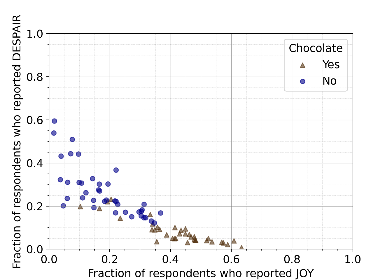
7.2.4.6 Ordering of axes to promote readability
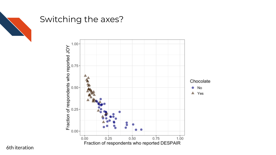
This sixth iteration focuses on improving the reading order and overall readability of the plot for the audience.
It doesn’t quite make sense to have the candy that is ranked the lowest appearing at the highest point in the plot (upper left) while the candy that is ranked the highest appears at the lowest point (lower right).
When we reverse the axes such that joy is on the y-axis and despair is on the x-axis, the highest ranked candy now appears at the highest point (in the upper left) or at the top of the plot above the the lowest ranked candies. However, reading order is still not optimal here because looking lowest to highest means looking right to left instead of left to right.
R code for switching the axes
to_plot %>%
ggplot(aes(y = JOY,
x = DESPAIR,
color = Chocolate,
shape = Chocolate
)
) +
geom_point(size = 3,
alpha = 0.6
) +
xlim(0, 1) +
ylim(0, 1) +
theme_bw() +
scale_color_manual(values = c("Yes" = "#543210",
"No" = "#00008B")) +
labs(y = "Fraction of respondents who reported JOY",
x = "Fraction of respondents who reported DESPAIR") +
theme(text = element_text(size = 14))- 10
-
switching the y- and x- axis within
aes - 11
- also switching the y- and x- axis labels
Python code for switching the axes
mpl.rcParams["font.size"] = 14
plt.style.use('seaborn-v0_8-deep')
fig, ax = plt.subplots()
scatter_choc = ax.scatter(just_candy_props['dislikeness'][mask_choc],
just_candy_props['likeness'][mask_choc],
c = just_candy_props['colors'][mask_choc],
marker = np.unique(just_candy_props['shapes'][mask_choc]).item(),
label = "Yes",
alpha = 0.6)
scatter_nc = ax.scatter(just_candy_props['dislikeness'][mask_nc],
just_candy_props['likeness'][mask_nc],
c = just_candy_props['colors'][mask_nc],
marker = np.unique(just_candy_props['shapes'][mask_nc]).item(),
label = "No",
alpha = 0.6)
ax.set_xlim(0,1)
ax.set_ylim(0,1)
ax.minorticks_on()
ax.grid(which='major',
linestyle='-', linewidth='0.5',
color='grey', alpha=0.7)
ax.grid(which='minor',
linestyle=':', linewidth='0.3',
color='grey', alpha=0.5)
ax.set_ylabel('Fraction of respondents who reported JOY')
ax.set_xlabel('Fraction of respondents who reported DESPAIR')
ax.legend(title="Chocolate")
plt.show()
plt.close()- 22
- Disliking or despair is on the x-axis
- 23
- Liking or joy is on the y-axis
(0.0, 1.0)
(0.0, 1.0)
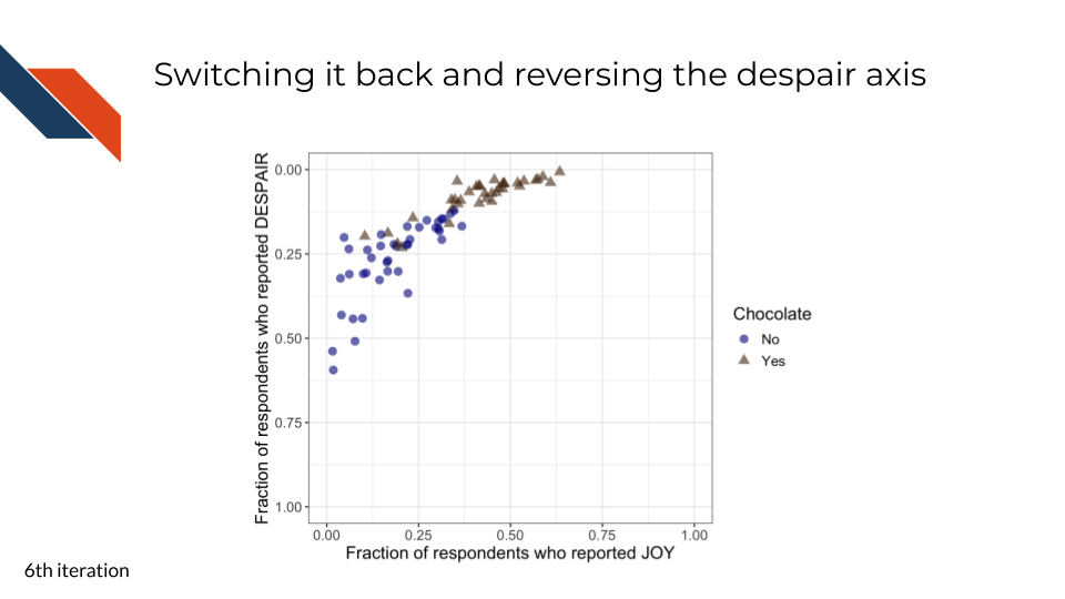
To promote overall readability, we can keep joy on the x-axis and reverse the y-axis so that the highest levels of despair appear at the bottom of the plot. While this is counterintuitive (and our next iteration will try to clarify this for readers), overall the trend is much more natural for readers: the lowest ranked candies appear at the bottom left and the highest ranked candies appear at the top right.
R code for switching the axes back and reordering y
to_plot %>%
ggplot(aes(x = JOY,
y = DESPAIR,
color = Chocolate,
shape = Chocolate
)
) +
geom_point(size = 3,
alpha = 0.6
) +
xlim(0, 1) +
ylim(1, 0) +
theme_bw() +
scale_color_manual(values = c("Yes" = "#543210",
"No" = "#00008B")) +
labs(x = "Fraction of respondents who reported JOY",
y = "Fraction of respondents who reported DESPAIR") +
theme(text = element_text(size = 14))- 12
-
switching the y- and x- axis back within
aes - 13
- reversing the limits of the y-axis
- 14
- also switching the y- and x- axis labels back
Python code for switching the axes back and reordering y
mpl.rcParams["font.size"] = 14
plt.style.use('seaborn-v0_8-deep')
fig, ax = plt.subplots()
scatter_choc = ax.scatter(just_candy_props['likeness'][mask_choc],
just_candy_props['dislikeness'][mask_choc],
c = just_candy_props['colors'][mask_choc],
marker = np.unique(just_candy_props['shapes'][mask_choc]).item(),
label = "Yes",
alpha = 0.6)
scatter_nc = ax.scatter(just_candy_props['likeness'][mask_nc],
just_candy_props['dislikeness'][mask_nc],
c = just_candy_props['colors'][mask_nc],
marker = np.unique(just_candy_props['shapes'][mask_nc]).item(),
label = "No",
alpha = 0.6)
ax.set_xlim(0,1)
ax.set_ylim(1,0)
ax.minorticks_on()
ax.grid(which='major',
linestyle='-', linewidth='0.5',
color='grey', alpha=0.7)
ax.grid(which='minor',
linestyle=':', linewidth='0.3',
color='grey', alpha=0.5)
ax.set_xlabel('Fraction of respondents who reported JOY')
ax.set_ylabel('Fraction of respondents who reported DESPAIR')
ax.legend(title="Chocolate", loc = 'lower right')
plt.show()
plt.close()- 24
- Liking or joy is back on the x-axis
- 25
- Disliking or despair is back on the y-axis
- 26
- The y-axis has been reversed so it goes from 1 to 0 instead of 0 to 1
(0.0, 1.0)
(1.0, 0.0)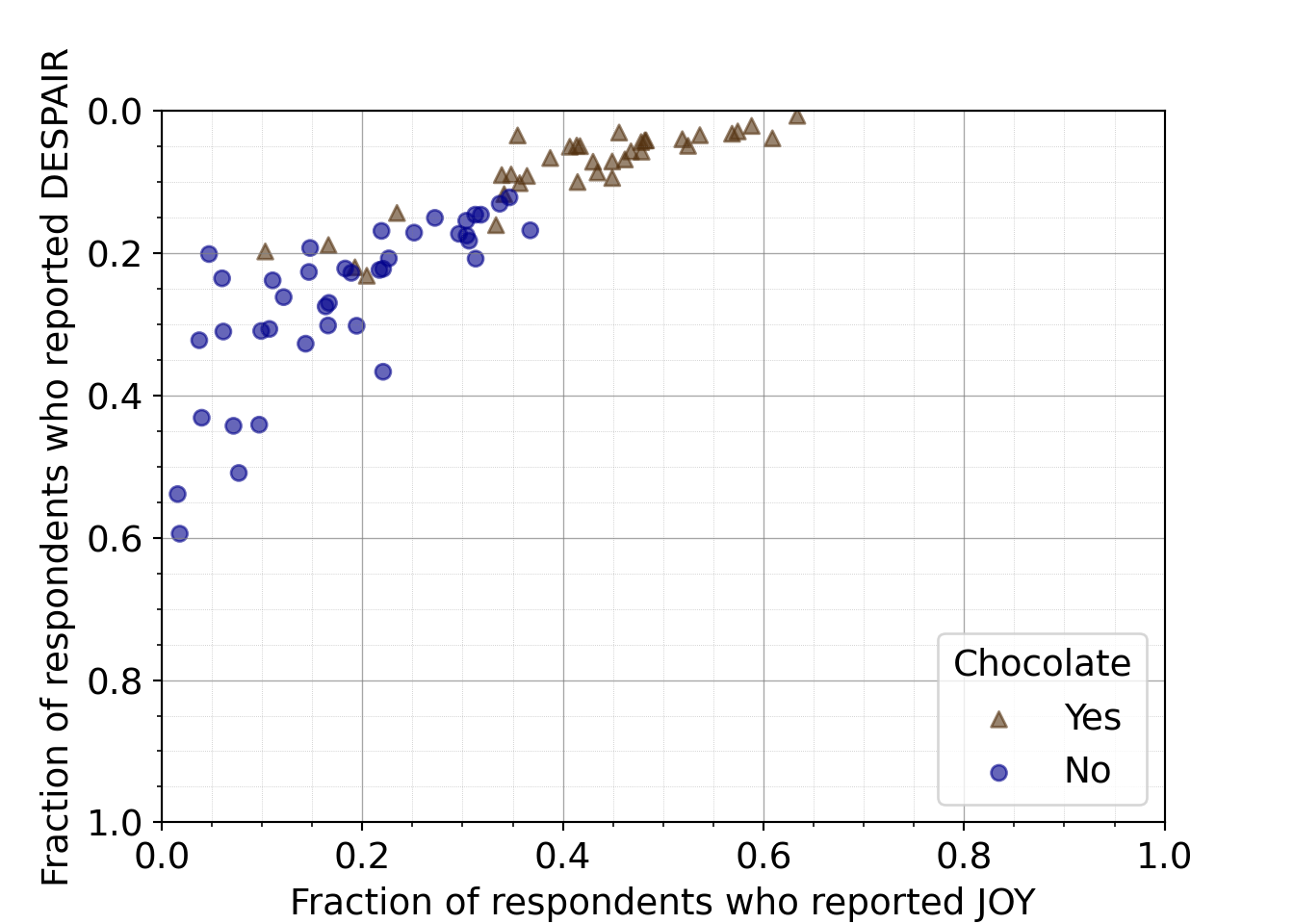
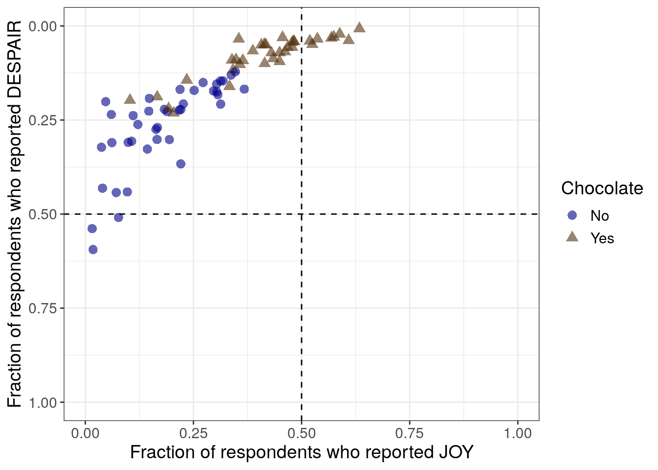
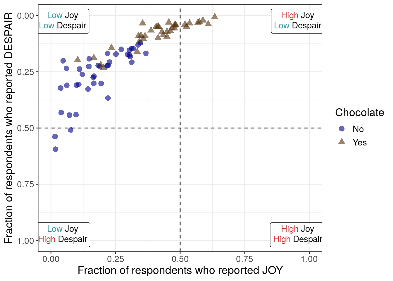
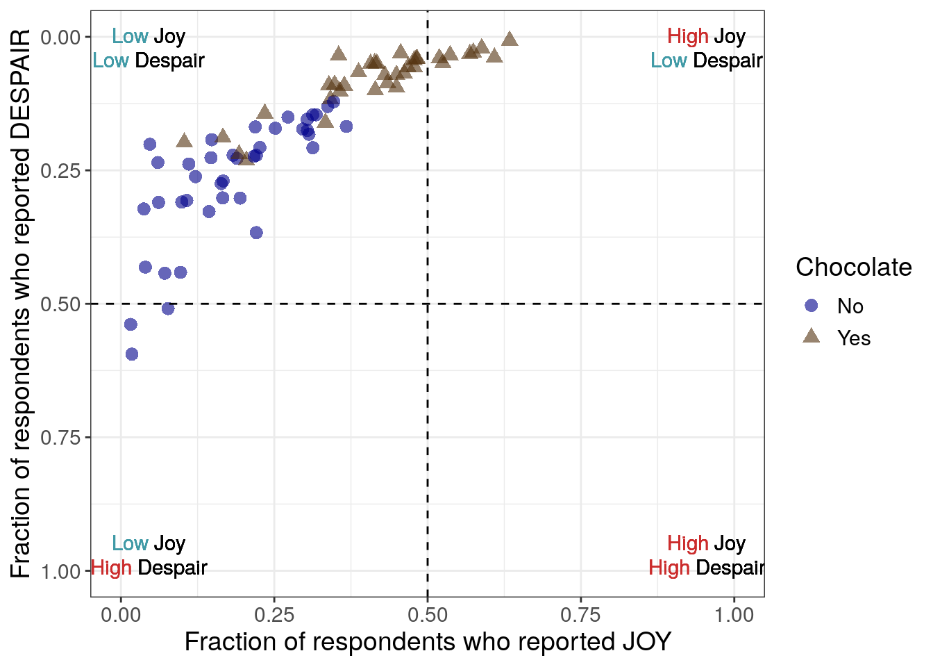
7.2.4.7 Adding quadrant delineations
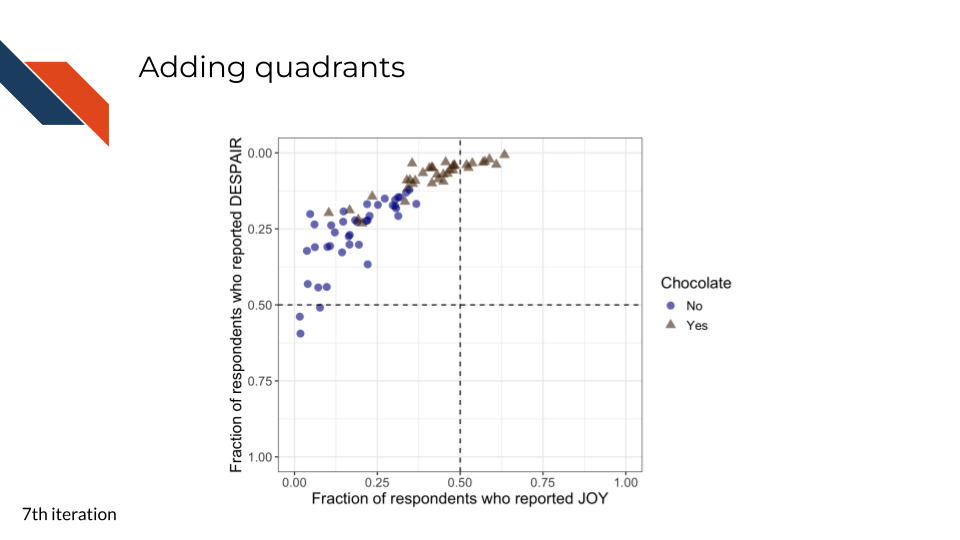
This seventh iteration aims to further improve readability in a clear and ethical way, specifically with respect to the unintuitive ordering of the y-axis. By reversing the y-axis in the previous step, we have promoted a logical way to read the overall plot and improved the overall readability of the plot. However, it could be misleading or confusing that the y-axis independently isn’t ordered in a natural way – the highest amounts of despair appear at the bottom of the plot now. To promote clear and ethical communication, we will acknowledge the reversed y-axis within the plot using quadrants (and quadrant labels in the next iteration).
Alternative ways that we could clearly communicate that we have reversed the order of the y-axis include adding an arrow pointing down or explicitly adjusting the y-axis label to mention it. However, both of these methods bring attention solely to the despair axis.
Considering that a scatter plot conveys information about two variables, and in this case we expected and observe that these two variables are inversely related, we want to prioritize communicating information about both of the variables and how they work together rather than highlighting only one of them. Adding quadrant delineations (that we can label in a later step), will assist with this. Each quadrant will represent a category that is uniquely defined by the range of values that both variables can take on within that area.
R code for adding quadrant delineations
to_plot %>%
ggplot(aes(x = JOY,
y = DESPAIR,
color = Chocolate,
shape = Chocolate
)
) +
geom_point(size = 3,
alpha = 0.6
) +
xlim(0, 1) +
ylim(1, 0) +
theme_bw() +
geom_hline(aes(yintercept=0.5), linetype = 'dashed') +
geom_vline(aes(xintercept=0.5), linetype = 'dashed') +
scale_color_manual(values = c("Yes" = "#543210",
"No" = "#00008B")) +
labs(x = "Fraction of respondents who reported JOY",
y = "Fraction of respondents who reported DESPAIR") +
theme(text = element_text(size = 14))- 15
- Adding a dashed horizontal line at y equals 0.5
- 16
- Adding a dashed vertical line at x equals 0.5
Python code for adding quadrant delineations
mpl.rcParams["font.size"] = 14
plt.style.use('seaborn-v0_8-deep')
fig, ax = plt.subplots()
ax.axhline(y=0.5, linestyle = 'dashed', color = 'black')
ax.axvline(x=0.5, linestyle = 'dashed', color = 'black')
scatter_choc = ax.scatter(just_candy_props['likeness'][mask_choc],
just_candy_props['dislikeness'][mask_choc],
c = just_candy_props['colors'][mask_choc],
marker = np.unique(just_candy_props['shapes'][mask_choc]).item(),
label = "Yes",
alpha = 0.6)
scatter_nc = ax.scatter(just_candy_props['likeness'][mask_nc],
just_candy_props['dislikeness'][mask_nc],
c = just_candy_props['colors'][mask_nc],
marker = np.unique(just_candy_props['shapes'][mask_nc]).item(),
label = "No",
alpha = 0.6)
ax.set_xlim(0,1)
ax.set_ylim(1,0)
ax.minorticks_on()
ax.grid(which='major',
linestyle='-', linewidth='0.5',
color='grey', alpha=0.7)
ax.grid(which='minor',
linestyle=':', linewidth='0.3',
color='grey', alpha=0.5)
ax.set_xlabel('Fraction of respondents who reported JOY')
ax.set_ylabel('Fraction of respondents who reported DESPAIR')
ax.legend(title="Chocolate", loc = "lower right")
plt.show()
plt.close()- 27
- Adding a dashed horizontal line at y equals 0.5
- 28
- Adding a dashed vertical line at x equals 0.5
(0.0, 1.0)
(1.0, 0.0)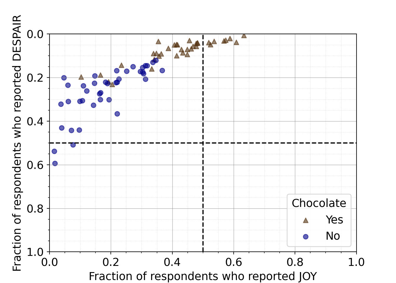
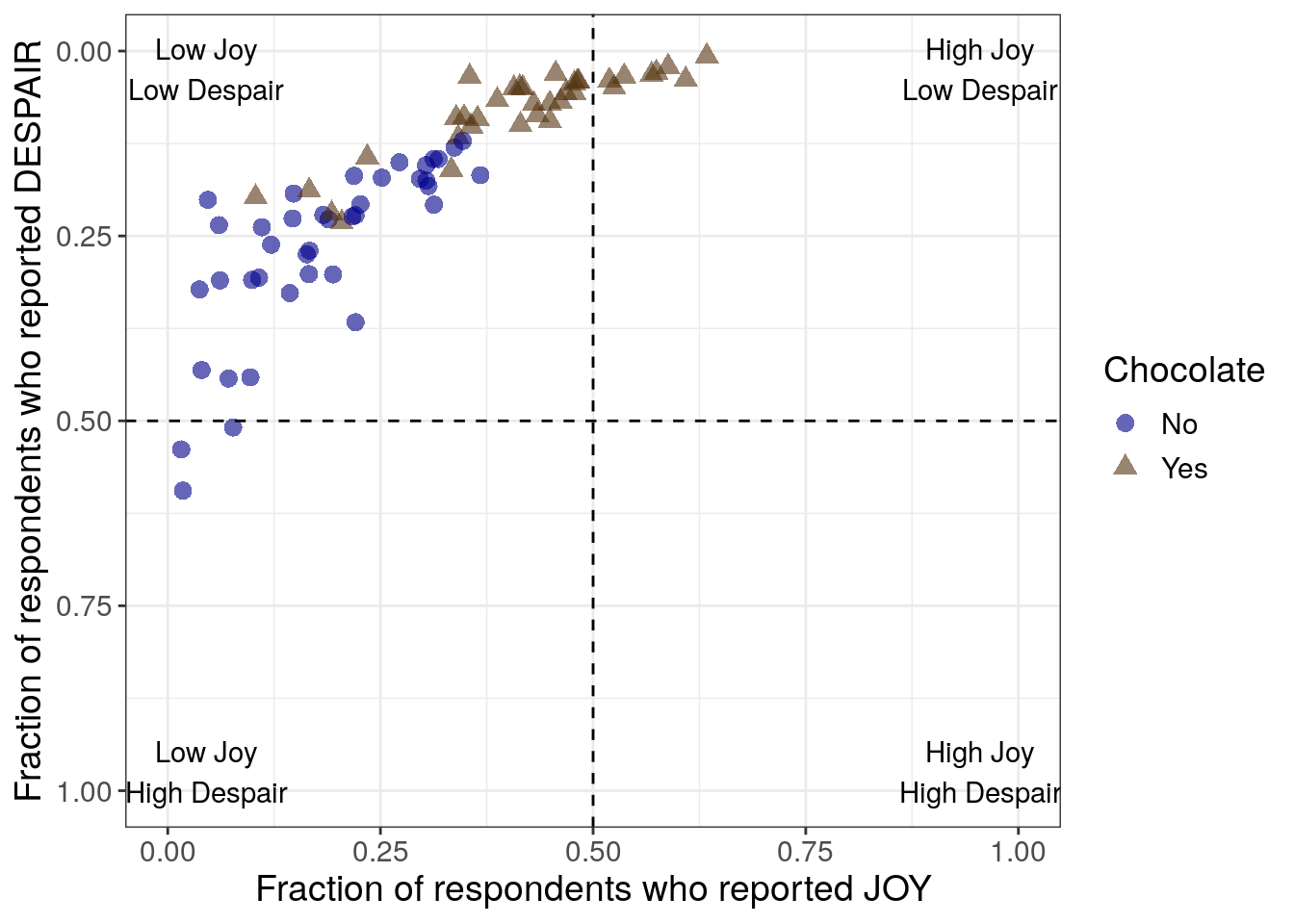
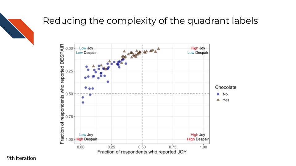
7.2.4.8 Labeling quadrants
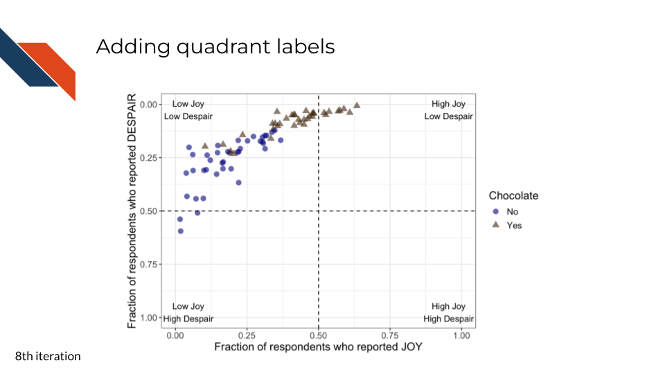
For the eighth iteration, we want to add some labels to the quadrants in this plot. Viewers need a quick way to know the significance of where the data points are with respect to the dashed lines. In addition, by labeling the quadrants, we can communicate that low levels of despair are at the top within context of the associated level of joy.
R code for labeling quadrants
to_plot %>%
ggplot(aes(x = JOY,
y = DESPAIR,
color = Chocolate,
shape = Chocolate
)
) +
geom_point(size = 3,
alpha = 0.6
) +
xlim(0, 1) +
ylim(1, 0) +
theme_bw() +
geom_hline(aes(yintercept=0.5), linetype = 'dashed') +
geom_vline(aes(xintercept=0.5), linetype = 'dashed') +
annotate("text",
label = "High Joy\nLow Despair",
x = 0.955,
y = 0.025
) +
annotate("text",
label = "High Joy\nHigh Despair",
x = 0.955,
y = 0.975
) +
annotate("text",
label = "Low Joy\nHigh Despair",
x = 0.045,
y = 0.975
) +
annotate("text",
label = "Low Joy\nLow Despair",
x = 0.045,
y = 0.025
) +
scale_color_manual(values = c("Yes" = "#543210",
"No" = "#00008B")) +
labs(x = "Fraction of respondents who reported JOY",
y = "Fraction of respondents who reported DESPAIR") +
theme(text = element_text(size = 14))- 17
- Adding labels to the upper right quadrant (I)
- 18
- Adding labels to the lower right quadrant (IV)
- 19
- Adding labels to the lower left quadrant (III)
- 20
- Adding labels to the upper left quadrant (II)
Python code for labeling quadrants
mpl.rcParams["font.size"] = 14
plt.style.use('seaborn-v0_8-deep')
fig, ax = plt.subplots()
ax.axhline(y=0.5, linestyle = 'dashed', color = 'black')
ax.axvline(x=0.5, linestyle = 'dashed', color = 'black')
scatter_choc = ax.scatter(just_candy_props['likeness'][mask_choc],
just_candy_props['dislikeness'][mask_choc],
c = just_candy_props['colors'][mask_choc],
marker = np.unique(just_candy_props['shapes'][mask_choc]).item(),
label = "Yes",
alpha = 0.6)
scatter_nc = ax.scatter(just_candy_props['likeness'][mask_nc],
just_candy_props['dislikeness'][mask_nc],
c = just_candy_props['colors'][mask_nc],
marker = np.unique(just_candy_props['shapes'][mask_nc]).item(),
label = "No",
alpha = 0.6)
ax.set_xlim(0,1)
ax.set_ylim(1,0)
ax.text(0.88, 0.1,
"High Joy\nLow Despair",
fontsize = 10,
ha = 'center', va = 'center')
ax.text(0.88, 0.875,
"High Joy\nHigh Despair",
fontsize = 10,
ha = 'center', va = 'center')
ax.text(0.125, 0.875,
"Low Joy\nHigh Despair",
fontsize = 10,
ha = 'center', va = 'center')
ax.text(0.125, 0.1,
"Low Joy\nLow Despair",
fontsize = 10,
ha = 'center', va = 'center')
ax.minorticks_on()
ax.grid(which='major',
linestyle='-', linewidth='0.5',
color='grey', alpha=0.7)
ax.grid(which='minor',
linestyle=':', linewidth='0.3',
color='grey', alpha=0.5)
ax.set_xlabel('Fraction of respondents who reported JOY')
ax.set_ylabel('Fraction of respondents who reported DESPAIR')
ax.legend(title="Chocolate", loc = "center right")
plt.show()
plt.close()- 29
- Adding labels to the upper right quadrant (I)
- 30
- Adding labels to the lower right quadrant (IV)
- 31
- Adding labels to the lower left quadrant (III)
- 32
- Adding labels to the upper left quadrant (II)
(0.0, 1.0)
(1.0, 0.0)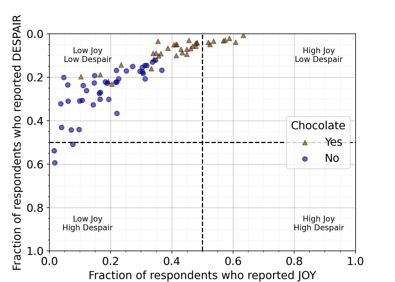
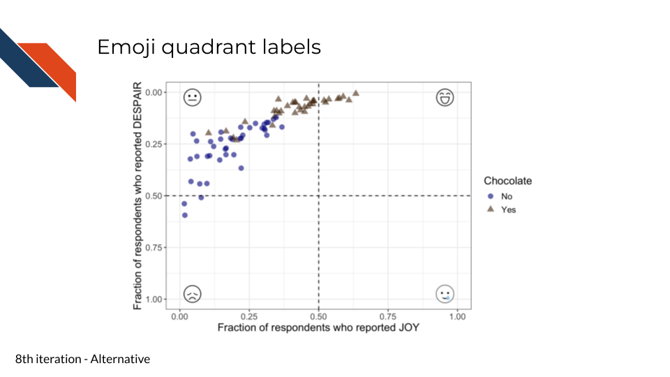
This step is an example of how sometimes there is no “single right choice” when it comes to data visualization. Labeling the quadrants could be done in several ways. And if you’re in a setting where peak professionalism isn’t necessary, you could even have some fun here – perhaps using emojis instead of words!
R code for labeling quadrants with emojis
library(ggtext)
to_plot %>%
ggplot(aes(x=JOY,
y = DESPAIR,
color = Chocolate,
shape = Chocolate)) +
geom_point(alpha=0.6,
size=3) +
xlim(0, 1) +
ylim(1, 0) +
theme_bw() +
geom_hline(aes(yintercept=0.5), linetype = 'dashed') +
geom_vline(aes(xintercept=0.5), linetype = 'dashed') +
annotate("richtext",
label = "<img src='resources/images/icons8-smiling.png' width='25'/>",
fill = NA,
label.color = NA,
x = 0.955,
y = 0.025
) +
annotate("richtext",
label = "<img src='resources/images/icons8-smiling-face-with-tear.png' width='32'/>",
fill = NA,
label.color = NA,
x = 0.955,
y = 0.975
) +
annotate("richtext",
label = "<img src='resources/images/icons8-unhappy.png' width='25'/>",
fill = NA,
label.color = NA,
x = 0.045,
y = 0.975
) +
annotate("richtext",
label = "<img src='resources/images/icons8-neutral.png' width='25'/>",
fill = NA,
label.color = NA,
x = 0.045,
y = 0.025
) +
scale_color_manual(values = c("Yes" = "#543210",
"No" = "#00008B")) +
labs(x = "Fraction of respondents who reported JOY",
y = "Fraction of respondents who reported DESPAIR") +
theme(text = element_text(size = 14))- 21
- Using a smiling face emoji from icons8 for high joy low despair quadrant
- 22
- Using a smiling with a tear face emoji from icons8 for high joy high despair quadrant
- 23
- Using an unhappy face emoji from icons8 for low joy high despair quadrant
- 24
- Using a neutral face emoji from icons8 for low joy low despair quadrant
Python code for labeling quadrants with emojis
from matplotlib.offsetbox import (AnnotationBbox, OffsetImage)
mpl.rcParams["font.size"] = 14
plt.style.use('seaborn-v0_8-deep')
arr_img_smiling = plt.imread("resources/images/icons8-smiling.png")
im_sm = OffsetImage(arr_img_smiling, zoom=0.35)
arr_img_smiling_tear = plt.imread("resources/images/icons8-smiling-face-with-tear.png")
im_smt = OffsetImage(arr_img_smiling_tear, zoom=0.5)
arr_img_sad = plt.imread("resources/images/icons8-unhappy.png")
im_s = OffsetImage(arr_img_sad, zoom=0.35)
arr_img_neutral = plt.imread("resources/images/icons8-neutral.png")
im_n = OffsetImage(arr_img_neutral, zoom=0.35)
fig, ax = plt.subplots()
ab1 = AnnotationBbox(im_sm, (0.955, 0.025),
xybox = (0.955, 0.025),
xycoords='data',
boxcoords = 'data',
frameon = False)
ax.add_artist(ab1)
ab2 = AnnotationBbox(im_smt, (0.955, 0.975),
xybox=(0.955, 0.975),
xycoords='data',
boxcoords="data",
frameon = False)
ax.add_artist(ab2)
ab3 = AnnotationBbox(im_s, (0.045, 0.975),
xybox=(0.045, 0.975),
xycoords='data',
boxcoords="data",
frameon = False)
ax.add_artist(ab3)
ab4 = AnnotationBbox(im_n, (0.045, 0.025),
xybox=(0.045, 0.025),
xycoords='data',
boxcoords="data",
frameon = False)
ax.add_artist(ab4)
ax.axhline(y=0.5, linestyle = 'dashed', color = 'black')
ax.axvline(x=0.5, linestyle = 'dashed', color = 'black')
scatter_choc = ax.scatter(just_candy_props['likeness'][mask_choc],
just_candy_props['dislikeness'][mask_choc],
c = just_candy_props['colors'][mask_choc],
marker = np.unique(just_candy_props['shapes'][mask_choc]).item(),
label = "Yes",
alpha = 0.6)
scatter_nc = ax.scatter(just_candy_props['likeness'][mask_nc],
just_candy_props['dislikeness'][mask_nc],
c = just_candy_props['colors'][mask_nc],
marker = np.unique(just_candy_props['shapes'][mask_nc]).item(),
label = "No",
alpha = 0.6)
ax.set_xlim(0,1)
ax.set_ylim(1,0)
ax.minorticks_on()
ax.grid(which='major',
linestyle='-', linewidth='0.5',
color='grey', alpha=0.7)
ax.grid(which='minor',
linestyle=':', linewidth='0.3',
color='grey', alpha=0.5)
ax.set_xlabel('Fraction of respondents who reported JOY')
ax.set_ylabel('Fraction of respondents who reported DESPAIR')
ax.legend(title="Chocolate", loc = "center right")
plt.show()
plt.close()- 33
- Importing the smiling face emoji image
- 34
- Importing the smiling with a tear face emoji image
- 35
- Importing the sad face emoji image
- 36
- Importing the neutral face emoji image
- 37
- Making the annotation box for the smiling emoji. Note that we’re using the same data coordinates and box coordinates since the annotation is not labeling a single data point, but rather a quadrant
- 38
- We also specify that these are data locations rather than some other way to represent a location within the coordinate system such as a fraction
- 39
-
We set the
frameonto false otherwise it will outline the emoji with a black outline/frame - 40
- Adding the smiling emoji annotation box to the plot
- 41
- Adding the smiling with a tear emoji to the plot 42 Adding the sad emoji to the plot
- 42
- Adding the neutral emoji to the plot
(0.0, 1.0)
(1.0, 0.0)
The Matplotlib AnnotationBbox demo was instrumental in building this code to add emoji images to the plot
7.2.4.9 Distinguishing quadrant labels
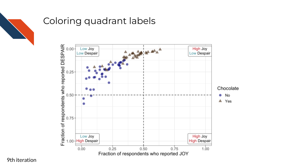
For the ninth iteration of this plot, we will proceed with the text labels for the quadrants. We want to use color, a pre-attentive attribute, to highlight and synchronize “High” vs “Low”.
We’ll use red-pink for high and a blue-gray for low. And if we look at all the colors together within the color palette, they still appear to be distinguishable for individuals with various color vision deficiencies.
R code for distinguishing quadrant labels
to_plot %>%
ggplot(aes(x = JOY,
y = DESPAIR,
color = Chocolate,
shape = Chocolate
)
) +
geom_point(size = 3,
alpha = 0.6
) +
xlim(0, 1) +
ylim(1, 0) +
theme_bw() +
geom_hline(aes(yintercept=0.5), linetype = 'dashed') +
geom_vline(aes(xintercept=0.5), linetype = 'dashed') +
annotate("richtext",
label = "<span style='color: #CB2C2C;'>High</span> Joy<br>
<span style='color: #409AA6;'>Low</span> Despair",
x = 0.955,
y = 0.025
) +
annotate("richtext",
label = "<span style='color: #CB2C2C;'>High</span> Joy<br>
<span style='color: #CB2C2C;'>High</span> Despair",
x = 0.955,
y = 0.975
) +
annotate("richtext",
label = "<span style='color: #409AA6;'>Low</span> Joy<br>
<span style='color: #CB2C2C;'>High</span> Despair",
x = 0.045,
y = 0.975
) +
annotate("richtext",
label = "<span style='color: #409AA6;'>Low</span> Joy<br>
<span style='color: #409AA6;'>Low</span> Despair",
x = 0.045,
y = 0.025
) +
scale_color_manual(values = c("Yes" = "#543210",
"No" = "#00008B")) +
labs(x = "Fraction of respondents who reported JOY",
y = "Fraction of respondents who reported DESPAIR") +
theme(text = element_text(size = 14))- 25
- Adding color so that “High” in the label is a dark red and “Low” is a light blue in the upper right
- 26
- Adding color so that “High” in the label is a dark red in the lower right
- 27
- Adding color so that “Low” in the label is a light blue and “High” is a dark red in the lower left
- 28
- Adding color so that “Low” in the label is a light blue in the upper left
Python code for distinguishing quadrant labels
from matplotlib import transforms
def multicolor_text(ax, x, y, lines, fontsize=10, hpad=4, vpad=4):
"""
This function was developed collaboratively with Microsoft Copilot
It draws multi-colored, multi-line text on a Matplotlib axis by rendering each
word as its own text object. This allows fine-grained control over per-word
coloring, spacing, and alignment -- similar to richtext annotations in ggplot.
The function iterates through each line and each word, measuring their widths
in display coordinates to determine precise horizontal placement. Vertical
placement is also computed in display coordinates to ensure consistent spacing
regardless of axis scaling or inversion.
To mimic ggplot’s default behavior for richtext labels, each line is centered
relative to a common midpoint (the x data coordinate). This ensures that the
top line is visually centered over the bottom line, even when the lines have
different lengths.
Display coordinates are used internally because Matplotlib’s data coordinates
cannot guarantee consistent spacing across transforms, DPI settings, or
inverted axes. Only the final computed positions are converted back into data
coordinates for drawing.
Parameters
------
ax: matplotlib.axes.Axes
The axis on which the annotation will be drawn.
x, y: float
Data coordinates where the annotation blocks should be anchored.
lines: list of lines, where each line is a list of (word, color) tuples.
Example:
lines = [
[("High ", "#CB2C2C"), ("Joy", "black")],
[("Low ", "#409AA6"), ("Despair", "black")]
]
fontsize: int
Fontsize for all words
hpad, vpad: horizontal and vertical padding between words and lines in display points
"""
fig = ax.figure
fig.canvas.draw()
renderer = fig.canvas.get_renderer()
# Convert the (x, y) data coordinate into display coordinates
x_disp, y_disp = ax.transData.transform((x, y))
# First, get a line height from a dummy text
dummy = ax.text(0, 0, "Ag", fontsize=fontsize, va = "top", ha="left")
line_height = dummy.get_window_extent(renderer=renderer).height
dummy.remove()
# --- Compute the center x for the block ---
# We use the anchor x as the center
center_x = x_disp
# --- Draw each line centered around center_x ---
for line_idx, line in enumerate(lines):
# vertical offset DOWN the page in display coords
y_line = y_disp - (line_height + vpad) * line_idx
# measure this line's width
line_width = 0
for word, color in line:
t = ax.text(0, 0, word, fontsize=fontsize)
ex = t.get_window_extent(renderer=renderer)
t.remove()
line_width += ex.width + hpad
line_width -= hpad # remove trailing padding
# compute left edge so line is centered
x_left = center_x - line_width / 2
# draw the line
x_offset = 0
for word, color in line:
x_word = x_left + x_offset
x_data, y_data = ax.transData.inverted().transform((x_word, y_line))
text = ax.text(
x_data, y_data, word,
color=color,
fontsize=fontsize,
va="top",
ha="left"
)
# measure width for next word
ex = text.get_window_extent(renderer=renderer)
x_offset += ex.width + hpad
smile_x = 0.88
smile_y = 0.05
smile_lines = [
[("High ", "#CB2C2C"), ("Joy", "black")],
[("Low ", "#409AA6"), ("Despair", "black")]
]
smiletear_x = 0.88
smiletear_y = 0.875
smiletear_lines = [
[("High ", "#CB2C2C"), ("Joy", "black")],
[("High ", "#CB2C2C"), ("Despair", "black")]
]
sad_x = 0.125
sad_y = 0.875
sad_lines = [
[("Low ", "#409AA6"), ("Joy", "black")],
[("High ", "#CB2C2C"), ("Despair", "black")]
]
neutral_x = 0.125
neutral_y = 0.05
neutral_lines = [
[("Low ", "#409AA6"), ("Joy", "black")],
[("Low ", "#409AA6"), ("Despair", "black")]
]
mpl.rcParams["font.size"] = 14
plt.style.use('seaborn-v0_8-deep')
fig, ax = plt.subplots()
ax.axhline(y=0.5, linestyle = 'dashed', color = 'black')
ax.axvline(x=0.5, linestyle = 'dashed', color = 'black')
scatter_choc = ax.scatter(just_candy_props['likeness'][mask_choc],
just_candy_props['dislikeness'][mask_choc],
c = just_candy_props['colors'][mask_choc],
marker = np.unique(just_candy_props['shapes'][mask_choc]).item(),
label = "Yes",
alpha = 0.6)
scatter_nc = ax.scatter(just_candy_props['likeness'][mask_nc],
just_candy_props['dislikeness'][mask_nc],
c = just_candy_props['colors'][mask_nc],
marker = np.unique(just_candy_props['shapes'][mask_nc]).item(),
label = "No",
alpha = 0.6)
ax.set_xlim(0,1)
ax.set_ylim(1,0)
fig.canvas.draw()
multicolor_text(ax, smile_x, smile_y, smile_lines, hpad = 0)
multicolor_text(ax, smiletear_x, smiletear_y, smiletear_lines, hpad = 0)
multicolor_text(ax, sad_x, sad_y, sad_lines, hpad = 0)
multicolor_text(ax, neutral_x, neutral_y, neutral_lines, hpad = 0)
ax.minorticks_on()
ax.grid(which='major',
linestyle='-', linewidth='0.5',
color='grey', alpha=0.7)
ax.grid(which='minor',
linestyle=':', linewidth='0.3',
color='grey', alpha=0.5)
ax.set_xlabel('Fraction of respondents who reported JOY')
ax.set_ylabel('Fraction of respondents who reported DESPAIR')
ax.legend(title="Chocolate", loc = "center right")
plt.show()
plt.close()- 44
- Defining a function to create multi-color, multi-line annotations for a Matplotlib plot
- 45
- Defining the inputs for the function – specifically for the upper right quadrant. Repeated for others below.
- 46
- Adding color so that “High” in the label is a dark red and “Low” is a light blue in the upper right
- 47
- Adding color so that “High” in the label is a dark red in the lower right
- 48
- Adding color so that “Low” in the label is a light blue and “High” is a dark red in the lower left
- 49
- Adding color so that “Low” in the label is a light blue in the upper left
(0.0, 1.0)
(1.0, 0.0)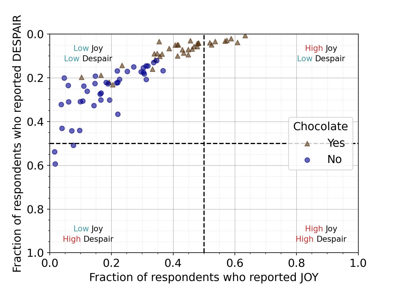
For the plot produced with R, we can simplify the labels for the quadrants by removing the border. The outlines are unnecessary/extraneous marks and could draw the attention of viewers before other elements. We want to be judicious with the geometric marks we use and simplify where we can.
For the plot produced with Python, we can use a pre-existing Python library to simplify the code needed to make the plot.
R code for simplifying quadrant labels
to_plot %>%
ggplot(aes(x = JOY,
y = DESPAIR,
color = Chocolate,
shape = Chocolate
)
) +
geom_point(size = 3,
alpha = 0.6
) +
xlim(0, 1) +
ylim(1, 0) +
theme_bw() +
geom_hline(aes(yintercept=0.5), linetype = 'dashed') +
geom_vline(aes(xintercept=0.5), linetype = 'dashed') +
annotate("richtext",
label = "<span style='color: #CB2C2C;'>High</span> Joy<br>
<span style='color: #409AA6;'>Low</span> Despair",
x = 0.955,
y = 0.025,
fill = NA,
label.color = NA,
label.padding = grid::unit(rep(0, 4), "pt")
) +
annotate("richtext",
label = "<span style='color: #CB2C2C;'>High</span> Joy<br>
<span style='color: #CB2C2C;'>High</span> Despair",
x = 0.955,
y = 0.975,
fill = NA,
label.color = NA,
label.padding = grid::unit(rep(0, 4), "pt")
) +
annotate("richtext",
label = "<span style='color: #409AA6;'>Low</span> Joy<br>
<span style='color: #CB2C2C;'>High</span> Despair",
x = 0.045,
y = 0.975,
fill = NA,
label.color = NA,
label.padding = grid::unit(rep(0, 4), "pt")
) +
annotate("richtext",
label = "<span style='color: #409AA6;'>Low</span> Joy<br>
<span style='color: #409AA6;'>Low</span> Despair",
x = 0.045,
y = 0.025,
fill = NA,
label.color = NA,
label.padding = grid::unit(rep(0, 4), "pt")
) +
scale_color_manual(values = c("Yes" = "#543210",
"No" = "#00008B")) +
labs(x = "Fraction of respondents who reported JOY",
y = "Fraction of respondents who reported DESPAIR") +
theme(text = element_text(size = 14))- 29
- Makes the label background transparent
- 30
- Removes the box outline from around the label
- 31
- Removes padding
Simplified Python code for distinguishing quadrant labels
from highlight_text import HighlightText, ax_text, fig_text
mpl.rcParams["font.size"] = 14
plt.style.use('seaborn-v0_8-deep')
fig, ax = plt.subplots()
ax.axhline(y=0.5, linestyle = 'dashed', color = 'black')
ax.axvline(x=0.5, linestyle = 'dashed', color = 'black')
scatter_choc = ax.scatter(just_candy_props['likeness'][mask_choc],
just_candy_props['dislikeness'][mask_choc],
c = just_candy_props['colors'][mask_choc],
marker = np.unique(just_candy_props['shapes'][mask_choc]).item(),
label = "Yes",
alpha = 0.6)
scatter_nc = ax.scatter(just_candy_props['likeness'][mask_nc],
just_candy_props['dislikeness'][mask_nc],
c = just_candy_props['colors'][mask_nc],
marker = np.unique(just_candy_props['shapes'][mask_nc]).item(),
label = "No",
alpha = 0.6)
ax.set_xlim(0,1)
ax.set_ylim(1,0)
ax_text(x = 0.88, y = 0.1,
s='<High> Joy\n<Low> Despair',
highlight_textprops=[{"color": '#CB2C2C'},
{"color": '#409AA6'}],
fontsize = 10,
ha = 'center',
va = 'center',
textalign = 'center',
ax = ax)
ax_text(x = 0.88, y = 0.875,
s = '<High> Joy\n<High> Despair',
highlight_textprops=[{"color": '#CB2C2C'},
{"color": '#CB2C2C'}],
fontsize = 10,
ha = 'center',
va = 'center',
textalign = 'center',
ax = ax)
ax_text(x = 0.125, y = 0.875,
s = '<Low> Joy\n<High> Despair',
highlight_textprops=[{"color": '#409AA6'},
{"color": '#CB2C2C'}],
fontsize = 10,
ha = 'center',
va = 'center',
textalign = 'center',
ax = ax)
ax_text(x = 0.125, y = 0.1,
s = '<Low> Joy\n<Low> Despair',
highlight_textprops=[{"color": '#409AA6'},
{"color": '#409AA6'}],
fontsize = 10,
ha = 'center',
va = 'center',
textalign = 'center',
ax = ax)
ax.minorticks_on()
ax.grid(which='major',
linestyle='-', linewidth='0.5',
color='grey', alpha=0.7)
ax.grid(which='minor',
linestyle=':', linewidth='0.3',
color='grey', alpha=0.5)
ax.set_xlabel('Fraction of respondents who reported JOY')
ax.set_ylabel('Fraction of respondents who reported DESPAIR')
ax.legend(title="Chocolate", loc = "center right")
plt.show()
plt.close()- 50
- Using the highlight_text library rather than our complex function
- 51
-
Using the
ax_textfunction from the highlight_text library for the upper right label
(0.0, 1.0)
(1.0, 0.0)
<highlight_text.htext.HighlightText object at 0x7f0c7df6a4a0>
<highlight_text.htext.HighlightText object at 0x7f0c7d9bfd30>
<highlight_text.htext.HighlightText object at 0x7f0c7d9be020>
<highlight_text.htext.HighlightText object at 0x7f0c7d9bf6a0>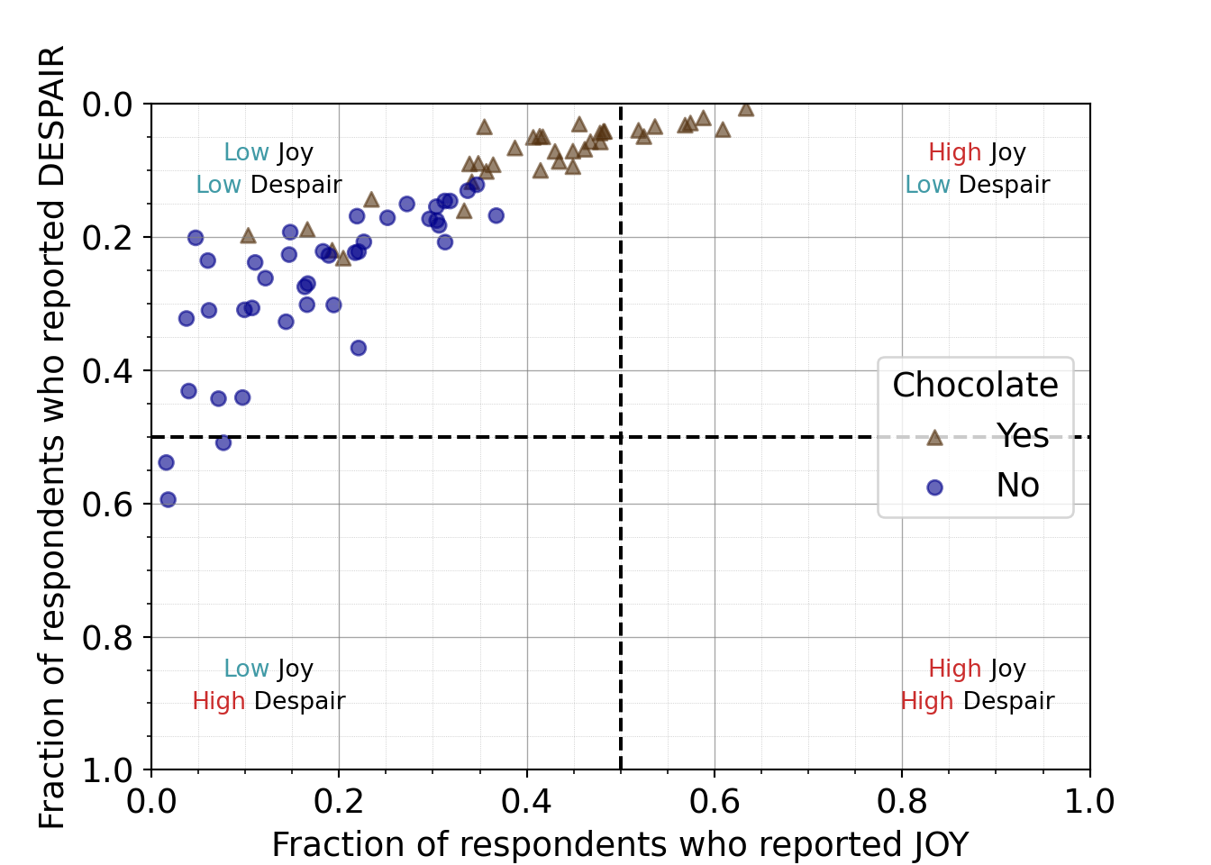
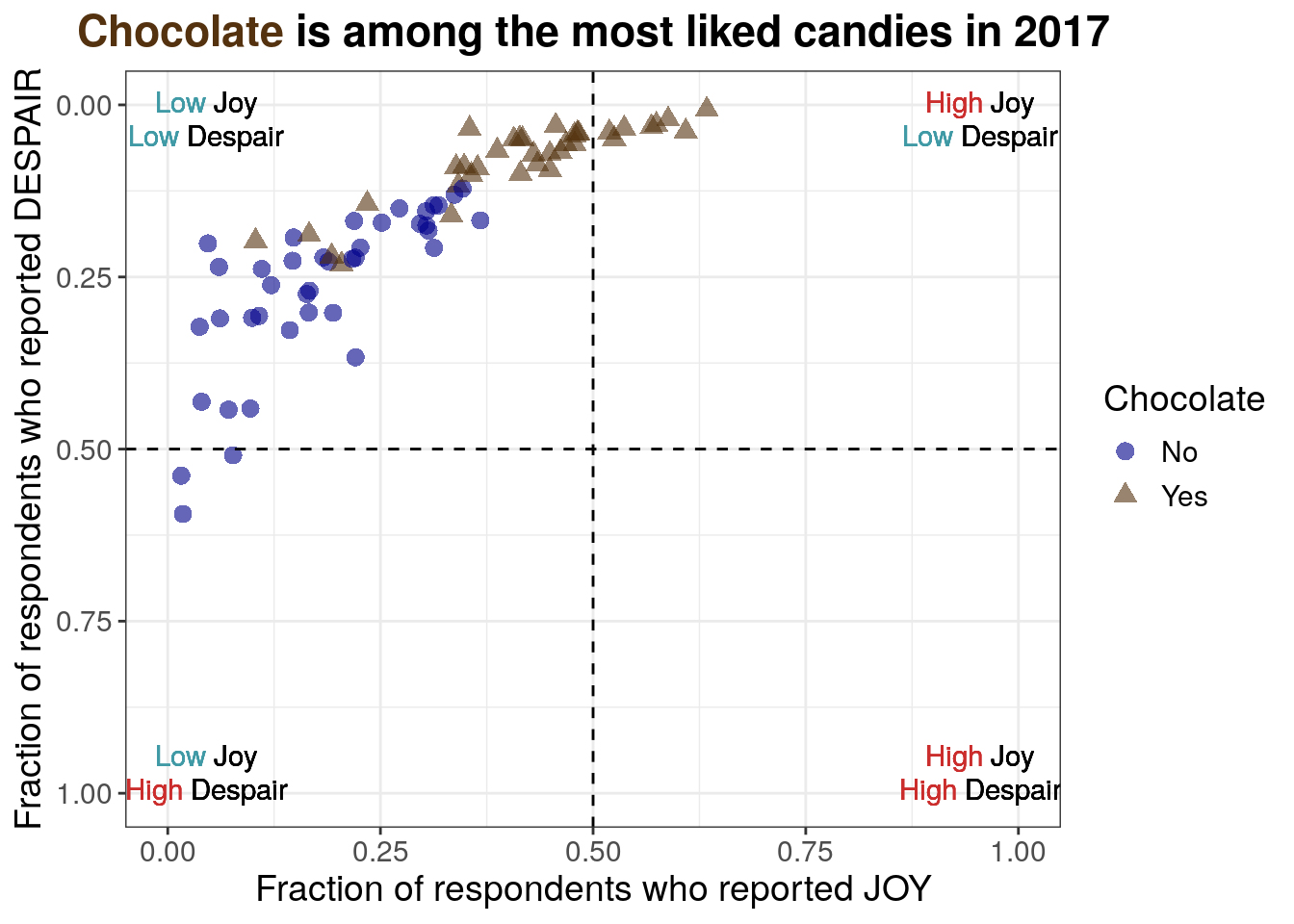
7.2.4.10 Informative title
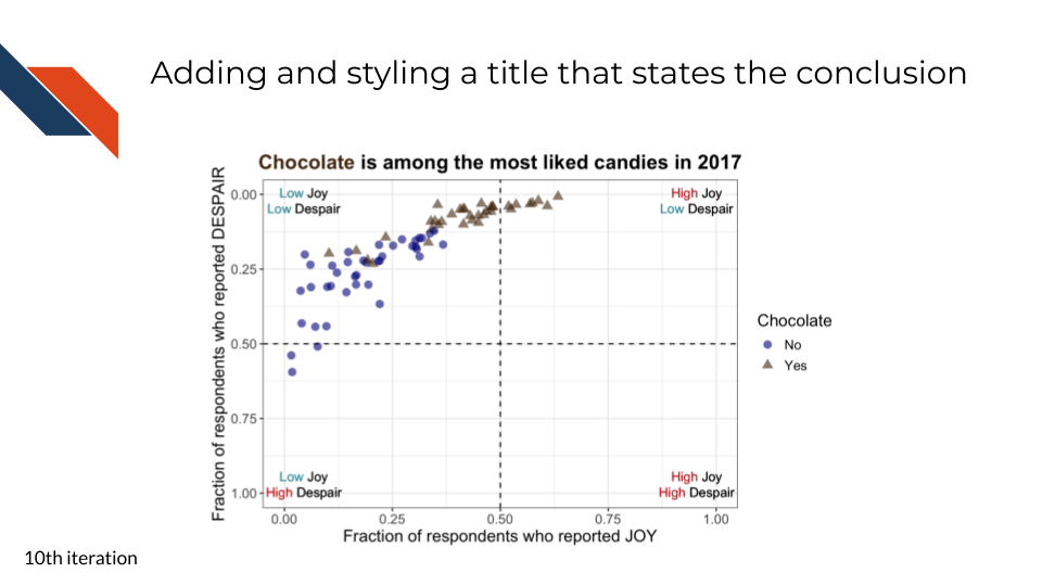
For the tenth iteration of the plot, we want to add an informative title. Something that states our conclusion for the audience and perhaps provides needed context.
“Chocolate is among the most liked candies in 2017” states the conclusion or observation that chocolate candies seem to be ranked highly and provides context that the data was collected in 2017.
We’ll also add some styling to the title:
- centering
- bolding
- coloring “Chocolate” to match how it’s displayed within the plot
R code for adding an informative title with styling
to_plot %>%
ggplot(aes(x = JOY,
y = DESPAIR,
color = Chocolate,
shape = Chocolate
)
) +
geom_point(size = 3,
alpha = 0.6
) +
xlim(0, 1) +
ylim(1, 0) +
theme_bw() +
geom_hline(aes(yintercept=0.5), linetype = 'dashed') +
geom_vline(aes(xintercept=0.5), linetype = 'dashed') +
annotate("richtext",
label = "<span style='color: #CB2C2C;'>High</span> Joy<br>
<span style='color: #409AA6;'>Low</span> Despair",
x = 0.955,
y = 0.025,
fill = NA,
label.color = NA,
label.padding = grid::unit(rep(0, 4), "pt")
) +
annotate("richtext",
label = "<span style='color: #CB2C2C;'>High</span> Joy<br>
<span style='color: #CB2C2C;'>High</span> Despair",
x = 0.955,
y = 0.975,
fill = NA,
label.color = NA,
label.padding = grid::unit(rep(0, 4), "pt")
) +
annotate("richtext",
label = "<span style='color: #409AA6;'>Low</span> Joy<br>
<span style='color: #CB2C2C;'>High</span> Despair",
x = 0.045,
y = 0.975,
fill = NA,
label.color = NA,
label.padding = grid::unit(rep(0, 4), "pt")
) +
annotate("richtext",
label = "<span style='color: #409AA6;'>Low</span> Joy<br>
<span style='color: #409AA6;'>Low</span> Despair",
x = 0.045,
y = 0.025,
fill = NA,
label.color = NA,
label.padding = grid::unit(rep(0, 4), "pt")
) +
scale_color_manual(values = c("Yes" = "#543210",
"No" = "#00008B")) +
labs(x = "Fraction of respondents who reported JOY",
y = "Fraction of respondents who reported DESPAIR",
title = "<b><span style='color: #543210;'>Chocolate</span> is among the most liked candies in 2017</b>") +
theme(text = element_text(size = 14),
plot.title = element_markdown(hjust = 0.5))- 32
- Setting the title including using to bold the title, and a span to color “Chocolate” in the title to match the color scheme
- 33
- Enables the markdown rendering (like the bolding) in the title and also centers it because of the hjust equals 0.5 argument
Python code for adding an informative title with styling
mpl.rcParams["font.size"] = 14
plt.style.use('seaborn-v0_8-deep')
fig, ax = plt.subplots()
ax.axhline(y=0.5, linestyle = 'dashed', color = 'black')
ax.axvline(x=0.5, linestyle = 'dashed', color = 'black')
scatter_choc = ax.scatter(just_candy_props['likeness'][mask_choc],
just_candy_props['dislikeness'][mask_choc],
c = just_candy_props['colors'][mask_choc],
marker = np.unique(just_candy_props['shapes'][mask_choc]).item(),
label = "Yes",
alpha = 0.6)
scatter_nc = ax.scatter(just_candy_props['likeness'][mask_nc],
just_candy_props['dislikeness'][mask_nc],
c = just_candy_props['colors'][mask_nc],
marker = np.unique(just_candy_props['shapes'][mask_nc]).item(),
label = "No",
alpha = 0.6)
ax.set_xlim(0,1)
ax.set_ylim(1,0)
ax_text(x = 0.88, y = 0.1,
s='<High> Joy\n<Low> Despair',
highlight_textprops=[{"color": '#CB2C2C'},
{"color": '#409AA6'}],
fontsize = 10,
ha = 'center',
va = 'center',
textalign = 'center',
ax = ax)
ax_text(x = 0.88, y = 0.875,
s = '<High> Joy\n<High> Despair',
highlight_textprops=[{"color": '#CB2C2C'},
{"color": '#CB2C2C'}],
fontsize = 10,
ha = 'center',
va = 'center',
textalign = 'center',
ax = ax)
ax_text(x = 0.125, y = 0.875,
s = '<Low> Joy\n<High> Despair',
highlight_textprops=[{"color": '#409AA6'},
{"color": '#CB2C2C'}],
fontsize = 10,
ha = 'center',
va = 'center',
textalign = 'center',
ax = ax)
ax_text(x = 0.125, y = 0.1,
s = '<Low> Joy\n<Low> Despair',
highlight_textprops=[{"color": '#409AA6'},
{"color": '#409AA6'}],
fontsize = 10,
ha = 'center',
va = 'center',
textalign = 'center',
ax = ax)
ax.minorticks_on()
ax.grid(which='major',
linestyle='-', linewidth='0.5',
color='grey', alpha=0.7)
ax.grid(which='minor',
linestyle=':', linewidth='0.3',
color='grey', alpha=0.5)
ax.set_xlabel('Fraction of respondents who reported JOY')
ax.set_ylabel('Fraction of respondents who reported DESPAIR')
fig_text(x = 0.5, y = 0.9,
s = '<Chocolate> is among the most liked candies in 2017',
highlight_textprops = [{"color": "#543210"}],
ha = 'center',
va = 'bottom',
fontweight = 'bold')
ax.legend(title="Chocolate", loc = "center right")
plt.show()
plt.close()- 52
-
Using
fig_textfrom highlight_text instead ofax_textfor plotting onto the figure in figure coordinates - 53
- Setting the color for the word “Chocolate” only
- 54
- Centering the title around x = 0.5
- 55
-
Setting the
fontweightto bold for the whole title
(0.0, 1.0)
(1.0, 0.0)
<highlight_text.htext.HighlightText object at 0x7f0c7d8925f0>
<highlight_text.htext.HighlightText object at 0x7f0c7d8afe20>
<highlight_text.htext.HighlightText object at 0x7f0c7d892b60>
<highlight_text.htext.HighlightText object at 0x7f0c7d9bc8e0>
<highlight_text.htext.HighlightText object at 0x7f0c7d8925c0>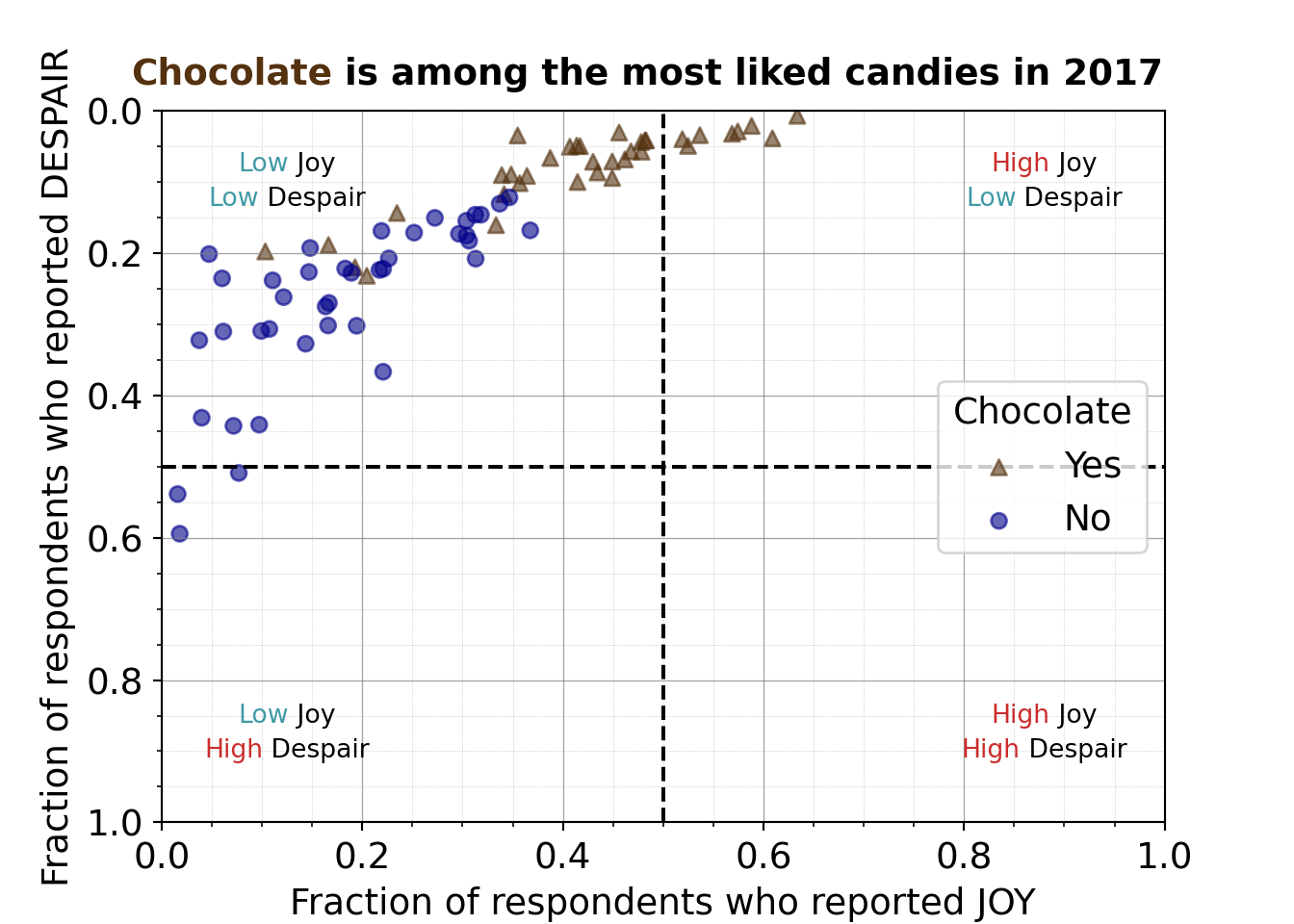
7.2.4.11 Labeling extreme and border points
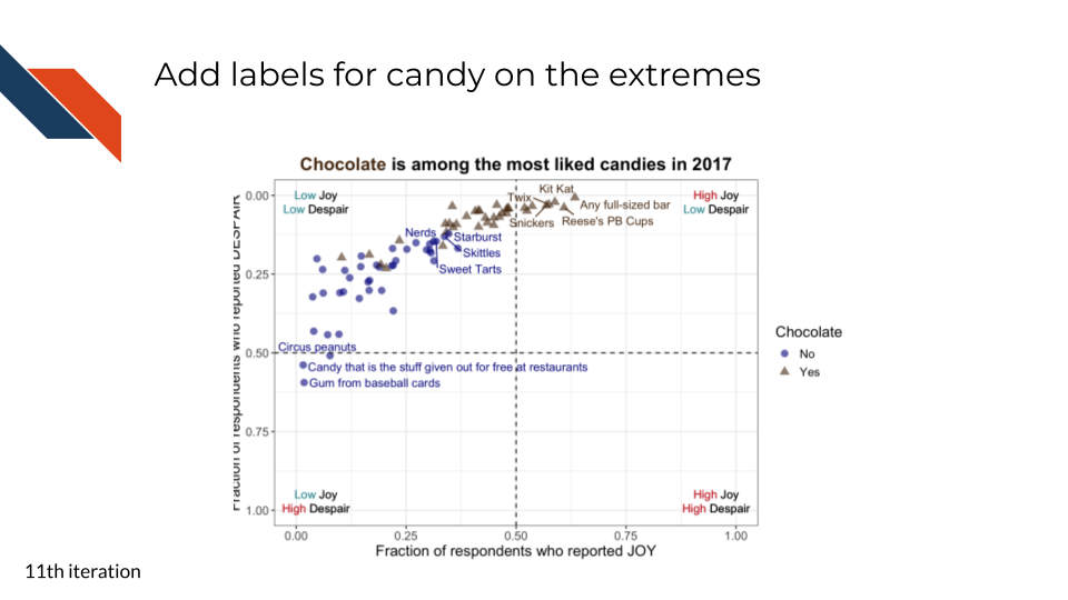
For the eleventh iteration of the plot, we want to add back some candy labels. We’ll focus on labeling
- the extremes
- most liked (quadrant I – upper right)
- least liked (quadrant III – lower left)
- some of the transition candies where chocolate and non-chocolate candies overlap a bit
R code for labeling the extreme points
to_plot <- to_plot %>%
mutate(label = "")
to_plot[nrow(to_plot), "label"] <- "Any full-sized bar"
to_plot[which(str_detect(to_plot$column_name, "Peanut Butter")), "label"] <- "Reese's PB Cups"
to_plot[nrow(to_plot)-2, "label"] <- to_plot[nrow(to_plot)-2, "column_name"]
to_plot[nrow(to_plot)-3, "label"] <- to_plot[nrow(to_plot)-3, "column_name"]
to_plot[nrow(to_plot)-4, "label"] <- to_plot[nrow(to_plot)-4, "column_name"]
to_plot[which(to_plot$column_name == "Nerds"), "label"] <- "Nerds"
to_plot[which(to_plot$column_name == "Skittles"), "label"] <- "Skittles"
to_plot[which(to_plot$column_name == "Starburst"), "label"] <- "Starburst"
to_plot[which(to_plot$column_name == "Sweet Tarts"), "label"] <- "Sweet Tarts"
to_plot[1, "label"] <- "Candy that is the stuff given out for free at restaurants"
to_plot[2, "label"] <- "Gum from baseball cards"
to_plot[which(str_detect(to_plot$column_name, "marshmallow")), "label"] <- "Circus peanuts"
to_plot %>%
ggplot(aes(x = JOY,
y = DESPAIR,
label = label,
color = Chocolate,
shape = Chocolate
)
) +
geom_point(size = 3,
alpha = 0.6
) +
xlim(0, 1) +
ylim(1, 0) +
theme_bw() +
geom_hline(aes(yintercept=0.5), linetype = 'dashed') +
geom_vline(aes(xintercept=0.5), linetype = 'dashed') +
annotate("richtext",
label = "<span style='color: #CB2C2C;'>High</span> Joy<br>
<span style='color: #409AA6;'>Low</span> Despair",
x = 0.955,
y = 0.025,
fill = NA,
label.color = NA,
label.padding = grid::unit(rep(0, 4), "pt")
) +
annotate("richtext",
label = "<span style='color: #CB2C2C;'>High</span> Joy<br>
<span style='color: #CB2C2C;'>High</span> Despair",
x = 0.955,
y = 0.975,
fill = NA,
label.color = NA,
label.padding = grid::unit(rep(0, 4), "pt")
) +
annotate("richtext",
label = "<span style='color: #409AA6;'>Low</span> Joy<br>
<span style='color: #CB2C2C;'>High</span> Despair",
x = 0.045,
y = 0.975,
fill = NA,
label.color = NA,
label.padding = grid::unit(rep(0, 4), "pt")
) +
annotate("richtext",
label = "<span style='color: #409AA6;'>Low</span> Joy<br>
<span style='color: #409AA6;'>Low</span> Despair",
x = 0.045,
y = 0.025,
fill = NA,
label.color = NA,
label.padding = grid::unit(rep(0, 4), "pt")
) +
scale_color_manual(values = c("Yes" = "#543210",
"No" = "#00008B")) +
geom_text_repel(show.legend = FALSE, max.overlaps = 16) +
labs(x = "Fraction of respondents who reported JOY",
y = "Fraction of respondents who reported DESPAIR",
title = "<b><span style='color: #543210;'>Chocolate</span> is among the most liked candies in 2017</b>") +
theme(text = element_text(size = 14),
plot.title = element_markdown(hjust = 0.5))- 34
- set the display label in a variable for the candies liked the most
- 35
- set the display label for the candies on the border between the two groups of candies
- 36
- set the display label for the candies that are least liked
- 37
- set the aesthetic for labels to point to the new variable for display labels
- 38
-
use
geom_text_repelto display those labels and handle any overlaps
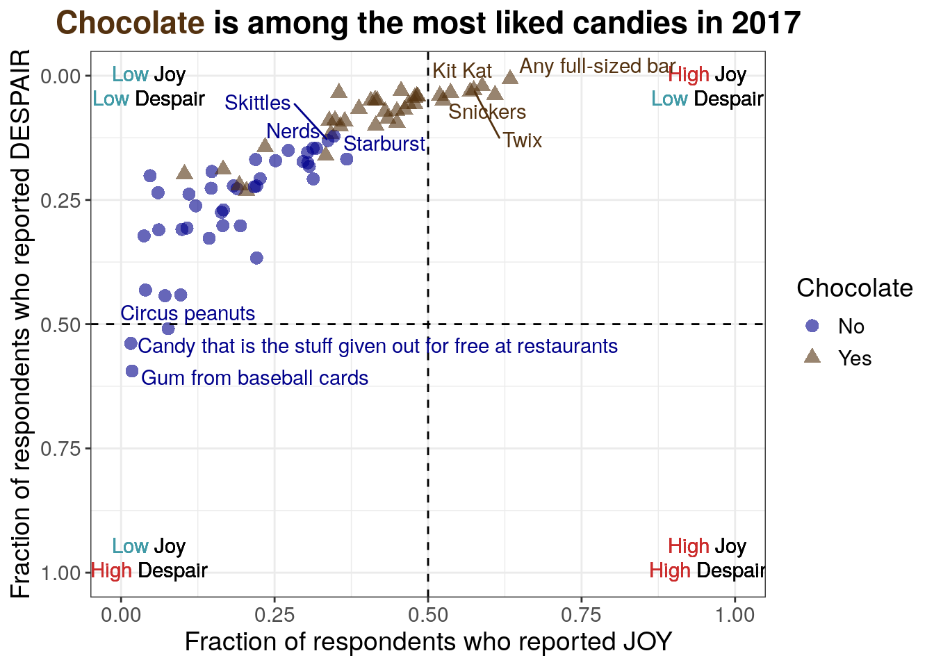
Note that the code is labeling points after visual inspection to manually decide what should be labeled. A more robust approach could use the quadrant cutoff values to select which points should be labeled.
Python code for labeling the extreme points
from adjustText import adjust_text
just_candy_props["label"] = ""
just_candy_props.loc[just_candy_props.index[-1], "label"] = "Any full-sized bar"
just_candy_props.loc[just_candy_props.index.str.contains("Peanut Butter", regex=False), "label"] = "Reese's PB Cups"
just_candy_props.loc[just_candy_props.index[-3], "label"] = just_candy_props.index[-3]
just_candy_props.loc[just_candy_props.index[-4], "label"] = just_candy_props.index[-4]
just_candy_props.loc[just_candy_props.index[-5], "label"] = just_candy_props.index[-5]
for candy in ["Nerds", "Skittles", "Starburst", "Sweet Tarts"]:
just_candy_props.loc[just_candy_props.index == candy, "label"] = candy
just_candy_props.loc[just_candy_props.index[0], "label"] = "Candy that is the stuff given out for free at restaurants"
just_candy_props.loc[just_candy_props.index[1], "label"] = "Gum from baseball cards"
just_candy_props.loc[just_candy_props.index.str.contains("marshmallow", regex=False), "label"] = "Circus peanuts"
mpl.rcParams["font.size"] = 14
plt.style.use('seaborn-v0_8-deep')
fig, ax = plt.subplots()
ax.axhline(y=0.5, linestyle = 'dashed', color = 'black')
ax.axvline(x=0.5, linestyle = 'dashed', color = 'black')
scatter_choc = ax.scatter(just_candy_props['likeness'][mask_choc],
just_candy_props['dislikeness'][mask_choc],
c = just_candy_props['colors'][mask_choc],
marker = np.unique(just_candy_props['shapes'][mask_choc]).item(),
label = "Yes",
alpha = 0.6)
scatter_nc = ax.scatter(just_candy_props['likeness'][mask_nc],
just_candy_props['dislikeness'][mask_nc],
c = just_candy_props['colors'][mask_nc],
marker = np.unique(just_candy_props['shapes'][mask_nc]).item(),
label = "No",
alpha = 0.6)
ax.set_xlim(0,1)
ax.set_ylim(1,0)
ax_text(x = 0.88, y = 0.1,
s='<High> Joy\n<Low> Despair',
highlight_textprops=[{"color": '#CB2C2C'},
{"color": '#409AA6'}],
fontsize = 10,
ha = 'center',
va = 'center',
textalign = 'center',
ax = ax)
ax_text(x = 0.88, y = 0.875,
s = '<High> Joy\n<High> Despair',
highlight_textprops=[{"color": '#CB2C2C'},
{"color": '#CB2C2C'}],
fontsize = 10,
ha = 'center',
va = 'center',
textalign = 'center',
ax = ax)
ax_text(x = 0.125, y = 0.875,
s = '<Low> Joy\n<High> Despair',
highlight_textprops=[{"color": '#409AA6'},
{"color": '#CB2C2C'}],
fontsize = 10,
ha = 'center',
va = 'center',
textalign = 'center',
ax = ax)
ax_text(x = 0.125, y = 0.1,
s = '<Low> Joy\n<Low> Despair',
highlight_textprops=[{"color": '#409AA6'},
{"color": '#409AA6'}],
fontsize = 10,
ha = 'center',
va = 'center',
textalign = 'center',
ax = ax)
ax.minorticks_on()
ax.grid(which='major',
linestyle='-', linewidth='0.5',
color='grey', alpha=0.7)
ax.grid(which='minor',
linestyle=':', linewidth='0.3',
color='grey', alpha=0.5)
ax.set_xlabel('Fraction of respondents who reported JOY')
ax.set_ylabel('Fraction of respondents who reported DESPAIR')
fig_text(x = 0.5, y = 0.9,
s = '<Chocolate> is among the most liked candies in 2017',
highlight_textprops = [{"color": "#543210"}],
ha = 'center',
va = 'bottom',
fontweight = 'bold')
texts = [plt.text(just_candy_props['likeness'].iloc[i],
just_candy_props['dislikeness'].iloc[i],
just_candy_props['label'].iloc[i],
fontsize = 6,
color = just_candy_props['colors'].iloc[i])
for i in range(len(just_candy_props))]
adjust_text(texts,
avoid_points = True,
arrowprops=dict(arrowstyle='-', shrinkA = 5.0))
ax.legend(title="Chocolate", loc = "center right")
plt.show()
plt.close()- 56
- Using adjust_text like in iteration 2 just with a different column of data for the display labels and adding a color for the labels
(0.0, 1.0)
(1.0, 0.0)
<highlight_text.htext.HighlightText object at 0x7f0c7db591b0>
<highlight_text.htext.HighlightText object at 0x7f0c7db5abf0>
<highlight_text.htext.HighlightText object at 0x7f0c7db819f0>
<highlight_text.htext.HighlightText object at 0x7f0c812e8d90>
<highlight_text.htext.HighlightText object at 0x7f0c7dc54be0>
Looks like you are using a tranform that doesn't support FancyArrowPatch, using ax.annotate instead. The arrows might strike through texts. Increasing shrinkA in arrowprops might help.
([Text(0.23336517927391262, 0.5243321718931474, 'Candy that is the stuff given out for free at restaurants'), Text(0.1208815705668577, 0.5800232288037166, 'Gum from baseball cards'), Text(0.037398373983739824, 0.3223577235772358, ''), Text(0.03983739837398373, 0.43130081300812995, ''), Text(0.04715447154471544, 0.2012195121951219, ''), Text(0.06016260162601628, 0.23536585365853657, ''), Text(0.0613821138211382, 0.3101626016260163, ''), Text(0.07154471544715449, 0.44268292682926824, ''), Text(0.1457232775092728, 0.48946256995037474, 'Circus peanuts'), Text(0.09715447154471543, 0.4410569105691057, ''), Text(0.0975609756097561, 0.31219512195121957, ''), Text(0.1032520325203252, 0.19756097560975605, ''), Text(0.108130081300813, 0.305081300813008, ''), Text(0.11056910569105696, 0.2382113821138212, ''), Text(0.12154471544715448, 0.2617886178861787, ''), Text(0.14349593495934962, 0.3272357723577235, ''), Text(0.1467479674796748, 0.2264227642276423, ''), Text(0.14612416170244655, 0.1967479674796747, ''), Text(0.16276422764227647, 0.2796747967479676, ''), Text(0.16585365853658543, 0.3016260162601625, ''), Text(0.16808943089430897, 0.1865853658536586, ''), Text(0.16699186991869922, 0.2674796747967476, ''), Text(0.1810835112959425, 0.2170731707317074, ''), Text(0.18718107227155226, 0.23434959349593465, ''), Text(0.19166666666666668, 0.20693168619997881, ''), Text(0.1943089430894309, 0.3020325203252032, ''), Text(0.20262822674309697, 0.2446943300601837, ''), Text(0.21573170731707317, 0.23656424875937065, ''), Text(0.2191056910569106, 0.1686991869918698, ''), Text(0.22073170731707317, 0.3666666666666665, ''), Text(0.22158536585365854, 0.23089430894308938, ''), Text(0.22792682926829264, 0.19433006018371868, ''), Text(0.23455284552845532, 0.14349593495934954, ''), Text(0.2516260162601627, 0.17113821138211371, ''), Text(0.27235772357723576, 0.15040650406504064, ''), Text(0.3369712637218537, 0.1947365642487594, ''), Text(0.30195121951219506, 0.14148453172843412, ''), Text(0.3080768798471395, 0.17167933692323922, ''), Text(0.32767786894458806, 0.19444620420230163, ''), Text(0.33541399722752985, 0.18845950797170286, 'Nerds'), Text(0.3350389644449441, 0.19761376834547573, ''), Text(0.3532705780974861, 0.1574965684721782, 'Sweet Tarts'), Text(0.4098759881608033, 0.18866539964100926, ''), Text(0.35636431756022635, 0.14737092176116562, 'Skittles'), Text(0.33718107227155225, 0.0910569105691057, ''), Text(0.35612865759994006, 0.10293527610600783, ''), Text(0.39928252969165645, 0.11764861155105066, 'Starburst'), Text(0.34653066576748726, 0.07644388132193014, ''), Text(0.3548780487804878, 0.03455284552845517, ''), Text(0.37390693492188376, 0.10013462147608476, ''), Text(0.38081750402757497, 0.10038538697075272, ''), Text(0.4179089393428497, 0.1835286664554956, ''), Text(0.3873983739837398, 0.06626016260162593, ''), Text(0.40506725113334086, 0.05284552845528423, ''), Text(0.41386178861788614, 0.04715447154471519, ''), Text(0.4017309205350118, 0.09999999999999987, ''), Text(0.4184146341463415, 0.04959349593495954, ''), Text(0.4291869918699187, 0.05855770246014136, ''), Text(0.41796298377730323, 0.0995723788406715, ''), Text(0.448130081300813, 0.058151198395100634, ''), Text(0.45065040650406496, 0.10729595607644393, ''), Text(0.45609756097560983, 0.030487804878048808, ''), Text(0.4599452999138286, 0.08127969591384221, ''), Text(0.46604286088943847, 0.06989758209270414, ''), Text(0.47727642276422755, 0.03091542603737718, ''), Text(0.47967479674796754, 0.07030408615774464, ''), Text(0.48353658536585364, 0.028476401647133276, ''), Text(0.4839837398373984, 0.0323170731707314, ''), Text(0.5172623730845604, 0.03617886178861762, ''), Text(0.5230081300813008, 0.0621740048569317, ''), Text(0.5384286838260088, 0.02378048780487796, ''), Text(0.5813898879772209, 0.05445042762115926, 'Snickers'), Text(0.5963948521973699, 0.011688311688311526, 'Twix'), Text(0.6140183957139111, 0.01948051948051943, 'Kit Kat'), Text(0.6895882507212169, 0.04770879526977079, "Reese's PB Cups"), Text(0.7159979019145032, 0.011688311688311526, 'Any full-sized bar')], [Text(0.1457232775092728, 0.48946256995037474, ''), Text(0.19166666666666668, 0.20693168619997881, ''), Text(0.20262822674309697, 0.2446943300601837, ''), Text(0.21573170731707317, 0.23656424875937065, ''), Text(0.22792682926829264, 0.19433006018371868, ''), Text(0.3369712637218537, 0.1947365642487594, ''), Text(0.30195121951219506, 0.14148453172843412, ''), Text(0.32767786894458806, 0.19444620420230163, ''), Text(0.33541399722752985, 0.18845950797170286, ''), Text(0.3532705780974861, 0.1574965684721782, ''), Text(0.4098759881608033, 0.18866539964100926, ''), Text(0.35612865759994006, 0.10293527610600783, ''), Text(0.39928252969165645, 0.11764861155105066, ''), Text(0.34653066576748726, 0.07644388132193014, ''), Text(0.37390693492188376, 0.10013462147608476, ''), Text(0.38081750402757497, 0.10038538697075272, ''), Text(0.4017309205350118, 0.09999999999999987, ''), Text(0.4291869918699187, 0.05855770246014136, ''), Text(0.41796298377730323, 0.0995723788406715, ''), Text(0.448130081300813, 0.058151198395100634, ''), Text(0.45065040650406496, 0.10729595607644393, ''), Text(0.4599452999138286, 0.08127969591384221, ''), Text(0.46604286088943847, 0.06989758209270414, ''), Text(0.47727642276422755, 0.03091542603737718, ''), Text(0.47967479674796754, 0.07030408615774464, ''), Text(0.48353658536585364, 0.028476401647133276, ''), Text(0.5230081300813008, 0.0621740048569317, ''), Text(0.5813898879772209, 0.05445042762115926, ''), Text(0.6895882507212169, 0.04770879526977079, ''), Text(0.7159979019145032, 0.011688311688311526, '')])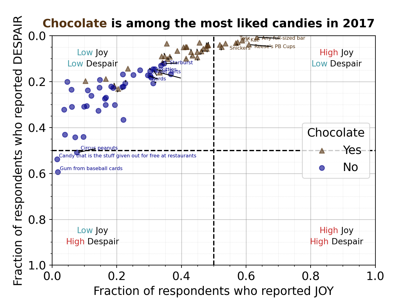
Note that Python uses 0-based indexing, so the wrangling steps to set display labels use indices offset by one compared to the R code wrangling steps.
7.2.4.12 Fixing the coordinate system aspect ratio
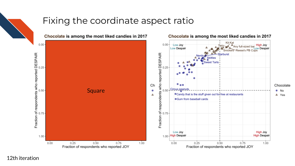
For the twelfth iteration, we want to ensure that we are fairly displaying the data rather than distorting it. Our axes are both constrained with data that can only take on values between 0 and 1. Therefore, we want to ensure that our axes are the same length. We can control the aspect ratio to make sure this is the case.
R code for fixing the coordinate ratio
to_plot %>%
ggplot(aes(x = JOY,
y = DESPAIR,
label = label,
color = Chocolate,
shape = Chocolate
)
) +
geom_point(size = 3,
alpha = 0.6
) +
xlim(0, 1) +
ylim(1, 0) +
theme_bw() +
geom_hline(aes(yintercept=0.5), linetype = 'dashed') +
geom_vline(aes(xintercept=0.5), linetype = 'dashed') +
annotate("richtext",
label = "<span style='color: #CB2C2C;'>High</span> Joy<br>
<span style='color: #409AA6;'>Low</span> Despair",
x = 0.955,
y = 0.025,
fill = NA,
label.color = NA,
label.padding = grid::unit(rep(0, 4), "pt")
) +
annotate("richtext",
label = "<span style='color: #CB2C2C;'>High</span> Joy<br>
<span style='color: #CB2C2C;'>High</span> Despair",
x = 0.955,
y = 0.975,
fill = NA,
label.color = NA,
label.padding = grid::unit(rep(0, 4), "pt")
) +
annotate("richtext",
label = "<span style='color: #409AA6;'>Low</span> Joy<br>
<span style='color: #CB2C2C;'>High</span> Despair",
x = 0.045,
y = 0.975,
fill = NA,
label.color = NA,
label.padding = grid::unit(rep(0, 4), "pt")
) +
annotate("richtext",
label = "<span style='color: #409AA6;'>Low</span> Joy<br>
<span style='color: #409AA6;'>Low</span> Despair",
x = 0.045,
y = 0.025,
fill = NA,
label.color = NA,
label.padding = grid::unit(rep(0, 4), "pt")
) +
scale_color_manual(values = c("Yes" = "#543210",
"No" = "#00008B")) +
geom_text_repel(show.legend = FALSE, max.overlaps = 16) +
labs(x = "Fraction of respondents who reported JOY",
y = "Fraction of respondents who reported DESPAIR",
title = "<b><span style='color: #543210;'>Chocolate</span> is among the most liked candies in 2017</b>") +
theme(text = element_text(size = 14),
plot.title = element_markdown(hjust = 0.5)) +
coord_fixed(ratio = 1)- 39
-
By using the
coord_fixedfunction we can set a fixed aspect ratio, in this case we want a square ratio of 1 because the axes have equal limits
Python code for fixing the coordinate ratio
mpl.rcParams["font.size"] = 14
plt.style.use('seaborn-v0_8-deep')
fig, ax = plt.subplots()
ax.axhline(y=0.5, linestyle = 'dashed', color = 'black')
ax.axvline(x=0.5, linestyle = 'dashed', color = 'black')
scatter_choc = ax.scatter(just_candy_props['likeness'][mask_choc],
just_candy_props['dislikeness'][mask_choc],
c = just_candy_props['colors'][mask_choc],
marker = np.unique(just_candy_props['shapes'][mask_choc]).item(),
label = "Yes",
alpha = 0.6)
scatter_nc = ax.scatter(just_candy_props['likeness'][mask_nc],
just_candy_props['dislikeness'][mask_nc],
c = just_candy_props['colors'][mask_nc],
marker = np.unique(just_candy_props['shapes'][mask_nc]).item(),
label = "No",
alpha = 0.6)
ax.set_xlim(0,1)
ax.set_ylim(1,0)
ax_text(x = 0.88, y = 0.1,
s='<High> Joy\n<Low> Despair',
highlight_textprops=[{"color": '#CB2C2C'},
{"color": '#409AA6'}],
fontsize = 10,
ha = 'center',
va = 'center',
textalign = 'center',
ax = ax)
ax_text(x = 0.88, y = 0.875,
s = '<High> Joy\n<High> Despair',
highlight_textprops=[{"color": '#CB2C2C'},
{"color": '#CB2C2C'}],
fontsize = 10,
ha = 'center',
va = 'center',
textalign = 'center',
ax = ax)
ax_text(x = 0.125, y = 0.875,
s = '<Low> Joy\n<High> Despair',
highlight_textprops=[{"color": '#409AA6'},
{"color": '#CB2C2C'}],
fontsize = 10,
ha = 'center',
va = 'center',
textalign = 'center',
ax = ax)
ax_text(x = 0.125, y = 0.1,
s = '<Low> Joy\n<Low> Despair',
highlight_textprops=[{"color": '#409AA6'},
{"color": '#409AA6'}],
fontsize = 10,
ha = 'center',
va = 'center',
textalign = 'center',
ax = ax)
ax.minorticks_on()
ax.grid(which='major',
linestyle='-', linewidth='0.5',
color='grey', alpha=0.7)
ax.grid(which='minor',
linestyle=':', linewidth='0.3',
color='grey', alpha=0.5)
ax.set_xlabel('Fraction of respondents who reported JOY')
ax.set_ylabel('Fraction of respondents who reported DESPAIR')
fig_text(x = 0.5, y = 0.9,
s = '<Chocolate> is among the most liked candies in 2017',
highlight_textprops = [{"color": "#543210"}],
ha = 'center',
va = 'bottom',
fontweight = 'bold')
texts = [plt.text(just_candy_props['likeness'].iloc[i],
just_candy_props['dislikeness'].iloc[i],
just_candy_props['label'].iloc[i],
fontsize = 6,
color = just_candy_props['colors'].iloc[i])
for i in range(len(just_candy_props))]
adjust_text(texts,
avoid_points = True,
arrowprops=dict(arrowstyle='-', shrinkA = 5.0))
ax.legend(title="Chocolate", loc = "center right")
ax.set_aspect('equal')
plt.show()
plt.close()- 57
- Setting the aspect of the axes to be equal, the same as setting the aspect ratio to 1
(0.0, 1.0)
(1.0, 0.0)
<highlight_text.htext.HighlightText object at 0x7f0c6c14e8c0>
<highlight_text.htext.HighlightText object at 0x7f0c7db5bc10>
<highlight_text.htext.HighlightText object at 0x7f0c6c14ff70>
<highlight_text.htext.HighlightText object at 0x7f0c6c197a00>
<highlight_text.htext.HighlightText object at 0x7f0c6c1b4ca0>
([Text(0.23336517927391262, 0.5243321718931474, 'Candy that is the stuff given out for free at restaurants'), Text(0.1208815705668577, 0.5800232288037166, 'Gum from baseball cards'), Text(0.037398373983739824, 0.3223577235772358, ''), Text(0.03983739837398373, 0.43130081300812995, ''), Text(0.04715447154471544, 0.2012195121951219, ''), Text(0.06016260162601628, 0.23536585365853657, ''), Text(0.0613821138211382, 0.3101626016260163, ''), Text(0.07154471544715449, 0.44268292682926824, ''), Text(0.1457232775092728, 0.48946256995037474, 'Circus peanuts'), Text(0.09715447154471543, 0.4410569105691057, ''), Text(0.0975609756097561, 0.31219512195121957, ''), Text(0.1032520325203252, 0.19756097560975605, ''), Text(0.108130081300813, 0.305081300813008, ''), Text(0.11056910569105696, 0.2382113821138212, ''), Text(0.12154471544715448, 0.2617886178861787, ''), Text(0.14349593495934962, 0.3272357723577235, ''), Text(0.1467479674796748, 0.2264227642276423, ''), Text(0.14612416170244655, 0.1967479674796747, ''), Text(0.16276422764227647, 0.2796747967479676, ''), Text(0.16585365853658543, 0.3016260162601625, ''), Text(0.16808943089430897, 0.1865853658536586, ''), Text(0.16699186991869922, 0.2674796747967476, ''), Text(0.1810835112959425, 0.2170731707317074, ''), Text(0.18718107227155226, 0.23434959349593465, ''), Text(0.19166666666666668, 0.20693168619997881, ''), Text(0.1943089430894309, 0.3020325203252032, ''), Text(0.20262822674309697, 0.2446943300601837, ''), Text(0.21573170731707317, 0.23656424875937065, ''), Text(0.2191056910569106, 0.1686991869918698, ''), Text(0.22073170731707317, 0.3666666666666665, ''), Text(0.22158536585365854, 0.23089430894308938, ''), Text(0.22792682926829264, 0.19433006018371868, ''), Text(0.23455284552845532, 0.14349593495934954, ''), Text(0.2516260162601627, 0.17113821138211371, ''), Text(0.27235772357723576, 0.15040650406504064, ''), Text(0.3369712637218537, 0.1947365642487594, ''), Text(0.30195121951219506, 0.14148453172843412, ''), Text(0.3080768798471395, 0.17167933692323922, ''), Text(0.32767786894458806, 0.19444620420230163, ''), Text(0.33541399722752985, 0.18845950797170286, 'Nerds'), Text(0.3350389644449441, 0.19761376834547573, ''), Text(0.3532705780974861, 0.1574965684721782, 'Sweet Tarts'), Text(0.4098759881608033, 0.18866539964100926, ''), Text(0.35636431756022635, 0.14737092176116562, 'Skittles'), Text(0.33718107227155225, 0.0910569105691057, ''), Text(0.35612865759994006, 0.10293527610600783, ''), Text(0.39928252969165645, 0.11764861155105066, 'Starburst'), Text(0.34653066576748726, 0.07644388132193014, ''), Text(0.3548780487804878, 0.03455284552845517, ''), Text(0.37390693492188376, 0.10013462147608476, ''), Text(0.38081750402757497, 0.10038538697075272, ''), Text(0.4179089393428497, 0.1835286664554956, ''), Text(0.3873983739837398, 0.06626016260162593, ''), Text(0.40506725113334086, 0.05284552845528423, ''), Text(0.41386178861788614, 0.04715447154471519, ''), Text(0.4017309205350118, 0.09999999999999987, ''), Text(0.4184146341463415, 0.04959349593495954, ''), Text(0.4291869918699187, 0.05855770246014136, ''), Text(0.41796298377730323, 0.0995723788406715, ''), Text(0.448130081300813, 0.058151198395100634, ''), Text(0.45065040650406496, 0.10729595607644393, ''), Text(0.45609756097560983, 0.030487804878048808, ''), Text(0.4599452999138286, 0.08127969591384221, ''), Text(0.46604286088943847, 0.06989758209270414, ''), Text(0.47727642276422755, 0.03091542603737718, ''), Text(0.47967479674796754, 0.07030408615774464, ''), Text(0.48353658536585364, 0.028476401647133276, ''), Text(0.4839837398373984, 0.0323170731707314, ''), Text(0.5172623730845604, 0.03617886178861762, ''), Text(0.5230081300813008, 0.0621740048569317, ''), Text(0.5384286838260088, 0.02378048780487796, ''), Text(0.5813898879772209, 0.05445042762115926, 'Snickers'), Text(0.5963948521973699, 0.011688311688311526, 'Twix'), Text(0.6140183957139111, 0.01948051948051943, 'Kit Kat'), Text(0.6895882507212169, 0.04770879526977079, "Reese's PB Cups"), Text(0.7159979019145032, 0.011688311688311526, 'Any full-sized bar')], [Text(0.1457232775092728, 0.48946256995037474, ''), Text(0.19166666666666668, 0.20693168619997881, ''), Text(0.20262822674309697, 0.2446943300601837, ''), Text(0.21573170731707317, 0.23656424875937065, ''), Text(0.22792682926829264, 0.19433006018371868, ''), Text(0.3369712637218537, 0.1947365642487594, ''), Text(0.30195121951219506, 0.14148453172843412, ''), Text(0.32767786894458806, 0.19444620420230163, ''), Text(0.33541399722752985, 0.18845950797170286, ''), Text(0.3532705780974861, 0.1574965684721782, ''), Text(0.4098759881608033, 0.18866539964100926, ''), Text(0.35612865759994006, 0.10293527610600783, ''), Text(0.39928252969165645, 0.11764861155105066, ''), Text(0.34653066576748726, 0.07644388132193014, ''), Text(0.37390693492188376, 0.10013462147608476, ''), Text(0.38081750402757497, 0.10038538697075272, ''), Text(0.4017309205350118, 0.09999999999999987, ''), Text(0.4291869918699187, 0.05855770246014136, ''), Text(0.41796298377730323, 0.0995723788406715, ''), Text(0.448130081300813, 0.058151198395100634, ''), Text(0.45065040650406496, 0.10729595607644393, ''), Text(0.4599452999138286, 0.08127969591384221, ''), Text(0.46604286088943847, 0.06989758209270414, ''), Text(0.47727642276422755, 0.03091542603737718, ''), Text(0.47967479674796754, 0.07030408615774464, ''), Text(0.48353658536585364, 0.028476401647133276, ''), Text(0.5230081300813008, 0.0621740048569317, ''), Text(0.5813898879772209, 0.05445042762115926, ''), Text(0.6895882507212169, 0.04770879526977079, ''), Text(0.7159979019145032, 0.011688311688311526, '')])
When axes have the same limits, fixing the aspect ratio to 1:1 is the most ethical approach to avoid distorting data.
7.2.4.13 Simplifying labels and increasing text size
For the thirteenth and final iteration of this plot, we want to simplify text labels where we can and make text larger throughout. These are common and important final steps when polishing an expository visualization.
We will simplify and clarify
- the axis labels
- reduce the number of words
- the legend
- doesn’t need a title
- clearly say “Chocolate” vs “Not chocolate”
Because there are quadrant labels/annotations and we’ve directly labeled some points with the candy it represents, we don’t want to over clutter the plot. Therefore,
- We’ll still use a legend rather than directly labeling plot areas with their grouping identity
- We’ll move the legend to the outside edge of the figure
Note that when we do this with R we need to be aware that both shape and color are manually set, so we need to adjust labels for both of these otherwise we’ll have two legends with different labels
R code for simplifying the legend
to_plot %>%
ggplot(aes(x = JOY,
y = DESPAIR,
label = label,
color = Chocolate,
shape = Chocolate
)
) +
geom_point(size = 3,
alpha = 0.6
) +
xlim(0, 1) +
ylim(1, 0) +
theme_bw() +
geom_hline(aes(yintercept=0.5), linetype = 'dashed') +
geom_vline(aes(xintercept=0.5), linetype = 'dashed') +
annotate("richtext",
label = "<span style='color: #CB2C2C;'>High</span> Joy<br>
<span style='color: #409AA6;'>Low</span> Despair",
x = 0.955,
y = 0.025,
fill = NA,
label.color = NA,
label.padding = grid::unit(rep(0, 4), "pt")
) +
annotate("richtext",
label = "<span style='color: #CB2C2C;'>High</span> Joy<br>
<span style='color: #CB2C2C;'>High</span> Despair",
x = 0.955,
y = 0.975,
fill = NA,
label.color = NA,
label.padding = grid::unit(rep(0, 4), "pt")
) +
annotate("richtext",
label = "<span style='color: #409AA6;'>Low</span> Joy<br>
<span style='color: #CB2C2C;'>High</span> Despair",
x = 0.045,
y = 0.975,
fill = NA,
label.color = NA,
label.padding = grid::unit(rep(0, 4), "pt")
) +
annotate("richtext",
label = "<span style='color: #409AA6;'>Low</span> Joy<br>
<span style='color: #409AA6;'>Low</span> Despair",
x = 0.045,
y = 0.025,
fill = NA,
label.color = NA,
label.padding = grid::unit(rep(0, 4), "pt")
) +
scale_color_manual(values = c("Yes" = "#543210",
"No" = "#00008B"),
labels = c("Not chocolate",
"Chocolate")) +
geom_text_repel(show.legend = FALSE, max.overlaps = 16) +
labs(x = "Fraction Joy",
y = "Fraction Despair",
title = "<b><span style='color: #543210 font-size: 30pt;'>Chocolate</span> is among the most liked candies in 2017</b>",
color = "") +
theme(text = element_text(size = 22),
plot.title = element_markdown(hjust = 0.5)) +
coord_fixed(ratio = 1)- 40
- Setting the display labels in the legend
- 41
- Simplifying the axis labels
- 42
- Turning off the legend title
- 43
- Increasing the text size
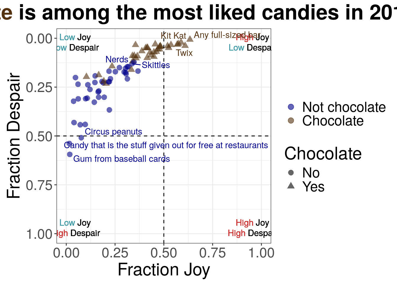
Python code for simplifying the legend
mpl.rcParams["font.size"] = 14
plt.style.use('seaborn-v0_8-deep')
fig, ax = plt.subplots()
ax.axhline(y=0.5, linestyle = 'dashed', color = 'black')
ax.axvline(x=0.5, linestyle = 'dashed', color = 'black')
scatter_nc = ax.scatter(just_candy_props['likeness'][mask_nc],
just_candy_props['dislikeness'][mask_nc],
c = just_candy_props['colors'][mask_nc],
marker = np.unique(just_candy_props['shapes'][mask_nc]).item(),
label = "Not chocolate",
alpha = 0.6)
scatter_choc = ax.scatter(just_candy_props['likeness'][mask_choc],
just_candy_props['dislikeness'][mask_choc],
c = just_candy_props['colors'][mask_choc],
marker = np.unique(just_candy_props['shapes'][mask_choc]).item(),
label = "Chocolate",
alpha = 0.6)
ax.set_xlim(0,1)
ax.set_ylim(1,0)
ax_text(x = 0.88, y = 0.1,
s='<High> Joy\n<Low> Despair',
highlight_textprops=[{"color": '#CB2C2C'},
{"color": '#409AA6'}],
fontsize = 10,
ha = 'center',
va = 'center',
textalign = 'center',
ax = ax)
ax_text(x = 0.88, y = 0.875,
s = '<High> Joy\n<High> Despair',
highlight_textprops=[{"color": '#CB2C2C'},
{"color": '#CB2C2C'}],
fontsize = 10,
ha = 'center',
va = 'center',
textalign = 'center',
ax = ax)
ax_text(x = 0.125, y = 0.875,
s = '<Low> Joy\n<High> Despair',
highlight_textprops=[{"color": '#409AA6'},
{"color": '#CB2C2C'}],
fontsize = 10,
ha = 'center',
va = 'center',
textalign = 'center',
ax = ax)
ax_text(x = 0.125, y = 0.1,
s = '<Low> Joy\n<Low> Despair',
highlight_textprops=[{"color": '#409AA6'},
{"color": '#409AA6'}],
fontsize = 10,
ha = 'center',
va = 'center',
textalign = 'center',
ax = ax)
ax.minorticks_on()
ax.grid(which='major',
linestyle='-', linewidth='0.5',
color='grey', alpha=0.7)
ax.grid(which='minor',
linestyle=':', linewidth='0.3',
color='grey', alpha=0.5)
ax.set_xlabel('Fraction Joy')
ax.set_ylabel('Fraction Despair')
fig_text(x = 0.5, y = 0.9,
s = '<Chocolate> is among the most liked candies in 2017',
highlight_textprops = [{"color": "#543210"}],
textalign = 'center',
ha = 'center',
va = 'bottom',
fontweight = 'bold',
fontsize = 15)
texts = [plt.text(just_candy_props['likeness'].iloc[i],
just_candy_props['dislikeness'].iloc[i],
just_candy_props['label'].iloc[i],
fontsize = 6,
color = just_candy_props['colors'].iloc[i])
for i in range(len(just_candy_props))]
adjust_text(texts,
avoid_points = True,
arrowprops=dict(arrowstyle='-', shrinkA=5.0))
ax.legend(bbox_to_anchor = (1.025, 0.5),
loc = "center left",
title="")
ax.set_aspect('equal')
plt.tight_layout()
plt.show()
plt.close()- 58
- Switching to plot the Not Chocolate group first so it’ll be listed first in the legend
- 59
- Switching the display label for the legend
- 60
- Increasing the font size of the title
- 61
- Moving the legend to outside of the plot area to the right in the center. “center left” has to do with alignment
- 62
- Turning off the title for the legend
- 63
-
Adding a
tight_layout()call because of the legend being outside of the plotting area
(0.0, 1.0)
(1.0, 0.0)
<highlight_text.htext.HighlightText object at 0x7f0c6bf56d10>
<highlight_text.htext.HighlightText object at 0x7f0c6bf56d40>
<highlight_text.htext.HighlightText object at 0x7f0c6bf8fe20>
<highlight_text.htext.HighlightText object at 0x7f0c6bf54820>
<highlight_text.htext.HighlightText object at 0x7f0c6bfaea10>
([Text(0.23336517927391262, 0.5243321718931474, 'Candy that is the stuff given out for free at restaurants'), Text(0.1208815705668577, 0.5800232288037166, 'Gum from baseball cards'), Text(0.037398373983739824, 0.3223577235772358, ''), Text(0.03983739837398373, 0.43130081300812995, ''), Text(0.04715447154471544, 0.2012195121951219, ''), Text(0.06016260162601628, 0.23536585365853657, ''), Text(0.0613821138211382, 0.3101626016260163, ''), Text(0.07154471544715449, 0.44268292682926824, ''), Text(0.1457232775092728, 0.48946256995037474, 'Circus peanuts'), Text(0.09715447154471543, 0.4410569105691057, ''), Text(0.0975609756097561, 0.31219512195121957, ''), Text(0.1032520325203252, 0.19756097560975605, ''), Text(0.108130081300813, 0.305081300813008, ''), Text(0.11056910569105696, 0.2382113821138212, ''), Text(0.12154471544715448, 0.2617886178861787, ''), Text(0.14349593495934962, 0.3272357723577235, ''), Text(0.1467479674796748, 0.2264227642276423, ''), Text(0.14612416170244655, 0.1967479674796747, ''), Text(0.16276422764227647, 0.2796747967479676, ''), Text(0.16585365853658543, 0.3016260162601625, ''), Text(0.16808943089430897, 0.1865853658536586, ''), Text(0.16699186991869922, 0.2674796747967476, ''), Text(0.1810835112959425, 0.2170731707317074, ''), Text(0.18718107227155226, 0.23434959349593465, ''), Text(0.19166666666666668, 0.20693168619997881, ''), Text(0.1943089430894309, 0.3020325203252032, ''), Text(0.20262822674309697, 0.2446943300601837, ''), Text(0.21573170731707317, 0.23656424875937065, ''), Text(0.2191056910569106, 0.1686991869918698, ''), Text(0.22073170731707317, 0.3666666666666665, ''), Text(0.22158536585365854, 0.23089430894308938, ''), Text(0.22792682926829264, 0.19433006018371868, ''), Text(0.23455284552845532, 0.14349593495934954, ''), Text(0.2516260162601627, 0.17113821138211371, ''), Text(0.27235772357723576, 0.15040650406504064, ''), Text(0.3387256003896446, 0.18982156055326793, ''), Text(0.30195121951219506, 0.14148453172843412, ''), Text(0.3080768798471395, 0.17167933692323922, ''), Text(0.3332846277771533, 0.197333966846162, ''), Text(0.3317273612828294, 0.19105691056910545, 'Nerds'), Text(0.3295211869169383, 0.19704360679970423, ''), Text(0.3569572140421865, 0.1548991658747756, 'Sweet Tarts'), Text(0.412378985425799, 0.1861260690528982, ''), Text(0.3526776816155258, 0.14996832435856822, 'Skittles'), Text(0.33718107227155225, 0.0910569105691057, ''), Text(0.35612865759994006, 0.10293527610600783, ''), Text(0.39928252969165645, 0.11764861155105066, 'Starburst'), Text(0.34653066576748726, 0.07644388132193014, ''), Text(0.3548780487804878, 0.03455284552845517, ''), Text(0.37390693492188376, 0.10013462147608476, ''), Text(0.38081750402757497, 0.10038538697075272, ''), Text(0.415405942077854, 0.18606799704360666, ''), Text(0.3873983739837398, 0.06626016260162593, ''), Text(0.40506725113334086, 0.05284552845528423, ''), Text(0.41386178861788614, 0.04715447154471519, ''), Text(0.4017309205350118, 0.09999999999999987, ''), Text(0.4184146341463415, 0.04959349593495954, ''), Text(0.4291869918699187, 0.05855770246014136, ''), Text(0.41796298377730323, 0.0995723788406715, ''), Text(0.448130081300813, 0.058151198395100634, ''), Text(0.45065040650406496, 0.10729595607644393, ''), Text(0.45609756097560983, 0.030487804878048808, ''), Text(0.4599452999138286, 0.08127969591384221, ''), Text(0.46604286088943847, 0.06989758209270414, ''), Text(0.47727642276422755, 0.03091542603737718, ''), Text(0.47967479674796754, 0.07030408615774464, ''), Text(0.48353658536585364, 0.028476401647133276, ''), Text(0.4839837398373984, 0.0323170731707314, ''), Text(0.5172623730845604, 0.03617886178861762, ''), Text(0.5230081300813008, 0.0621740048569317, ''), Text(0.5384286838260088, 0.02378048780487796, ''), Text(0.5832332059495712, 0.05185302502375677, 'Snickers'), Text(0.5982381701697201, 0.011688311688311526, 'Twix'), Text(0.6158617136862613, 0.016883116883116722, 'Kit Kat'), Text(0.6895882507212169, 0.04770879526977079, "Reese's PB Cups"), Text(0.7159979019145032, 0.011688311688311526, 'Any full-sized bar')], [Text(0.1457232775092728, 0.48946256995037474, ''), Text(0.19166666666666668, 0.20693168619997881, ''), Text(0.20262822674309697, 0.2446943300601837, ''), Text(0.21573170731707317, 0.23656424875937065, ''), Text(0.22792682926829264, 0.19433006018371868, ''), Text(0.3387256003896446, 0.18982156055326793, ''), Text(0.30195121951219506, 0.14148453172843412, ''), Text(0.3332846277771533, 0.197333966846162, ''), Text(0.3317273612828294, 0.19105691056910545, ''), Text(0.3295211869169383, 0.19704360679970423, ''), Text(0.3569572140421865, 0.1548991658747756, ''), Text(0.412378985425799, 0.1861260690528982, ''), Text(0.3526776816155258, 0.14996832435856822, ''), Text(0.35612865759994006, 0.10293527610600783, ''), Text(0.39928252969165645, 0.11764861155105066, ''), Text(0.34653066576748726, 0.07644388132193014, ''), Text(0.37390693492188376, 0.10013462147608476, ''), Text(0.38081750402757497, 0.10038538697075272, ''), Text(0.415405942077854, 0.18606799704360666, ''), Text(0.4017309205350118, 0.09999999999999987, ''), Text(0.4291869918699187, 0.05855770246014136, ''), Text(0.41796298377730323, 0.0995723788406715, ''), Text(0.448130081300813, 0.058151198395100634, ''), Text(0.45065040650406496, 0.10729595607644393, ''), Text(0.4599452999138286, 0.08127969591384221, ''), Text(0.46604286088943847, 0.06989758209270414, ''), Text(0.47727642276422755, 0.03091542603737718, ''), Text(0.47967479674796754, 0.07030408615774464, ''), Text(0.48353658536585364, 0.028476401647133276, ''), Text(0.5230081300813008, 0.0621740048569317, ''), Text(0.5832332059495712, 0.05185302502375677, ''), Text(0.6895882507212169, 0.04770879526977079, ''), Text(0.7159979019145032, 0.011688311688311526, '')])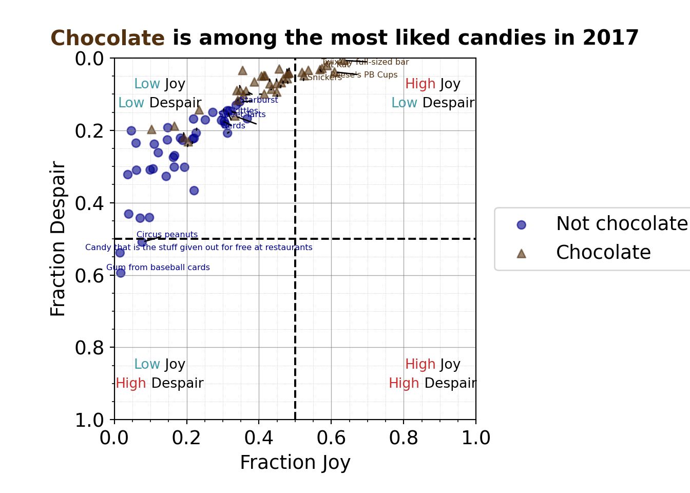
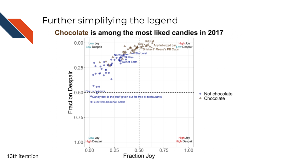
Here we adjust the labels for the shape legend too so they match the legend for color.
R code for simplifying the legend
to_plot %>%
ggplot(aes(x = JOY,
y = DESPAIR,
label = label,
color = Chocolate,
shape = Chocolate
)
) +
geom_point(size = 3,
alpha = 0.6
) +
xlim(0, 1) +
ylim(1, 0) +
theme_bw() +
geom_hline(aes(yintercept=0.5), linetype = 'dashed') +
geom_vline(aes(xintercept=0.5), linetype = 'dashed') +
annotate("richtext",
label = "<span style='color: #CB2C2C;'>High</span> Joy<br>
<span style='color: #409AA6;'>Low</span> Despair",
x = 0.955,
y = 0.025,
fill = NA,
label.color = NA,
label.padding = grid::unit(rep(0, 4), "pt")
) +
annotate("richtext",
label = "<span style='color: #CB2C2C;'>High</span> Joy<br>
<span style='color: #CB2C2C;'>High</span> Despair",
x = 0.955,
y = 0.975,
fill = NA,
label.color = NA,
label.padding = grid::unit(rep(0, 4), "pt")
) +
annotate("richtext",
label = "<span style='color: #409AA6;'>Low</span> Joy<br>
<span style='color: #CB2C2C;'>High</span> Despair",
x = 0.045,
y = 0.975,
fill = NA,
label.color = NA,
label.padding = grid::unit(rep(0, 4), "pt")
) +
annotate("richtext",
label = "<span style='color: #409AA6;'>Low</span> Joy<br>
<span style='color: #409AA6;'>Low</span> Despair",
x = 0.045,
y = 0.025,
fill = NA,
label.color = NA,
label.padding = grid::unit(rep(0, 4), "pt")
) +
scale_color_manual(values = c("Yes" = "#543210",
"No" = "#00008B"),
labels = c("Not chocolate",
"Chocolate")) +
scale_shape_discrete(labels = c("Not chocolate",
"Chocolate")) +
geom_text_repel(show.legend = FALSE, max.overlaps = 16) +
labs(x = "Fraction Joy",
y = "Fraction Despair",
title = "<b><span style='color: #543210 font-size: 30pt;'>Chocolate</span> is among the most liked candies in 2017</b>",
color = "",
shape = "") +
theme(text = element_text(size = 22),
plot.title = element_markdown(hjust = 0.5)) +
coord_fixed(ratio = 1)- 44
- Change the labels in the legend for shape too
- 45
- Turn off the legend title for shape too
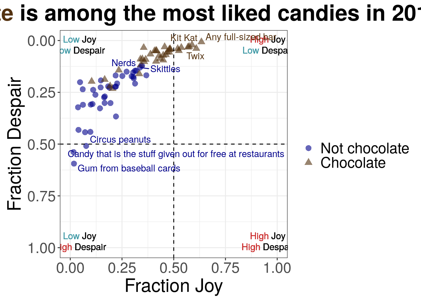
7.2.4.14 The plot!
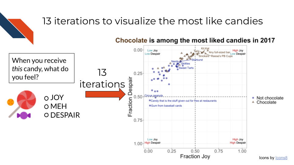
But we’re not done yet….
7.2.4.15 The caption!

7.2.4.16 Going further
The dataset is an open dataset, meaning that it is available for you to explore and visualize on your own!
Perhaps you are interested in whether there’s a difference in rankings depending on the sex of respondent or some other demographics. Do males prefer chocolate over non-chocolate candy? Does the age or location of the respondent impact the rankings?
Perhaps you are interested in how the proportion of indifference affects these rankings. Is there a design element that can be added to this plot to visualize that specifically?
Perhaps you’d like to try to plot this with a completely different plot type! Whatever your question – go for it! Practice is one of the best ways to improve your data visualization skills.
7.3 In Summary
Aim for understanding and readability over complexity. When you are working with your data and selecting your plot, think about what message you want to communicate.
7.4 Checklist
This checklist contains reminders of considerations and steps you should take while building your expository data visualization in order to minimize its complexity, enhance its clarity and accessibility, and assess its accuracy.
Style
Accessibility
Fairness
Validity
7.5 Keep Practicing!
Give some examples