3 Elements of Data Visualization
A data visualization represents data in a simplified way. The visualization is made up of the represented data as well as the means by which the data is represented: textual and graphical design elements. Each conventional plot type utilizes a combination of design elements in a predictable way or layout. Because the design elements are the building blocks for the data visualizations, an important step in choosing an appropriate plot for your data is considering what your data is and how it can be encoded or represented.
3.1 Learning Objectives
3.2 Data Types
A dataset is a collection of records or observations. This course assumes that the dataset you are going to visualize has been processed and wrangled such that it is a “structured dataset.” In structured datasets, typically each row (or “record”) contains observations for a single sample or patient. Each column is a different variable for that sample or patient. Every variable will be unique either because different things are being measured or documented or because the same thing or individual is being measured at different time points. When thinking about the amount of data that will be displayed in a visualization, there are two different considerations: the number of records (the number of rows) and the number of variables (which and how many columns).
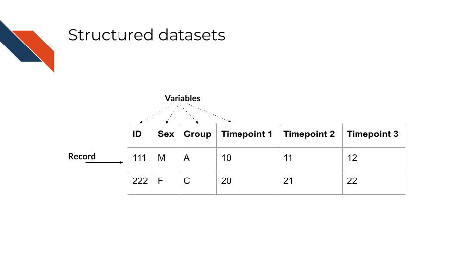
While “records” is a general term for rows in a structured dataset, certain fields and datasets use more specific terms for the rows. For example, in gene expression (biological) datasets the rows are often called “features” because each row represents a gene or feature.
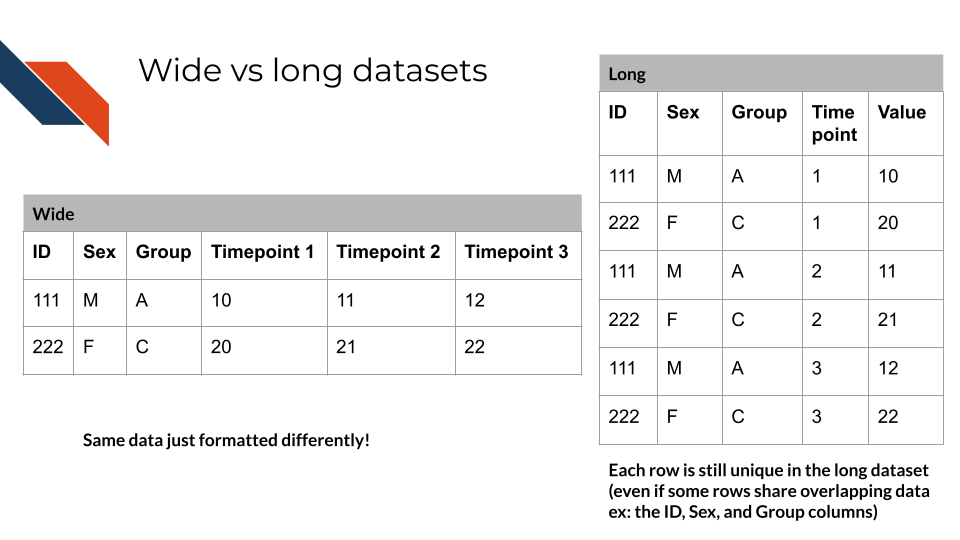
Wide vs Long datasets
Some datasets may utilize a “long” approach to stack similar variables on top of each other with a new column helping to distinguish them and repeating record IDs across multiple rows; but this “long” approach is typically used as input to visualization software, especially when using ggplot in R or some libraries like Seaborn in Python.
tidyverse R functions that can “pivot” data from a wide format into a long format include:
pivot_longer: pivots wide data into a longer format by storing column names in a new column and the corresponding values from those columns into another new columnseparate_longer_delim: splits a string using a specific delimiter such as a comma or a semicolon and splits the values into separate rows
Python functions for pandas data frame data include:
Functions that perform the inverse operation, transforming long form data into wide form also exist and are mentioned in the referenced documentation.
There are two main types of data within a dataset: numerical and categorical data. A dataset will likely have a mixture of these data types and new variables may be generated using the original data through transformations. Transformations can be used by performing mathematical operations or converting between data types. Converting numerical data into categorical data is accomplished through binning or by employing a cutoff value. Alternatively, categorical data may need to be encoded as numerals so the data is in a form that requires less storage or so that a computer or algorithm can process it (e.g., machine readable).
3.2.1 Numerical Data
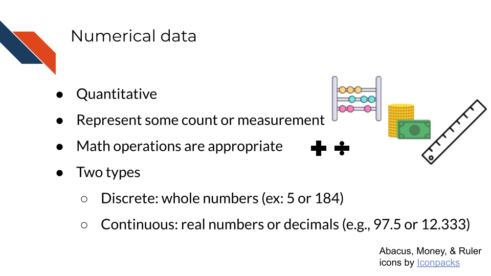
Numerical data is data that quantitatively represents some count or measurement. Mathematical operations such as addition, subtraction, division, multiplication, exponentiation, etc. are appropriate.
There are two subtypes of numerical data: discrete and continuous. Whole numbers or integers (e.g., 103 and 25,975) are examples of discrete data while decimals (e.g., 98.6 and 32.25) are examples of continuous data.
Examples of numerical data within the biomedical field include
- a blood test result value or concentration
- a patient’s age
- the thickness of a tumor
- the length of stay for a patient at the hospital
- a survival probability
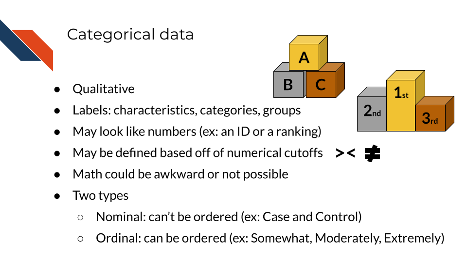
3.2.2 Categorical Data
Categorical data qualitatively characterizes, categorizes, or groups objects or individuals with labels. Categorical data sometimes may look like numbers when they are group IDs or some sort of ranking or index score. However, A-B-C could be switched out for 1-2-3 making such data categorical data.
Survey data frequently has categorical data that appears as numbers because responses are typically “coded”. This is especially true for biomedical data from platforms like REDCap.
There are two subtypes of categorical data: nominal and ordinal. Nominal data is data that can’t be ordered, for example “Case” and “Control”. Ordinal data is data that can be ordered, for example “A”, “B”, “C” or “January 14, 1994”, “February 8, 1995”, “March 18, 1996”.
While you may be able to do some arithmetic operations with ordinal data specifically (like finding an average ranking or finding the distance between numerically encoded categories), typically arithmetic operations aren’t appropriate for categorical data and shouldn’t be used because the numbers don’t have mathematical meaning. Index scores particularly should be treated like categorical data given that they represent categories. However, they often have order to them (are ordinal) and therefore, because the index or score is fundamentally a number, it’s made up of other numbers and can be tracked over time, etc.
Examples of categorical data within the biomedical field include
- patient or sample IDs
- treatment group
- patient sex
- tumor location
- Patient Health Questionnaire-9 (PHQ-9) Score / depression severity level
- Charlson-Deyo Comorbidity Index
3.3 Data Encodings
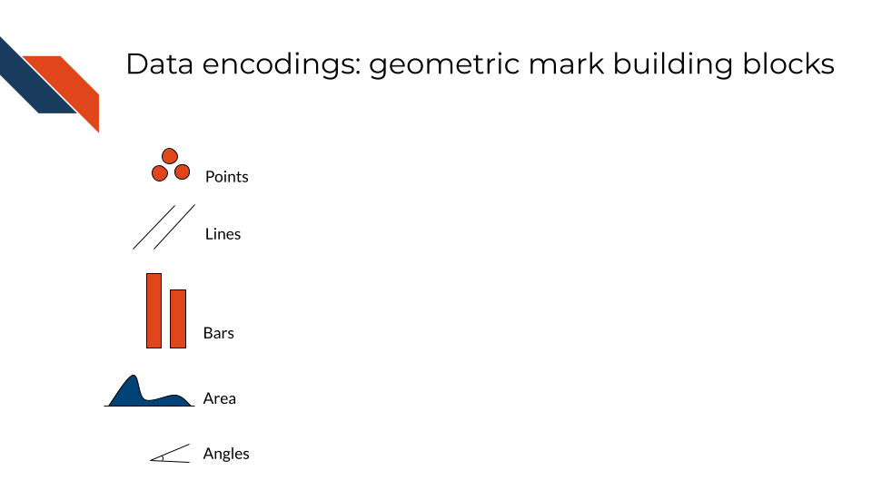
Data encoding is the process of representing data using visual elements or graphical attributes. These include geometric marks and visual channels which are the building blocks of data visualization. Different graph types utilize different encodings to represent data. Geometric marks are typically the primary means of representing data across graph types while the visual channels are usually used as secondary or supplementary methods (e.g., shape, color, and textures). However, color can be a primary means of data encoding for certain graphs like heatmaps or choropleths
3.3.1 Geometric Marks
These building blocks are also referred to as “geometric marks” and they include
- points
- lines
- bars
- area
- angle
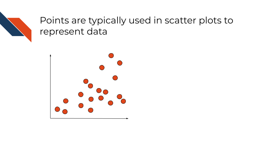
An example of a conventional plot type that uses points is a scatter plot. Points typically are circles but can be other shapes (like triangles or squares), and typically represent one person or sample.
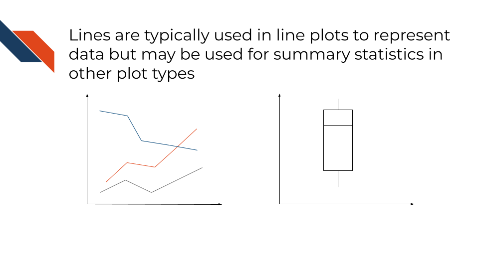
An example of a conventional plot type that uses lines is a line plot. Lines connect different data points. Slope may be a value of interest when working with lines, but it’s often difficult for audiences to compare slope values visually without labels. Lines may also be trendlines that aren’t connecting explicit data points and rather are included in a plot to showcase a general relationship or trend. Lines are often used to indicate summary statistics such as averages as well as medians or quartiles (in boxplots).
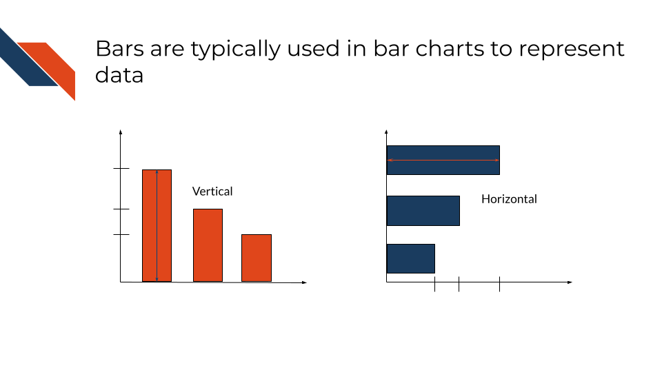
Bars use height (vertical bars) or length (horizontal bars) to communicate information about a set of samples. Within bar charts, width typically isn’t used to communicate information about data, but for plot types like flow diagrams or histograms, bar width does convey a meaningful value.
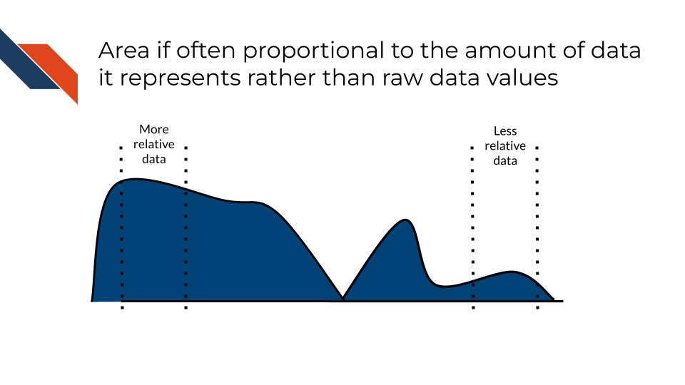
Area is often proportional to the amount of data its representing rather than the raw data values itself. Larger areas correspond to larger data values. Area is commonly used in density plots.
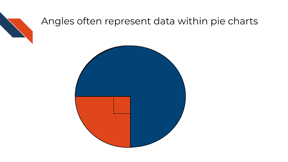
Angles are most commonly used to represent numerical values such as proportions but can also be used to represent direction rather than just magnitude/size (through use of arrows or slope). Angles are the primary geometric mark used in pie charts.
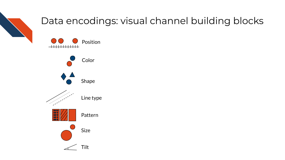
3.3.2 Visual Channels
These visual building blocks are also referred to as “visual channels” and they control the way that the geometric building blocks will appear. You can change the shape, color, or size of a point, but it’s still a point. Visual channels include:
- position
- color
- shape
- line type
- patterns
- size
- tilt
Position often reflects numerical value with marks that are near each other having more similar values than marks that are further away. Position may also be used to separate different categories where the general order or position may reflect similar categories, the same parent category, or a numerical variable that is being compared across variables.
Color may reflect categorization or group membership. Color may control the appearance of any of the geometric marks.
Shape may reflect categorization or group membership and controls the way that points appear. Shape is sometimes used in place of or as a supplement to color.
Line types can be used much like shape to communicate categorization or group membership. Line type controls the appearance of lines.
Pattern is sometimes used in place of or as a supplement to color to reflect categorization or group membership. For the recurring pattern to be recognized, it often needs to be used with geometric marks that have enough area for the pattern to be distinguishable (such as bars).
Size is used to encode quantitative data by altering physical attributes of the geometric marks: thickness of a line, radius of a point, etc. Changes in size are often proportional to the quantitative data with larger sizes corresponding to larger values.
Tilt is another word for angles and can be used as a visual channel, not just a geometric mark. Tilt is used to represent proportions or trends (such as slope). While helpful for comparisons, audiences often find it difficult to compare tilt precisely and designers should not rely on tilt to communicate main messages.
3.3.3 Preattentive Attributes
Several of the visual channels are considered “Preattentive attributes” which means that they are visual features that the human brain tends to process quickly and unconsciously such that a viewer is instinctively guided to focus their attention on that feature. This is often due to contrast or differences in the feature compared to everything else. Examples include:
- Bars that are obviously taller than the rest
- Mostly one dominant color, but a few data points are a different, more vibrant or contrasting color
- Only one data point is outlined
- One line is wider than the rest
3.3.4 Additional Design Tools
These additional design tools may or may not encode data, but do separate out data to enhance clarity and interpretability. The actual group membership will affect what is labeled or separated out, but often other visual design channels (like color) may be used to communicate group membership in a redundant way. These design tools are especially effective at improving the clarity of a visualization without having to change plot types. So if you’re building a data visualization and it’s a little too cluttered or difficult to interpret, try utilizing one of these design tools before switching plot types to a more complex plot type.
- labels
- facets or subplots
- transparency
Labels include axis labels, titles, and direct annotations within the plot perhaps specifying a specific summary statistic/number or pointing out the name/value of a specific data point or line. They may be combined with dashed lines, colors, or other visual channels to provide further clarity.
Subplots, also known as faceting, subplots separates out the data into different panels based on group membership. The same plot type will be utilized in each panel. Panels may or may not use the same scaling and axis limits.
Transparency controls the opacity of the geometric marks. If an area appears less transparent, there is a greater density of data there than areas that appear more transparent. This visual channel is especially helpful to distinguish groups that overlap.
3.4 Coordinate System
Most data visualizations will utilize a two dimensional XY coordinate system (or Cartesian plane) with a horizontal (x-) axis and a vertical (y-) axis that are perpendicular and intersect where x = 0 and y = 0. Each variable will be assigned to one of the axes. If working with regression or where you have a dependent variable (outcome or event being measured or observed) and an independent variable (the variable being controlled or changed/purposefully manipulated), the independent variable is assigned to the x-axis and the dependent variable is assigned to the y-axis. When working with numerical data, this XY coordinate system allows for the positioning of the numerical data along these axes. When working with a categorical data, the categories can still be positioned along of the numerical axes, however the corresponding numerical positions will not have the same meaning they would otherwise have. The two axes can utilize different units (e..g, micrograms per milliliter, percentage, grams, log fold change, etc.) and scales, however, if the same units are used for the two axes, then the scaling should be equal for both axes to avoid distortion.
Additional coordinate systems
Additional coordinate systems are appropriate for some specific visualizations such as a three dimensional XYZ coordinate system, the polar coordinate system (e.g., pie charts and spider charts), and a geospatial coordinate system for maps such as the projected coordinate system.
- The XYZ coordinate system utilizes a third axis (z-) that intersects the XY-plane perpendicularly at x = 0, y = 0, and z = 0.
- The polar coordinate system uses angles to position groups and radii length to represent magnitude or group size.
- A projected coordinate system is a two dimensional map.
3.5 Summary
Data has two main subdivisions: numeric and categorical data. Each type of data has certain geometric marks and visual channels that best represent that type of data. Categorical data communicates qualitative information such as groups, categorizations, or rankings and is best represented by color and shape as well as line type or patterns. Position may also be used for categorical data though position is typically associated with numerical data. Numerical data communicates quantitative information such as a measurement, count, or other numerical value perhaps the result of a mathematical operation.