In the second week of class, we will look at linear regression in more depth, and examine the challenge of over-fitting.
3.1 Linear Regression in depth
Last week, we were exposed to the Linear Regression model. Today we will take it apart and look at it carefully to see how it works and what are the needed assumptions to use this model.
3.1.1 One predictor
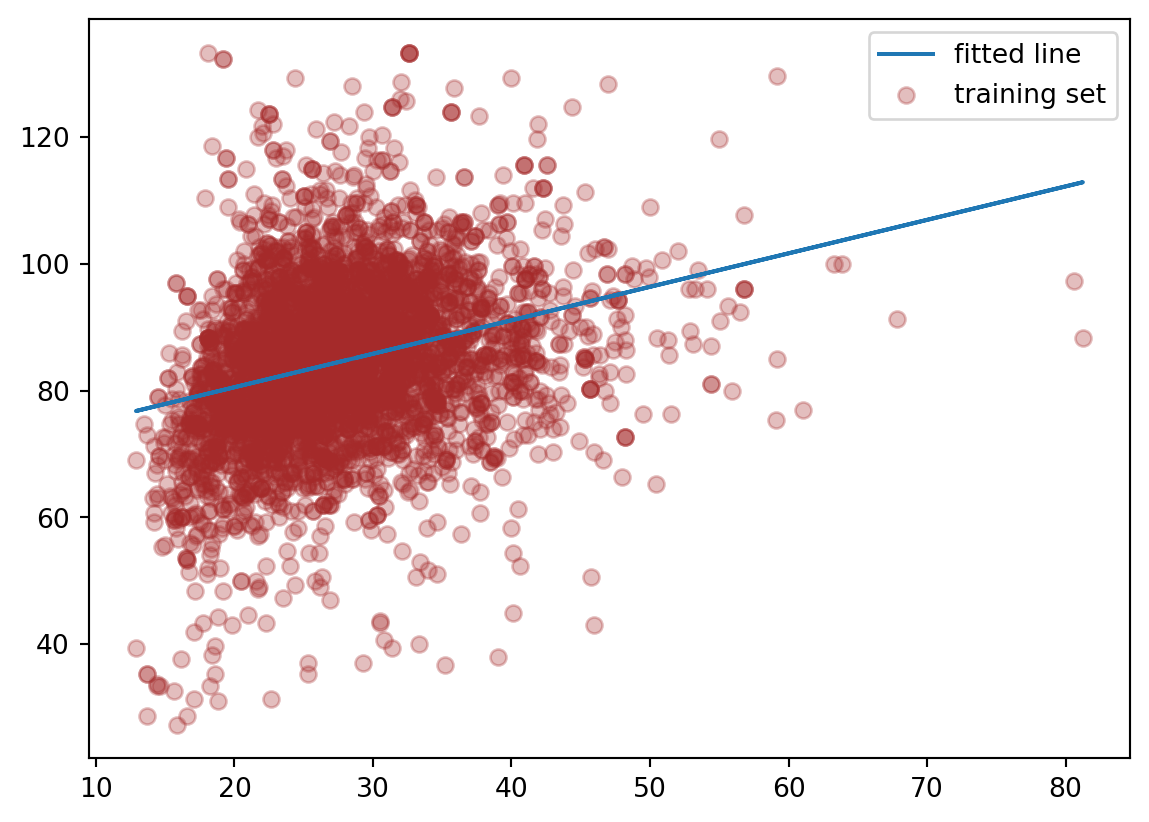
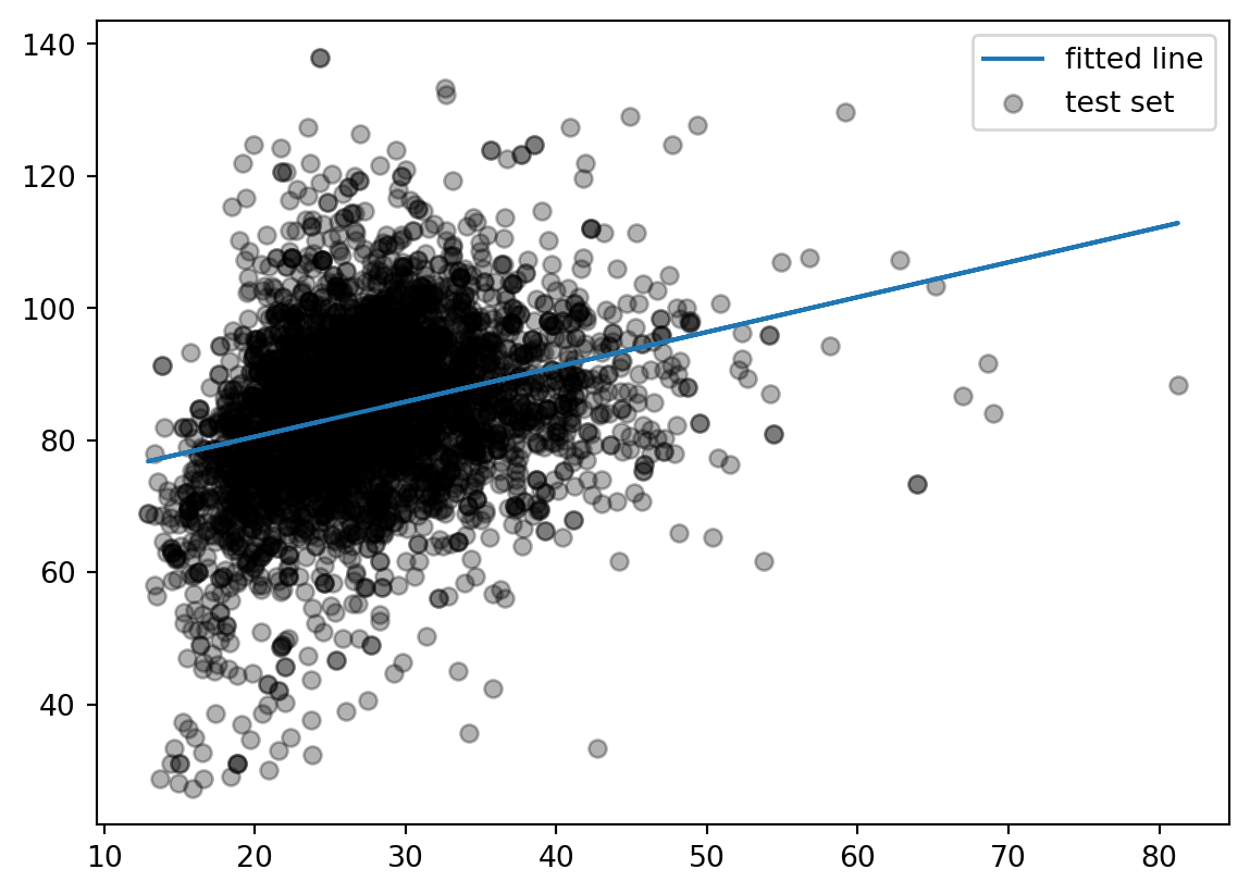
Suppose we just use one predictor, \(Age\) to predict our outcome \(MeanBloodPressure\).
\[
MeanBloodPressure= \beta_0 + \beta_1 \cdot Age
\]
Our model would look like the following like the red line from our Training data:
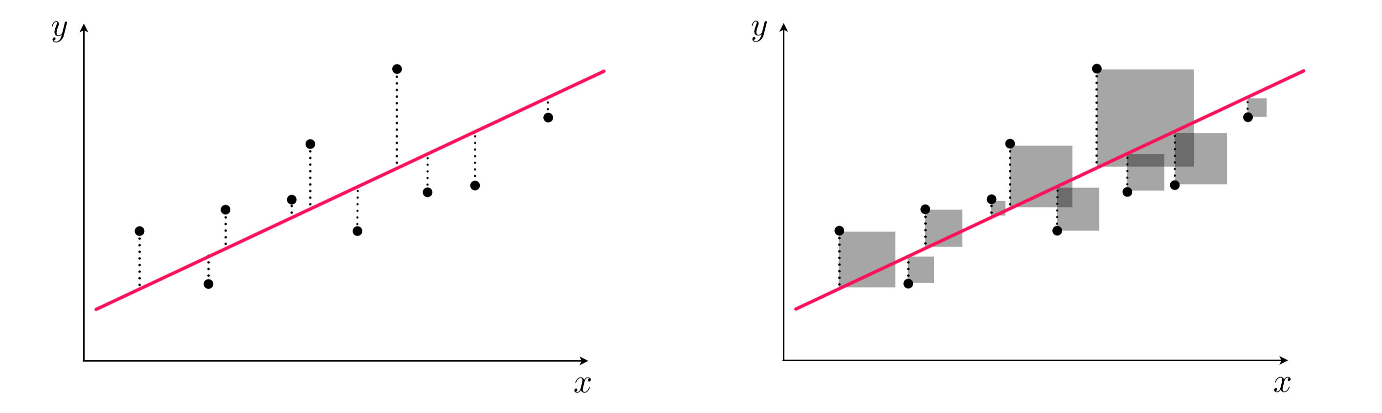
This model is formed by making the the line of best fit determined by the minimum of the sum of squared difference between the observed response (in blue points) and predicted response (in red line). Using the terminology from last week, we say that we fit a line where the Mean Squared Error (MSE) is minimized.
Left panel: difference between response and predicted response (residual). Right panel: squared difference between predicted response and response.
3.2 Assumptions of linear regression
Any model that one uses has some assumptions about the data that allows the model to make good predictions. Note that there are other types of assumptions if your modeling technique is focused on inference.
Let’s take a look what are the assumptions needed for a sound model, and what we can do to address it not upheld.
3.2.1 Linearity of responder-predictor relationship
The linear regression model assumes that there is a straight line (linear) relationship between the predictors and the response. It doesn’t ask for the straight line relationship to be perfect, but rather on average the cloud of points has a linear shape. If that is not true, then our prediction is going to be less accurate.
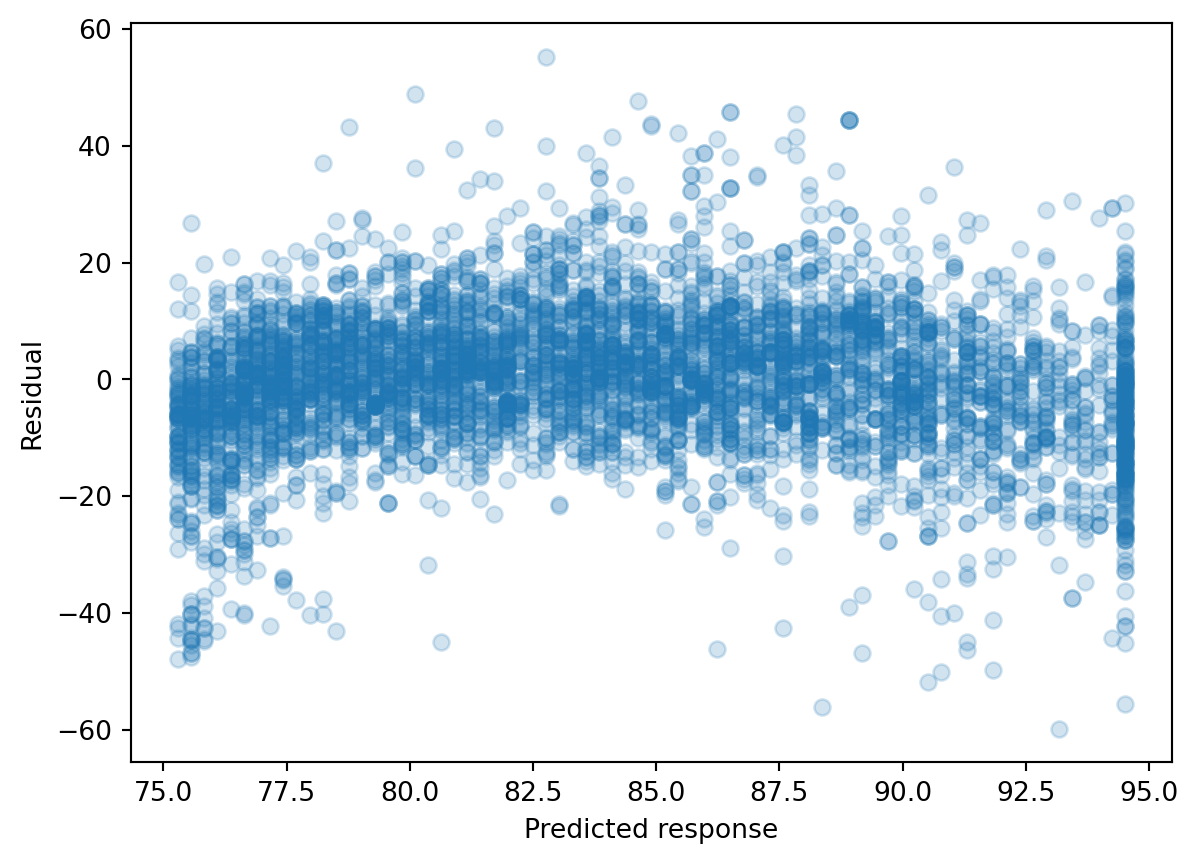
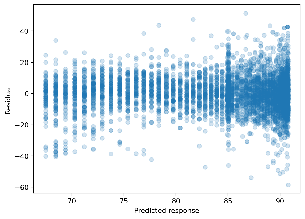
We can check this relationship by seeing whether predictor is linear with the predicted response value, but this is cumbersome with multiple predictors. Rather, we typically calculate the residual, which is the difference between the response value and the predicted response value (similar to a type of model performance metrics we examined last week). Then, we can make a residual plot of the predicted response vs. residual. Ideally, this residual plot should have no pattern - some residuals above 0, some below 0, but no strong trend.
If there’s a trend in the data, that means there are non-linear associations between some of the predictors and the response.
We see there’s a slight curve in our residual plot. We will look at ways to deal with this later in this lecture.
In a model with more predictors, we can dig into more details by making a residual plot of a predictor vs. residual. This is often used to figure out which predictor is contributing to the shape of the predicted response vs. residual plot.
An outlier is an observation for which the response is far from the value predicted response (y-axis). An observation has high leverage if it has an unusual predictor value (x-axis). Outliers and high leverage observations arise may arise out of incorrect measurements, among many other causes. When these observations cause significant changes to the regression model, they are called influential. They may greatly contribute to the Mean Squared Error, as observations away the majority of the data will have exponentially large residuals.
Some possible solutions:
We can eyeball for for potential influential points by exploratory data analysis, and see how the model changes if we remove it. We may troubleshoot with the instruments that generated the data in the first place to diagnosis.
We can detect an influential point via computing the studentized residuals or cook’s distance and decide whether it makes sense to remove it.
We can use a different linear regression method, called Huber loss regression, that allows more tolerance for outliers.
3.2.3 Predictors are not colinear
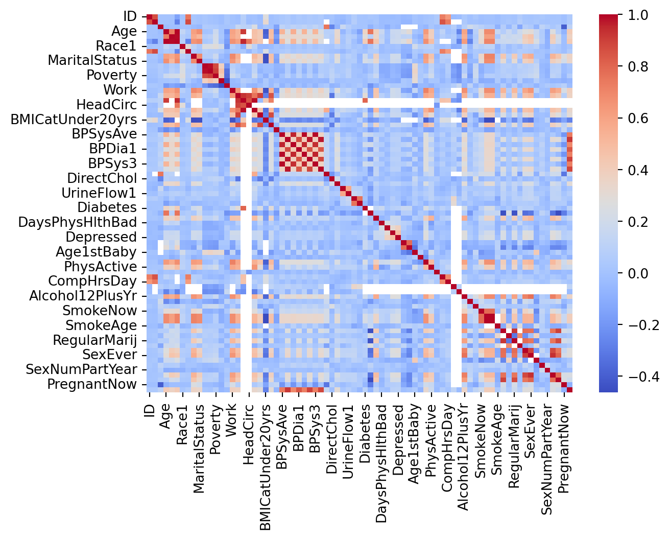
Colinearity is the situation when two or more predictors are linearly related to each other. If we put collinear predictors into our regression model, they start to serve as redundant information to our model and can degrade predictive performance.
Some possible solutions:
We can detect collinearity to look at the correlation matrix between predictors. This works well for pairwise correlations.
When there is a collinear relationship between three or more predictors, pairwise methods will fail. We may consider the Variance Inflation Factor to detect them, but doesn’t that necessarily recommend which variables to remove.
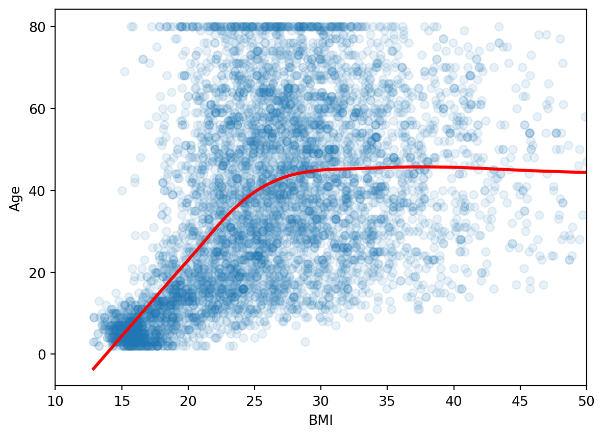
Suppose that we are consider the predictors of our training set:
3.2.4 Number of predictors is less than the number of samples
Sometimes, in machine learning, we have more predictors than the number of samples. This is called a high dimensional problem. Our regression method will not work here and we need to find ways to reduce the number of predictors.
We recommend evaluate the assumptions of your linear regression model on the training set before evaluating it on the test set.
3.3 Extensions of the Linear Model
3.3.1 Polynomial Regression
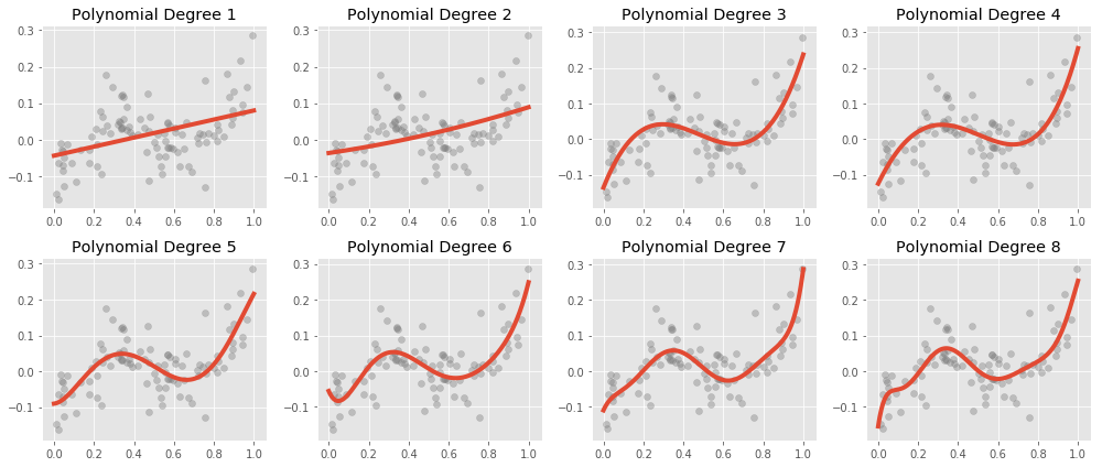
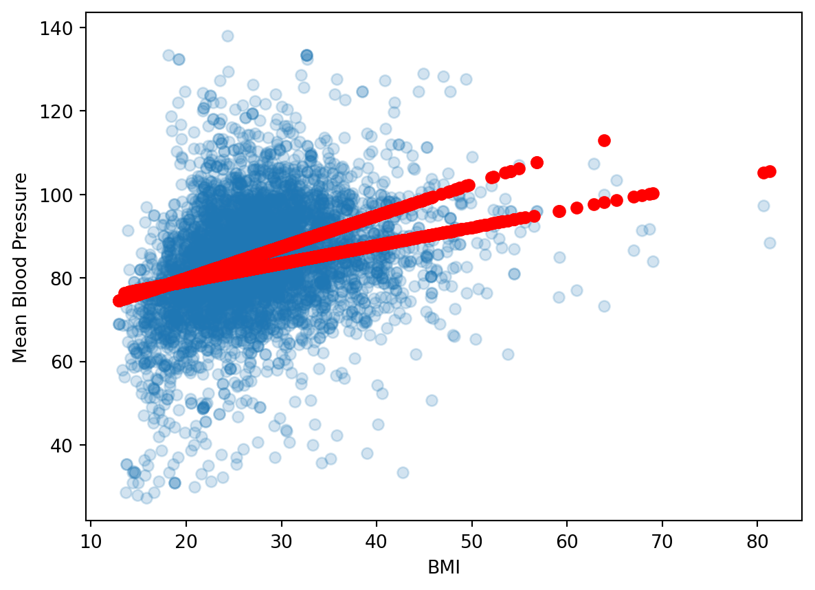
Let’s go back to revisit the non-linearity of responder-predictor relationship. To deal with the slight curve in the residual plot, we can extend our model to accommodate non-linear relationships via Polynomial Regression.
Here is what polynomial regression is capable, visually:
\[
MeanBloodPressure= \beta_0 + \beta_1 \cdot Age
\] We can include transformed versions of the predictors to have other shapes, such as a quadratic shape:
This is still a linear model – we have added a new predictor that gives us a quadratic shape. We use the poly() function to generate our polynomial predictor.
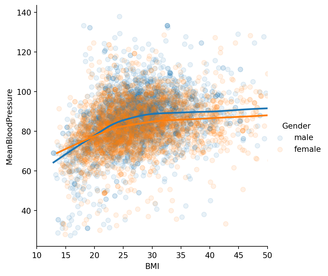
According to our model, the relationship between \(BMI\) and \(MeanBloodPressure\) is a linear line with slope \(\beta_1\), and the additional predictor of \(Gender\) will change our prediction by only a constant, \(\beta_2\). Visually, that would look like two parallel lines, with \(\beta_2\) dictating the distance between parallel lines. However, this plot suggests that our original model isn’t quite right: the additional predictor of \(Gender\) changes our prediction by more than a constant - it is dependent on \(BMI\) also.
When multiple predictors have an synergistic effect on the outcome, their effect on the outcome occurs jointly - this is called an Interaction. To incorporate this into our model, we add an interaction term:
Which creates unique, non-parallel lines depending on the value of \(Gender\).
3.5 Appendix: Inference
For this course, we focus on prediction from our machine learning models. These models have an equally important usage in statistical inference. This appendix gives a quick overview of what that is about.
3.5.1 Population and Sample
The way we formulate machine learning model is based on some fundamental concepts in inferential statistics. We will refresh this quickly in the context of our problem. Recall the following definitions:
Population: The entire collection of individual units that a researcher is interested to study. For NHANES, this could be the entire US population.
Sample: A smaller collection of individual units that the researcher has selected to study. For NHANES, this could be a random sampling of the US population.
Now let’s examine the function \(f()\)’s trained values, which are called parameters.
For the Linear Model, the model we first fitted was of the following form:
\[
BloodPressure=\beta_0 + \beta_1 \cdot BMI
\]
which is an equation of a line.
\(\beta_0\) is a parameter describing the intercept of the line, and \(\beta_1\) is a parameter describing the slope of the line.
Suppose that from fitting the model on the Training Set, \(\beta_1=2\). That means increasing \(BMI\) by 1 will lead to an increase of \(BloodPressure\) by 2. This measures the strength of association between a variable and the outcome.
Let’s see this in practice:
import statsmodels.api as smy, X = model_matrix("MeanBloodPressure ~ BMI", nhanes_train)X_train, X_test, y_train, y_test = train_test_split(X, y, test_size=0.5, random_state=42)model = sm.OLS(y_train, X_train).fit()model.summary()
OLS Regression Results
Dep. Variable:
MeanBloodPressure
R-squared:
0.078
Model:
OLS
Adj. R-squared:
0.077
Method:
Least Squares
F-statistic:
221.3
Date:
Thu, 11 Jun 2026
Prob (F-statistic):
4.11e-48
Time:
22:24:10
Log-Likelihood:
-10325.
No. Observations:
2624
AIC:
2.065e+04
Df Residuals:
2622
BIC:
2.067e+04
Df Model:
1
Covariance Type:
nonrobust
coef
std err
t
P>|t|
[0.025
0.975]
Intercept
70.0309
0.975
71.863
0.000
68.120
71.942
BMI
0.5091
0.034
14.876
0.000
0.442
0.576
Omnibus:
120.715
Durbin-Watson:
2.008
Prob(Omnibus):
0.000
Jarque-Bera (JB):
355.971
Skew:
-0.166
Prob(JB):
5.03e-78
Kurtosis:
4.774
Cond. No.
115.
Notes: [1] Standard Errors assume that the covariance matrix of the errors is correctly specified.
Based on the output, \(\beta_0=69\), \(\beta_1=.55\). We also see associated standard errors, p-values, and confidence intervals. This is necessarily to report and interpret because we derive these parameters based on a sample of the population, so there are statistical uncertainties associated with them. For instance, the 95% confidence interval of true population parameter will fall between (.22, .87). Notice that we used a different package called statsmodels instead of sklearn to look the model inference.