Chapter 1 Introduction

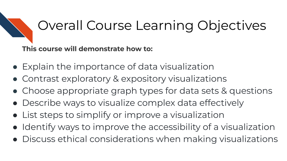
This course is meant to discuss best practices when constructing data visualizations with a special focus on graphs within biology research.

1.1 Motivation

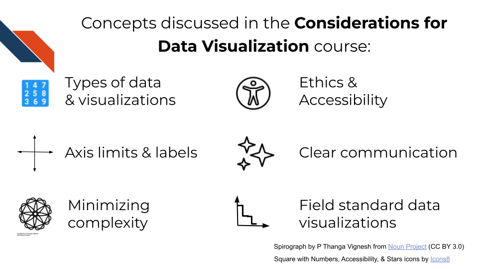
Data is now used more than ever to evaluate and understand questions across many fields including pubic health, bioinformatics, and clinical research. It is critical to produce effective visual summaries of our data. Data visualization is useful for exploration, validation, and presentation of research, aiding in the understanding of underlying biology in datasets, debugging errors in informatics workflows, and identifying/avoiding sources of bias. This course is designed to introduce key concepts of data visualization, in particular for visualizing complex data and accessibility. In addition we will point to additional resources.
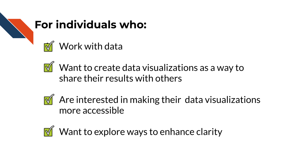
1.2 Target audience

The course is intended for anyone who has an interest in data visualization, but contains sections of specific interest for cancer researchers with experience using basic informatics tools.

for individuals who: work with data and want to create data visualizations as a way to share their results with others, are interested in making their visualizations more accessible, and want to explore ways to enhance the clarity of their visualizations

1.3 Curriculum

The course covers why data visualizations are important for communication within the biomedical and bioinformatics fields as well as best practices and design principles that researchers should consider when constructing data visualizations for their work.

the topics covered in this course include defining the types of data and visualizations, discussing axis limits and labels, tips to minimize complexity, tips for making ethical and accessible visualizations, enhancing clear communication, and field standard or typical data visualizations

1.4 Objectives

This course will demonstrate how to explain the importance of data visualization, contrast exploratory and expository visualizations, choose appropriate graph types based on your dataset and question, list steps to simplify or improve a visualization to enhance clarity, identify ways to improve the accessibility of a visualization, and how to discuss ethical considerations when making data visualizations